Building 33 on Microsoft’s campus in Redmond, Washington, houses a conference room unlike any you’ve ever seen. It includes an enormous glowing sphere, a buckyball for a boardroom. A 360-video camera mushrooms from dead center of that pod, a ring of stools surrounding it, and Surface Hubs line the walls. Stepping inside the pod is like entering another realm. Welcome to the Productivity Zone.
The sphere in Building 33 is the future, and like any good sci-fi flick, it looks nothing like today’s world. Microsoft’s Anton Andrews, head of Envisioning for Modern Work and Life, makes the reason for the revolution clear. “We thought we could do a better job. We have to do a better job,” he told Digital Trends.

The Surface Hub is key to that vision, bringing immersive video conferencing, a space for whiteboarding, a place to share documents, and more. The first-gen Hub was popular with the business crowd, but it had a few crucial failings. Notably, it couldn’t be moved. So, Microsoft went back to the drawing board and reinvented the Hub, and along the way rethought what the office looks like.
That’s right. The company that defined your office through Microsoft Office is trying to redefine the actual office, this time through the Surface Hub 2. The goal is ambitious and clear. Reinvent teamwork, then future-proof it.
“One thing that we think is still an unsolved problem is collaboration,” Andrews said. “How can we help bring people together — to be together and work together in much richer ways?”
Round peg vs. square hole: Designing the Hub 2
The trip to the future starts in Building 87, one of dozens of buildings on Microsoft’s campus. About 40,000 people work for the technology giant in and around the Puget Sound in Washington. About 250 work here, and they build the gear.
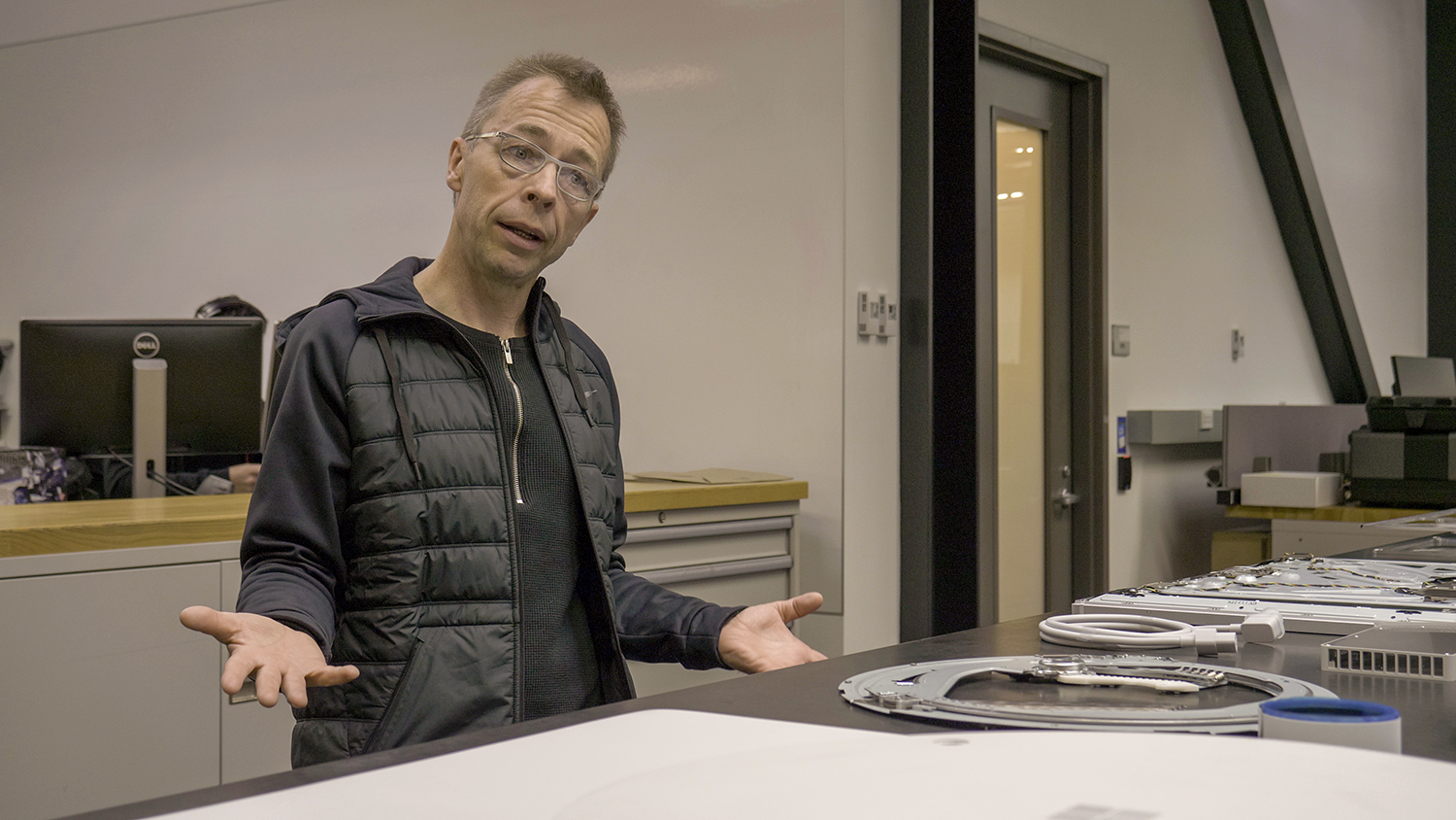
“All products are kind of born here,” explained John Haley, senior prototyping manager for Microsoft Devices. He works in the Advanced Prototyping Center, which lives right across the hall from the industrial design space, the nerve center of the design team. There, a team of industrial designers, user interface experts, and hardware engineers build Microsoft’s future tech. Everything Xbox, HoloLens, and Surface is created here.
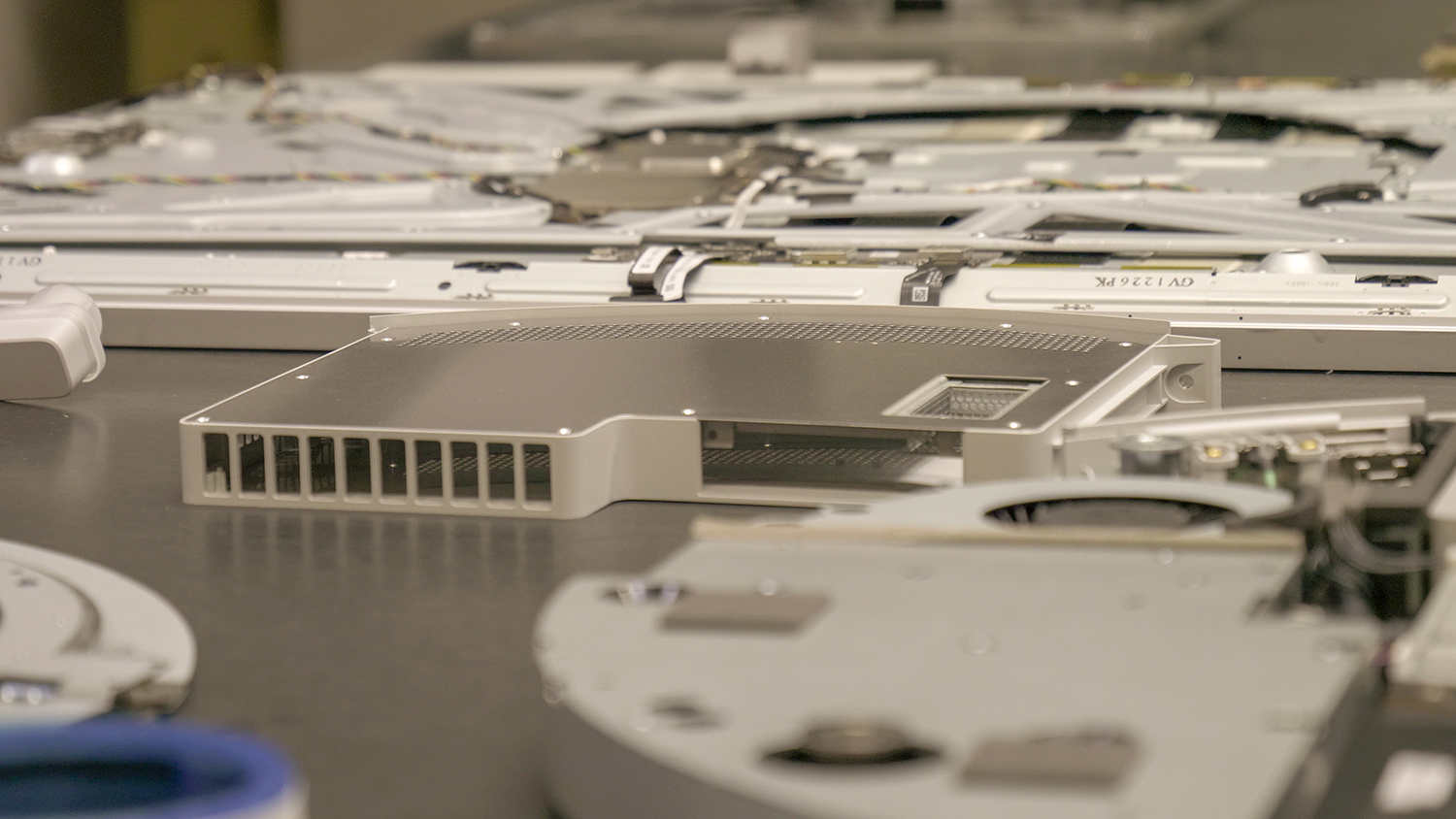
The center houses around a dozen industrial-scale 3D printers, and dozens upon dozens of CNC printers, all used to prototype Surface devices – including the Surface Hub 2S and its follow-up, the Surface Hub 2X. “We print on average about 400 individual pieces and parts a day,” Haley told Digital Trends. “This is about iteration. This is about having an idea in the morning and trying to prove it out as absolutely fast as you can and getting a physical object in your hand as quickly as possible.”
The Hub 2 is different from 2015’s Hub. Instead of mounting on a wall, it sits at eye level on an easel designed by Steelcase. Unplug the screen, and you can wheel it to any corner of your office, meaning collaboration is no longer relegated to your conference room.
Designing such an enormous device was no simple task. Haley had to purchase larger CNC machines because The Hub’s parts couldn’t be produced on the same machines used to prototype the Surface Pro 6 (or the anticipated sequel, the Surface Pro 7).
“We took our obsession for detail that we apply to all of our smaller devices and applied it to a large device – which is actually not trivial at all,” said Kaeling Gurr, a senior designer with Microsoft Devices and project lead on the Surface Hub 2S. “Things like steps and gaps and parting breaks magnify with the size of the device. So, there was actually a lot of hardware and engineering innovation that went into each of these parts to bring it together seamlessly,” she told us.
That obsession for detail can be seen in parts big and small, if you look closely. Take the bezels, which are just 15 millimeters wide. They’re made from precision-machined aluminum, and they go through a double anodization process – first to give the platinum finish you see on many Surface products, then a second time to achieve the black finish visible from the front.
“It makes the bezels recede a little more. You’re not getting a silver bezel all the way around. It allows your content to come forward,” Gurr said.
Exploded diagram: A close look at the Surface Hub 2S
The screen on the Surface Hub 2S is a 50-inch, 4K Pixelsense display that supports multitouch from by multiple users. It has a matte finish, giving it a paper-like quality. Microsoft says it spent over a year working on the anti-glare technology with the glass manufacturer, across more than 100 sample screens, carefully balancing the material on the tip of the pen and the surface of the screen. Do it wrong and a pen tip will skip or skid across the surface. Do it right and you don’t even notice that you’re writing on glass.
“We’d get a box of glass that had incrementally different etching treatments, and we would sit with a pen and draw on each one and feel what that pen-feel was like,” Gurr said. “And then evaluating the anti-glare properties itself to dial in both the touch and feel experience against the clarity of the screen and its ability to block light.”

Tech within the display impacts the quality of the screen as well, she noted. Traditionally, displays have edge lighting that creates a little bit of vignetting at the edges. “The Hub 2 has over a hundred points of individual light in the TV itself, which gives you a really nice, even lighting and color across the entire display,” Gurr said. All that tech is one reason the Hub 2S starts at about $9,000, a reasonable price for a high-tech conference room, but not something you’d put in your study at home.
In many ways, the back of the Hub 2 is as interesting as the front. For one thing, there’s the color and quality of that back panel itself. Most large screen TVs have black rear panels, a color that disguises the imperfections that come with the injection molding process that is used to make large displays. Designers call those little glitches “flow marks,” and they come from the impact of the tool heads on the material. Gurr and her team found themselves constantly shuttling back and forth to the manufacturer to remove all those marks. The net result is a rear panel as beautiful as the front.
Hub 2S vs. Hub 2X: Portrait mode and the power of software
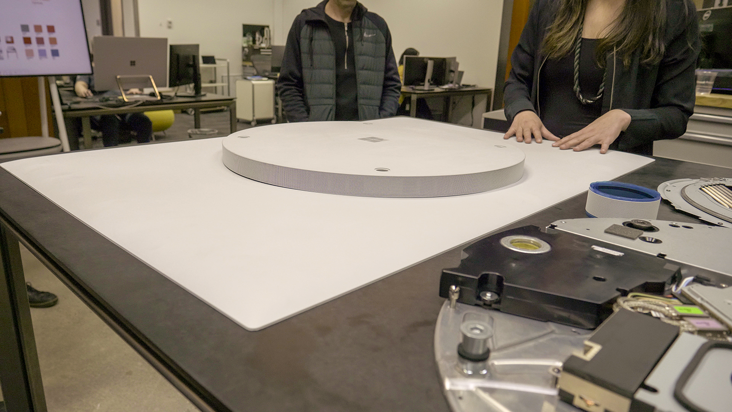
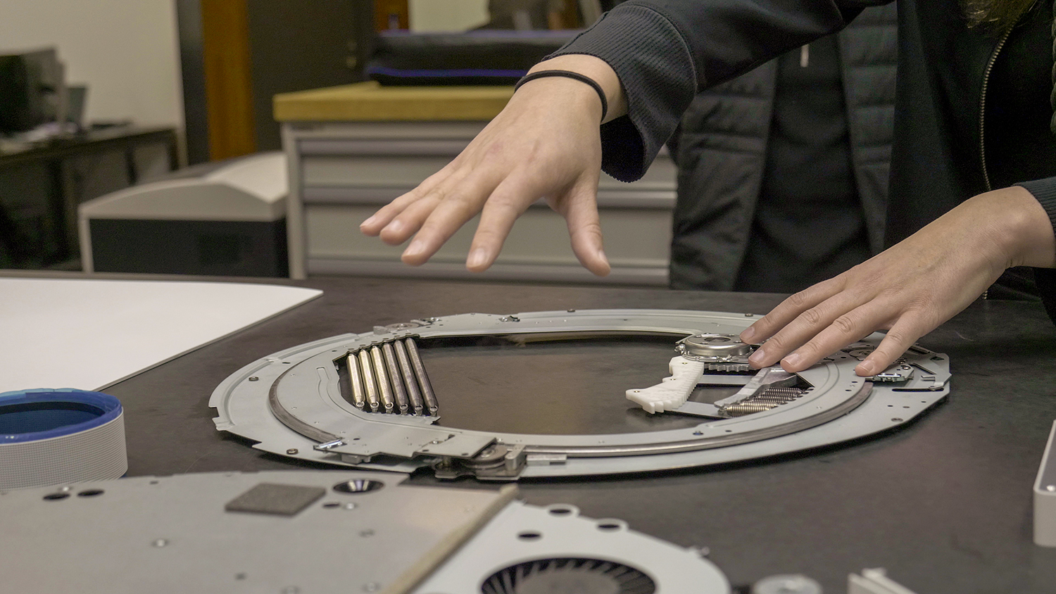
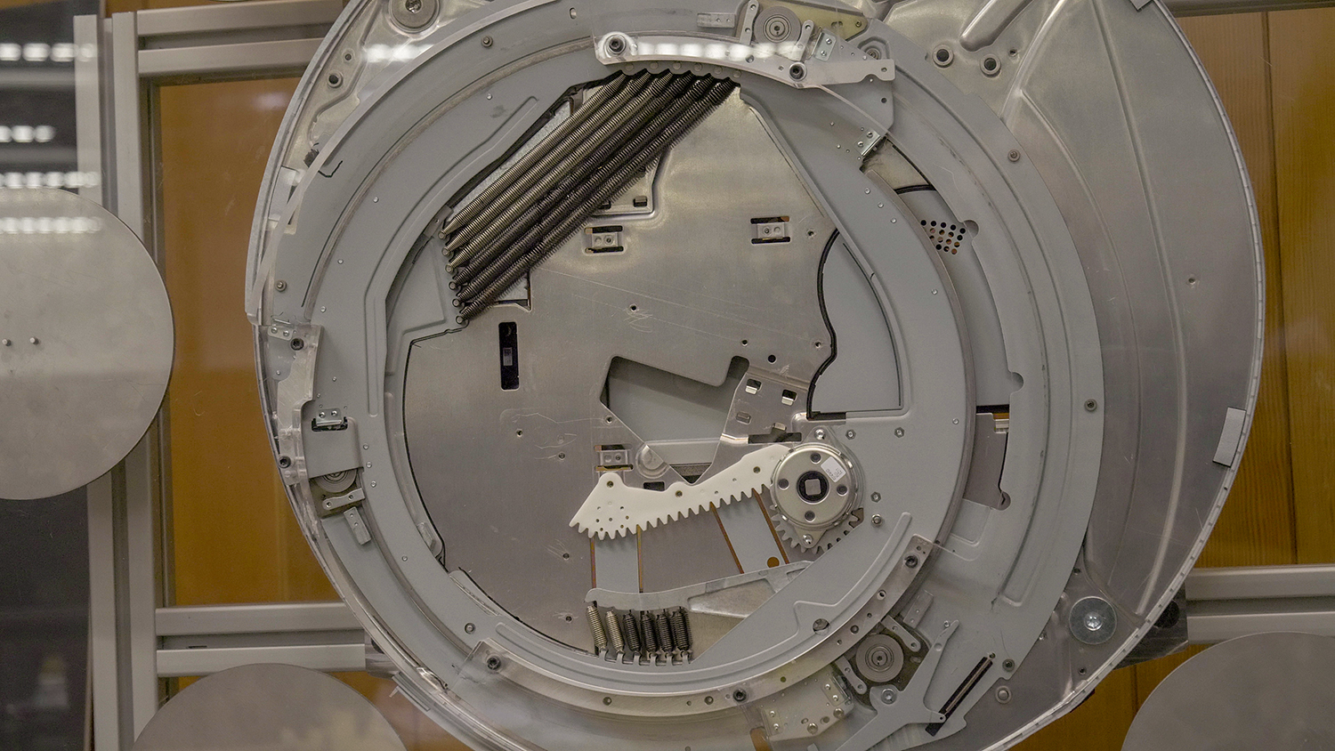
The Hub 2S has a distinctive rear bump-out that fills the back panel. It contains a unique rotating mechanism that will let you rotate the screen from landscape to portrait mode. Well, eventually. That’s the hallmark feature of a future version of the Hub called the Surface Hub 2X.
“It’s actually a really easy upgrade to 2X. Every 2S carries the ability to become a 2X in the future,” Gurr said, thanks to a compute module slotted in at the bottom of the disk. It contains the entire guts of the computer – CPU, RAM, and so on. Replacement cartridges unlock the rotation feature.
Upgrading to unlock a feature that already exists is surprising, and annoying. The device has the feature. Why doesn’t it just work from the start? Microsoft says the software isn’t ready yet, and it doesn’t want owners and users to have a subpar experience.
Microsoft’s core competency lies in software, but increasingly it’s been focused on the cloud and A.I. Simply adding a design team – even the best design team in the business – wouldn’t work without close connections between these two fields. And Microsoft Teams is at the heart of this vision. Teams is a platform for collaboration, an idea that joins concepts like chat, whiteboarding, and videoconferencing, just as Office joins programs like Word and Excel. But the programs in the Office suite need only keyboard, mouse, and computer to work.
“It’s a dance,” Ralf Groene, chief vice president of design, Microsoft Devices, told Digital Trends. “Since the beginning, we like to talk about hardware as a stage for software. So instead of putting the hardware in the foreground, we try to recede the hardware in the background, so the software can perform.”
Crispy fricatives: Testing the Hub in the quietest place on Earth
There’s a roomful of ears in Building 87.
Anyone who’s used the Surface line of products knows that Microsoft sweats the details. That attitude pervades all aspects of the company’s products too – even sound.
“We obsess over sounds,” explains Hundraj Gopal, principal human factors engineer, Microsoft Devices. Gopal’s a speech and hearing scientist, and as passionate about sound as Gordon Ramsay is about spice. He’s the reason Microsoft invested over $1.5 million in an anechoic chamber, a specially constructed room lined top-to-bottom with spikey foam. It’s essentially a sonic fortresses of solitude, allowing for near-perfect isolation and almost total silence, that’s meant to test loudspeakers and other audio gear. Samsung’s got one in California; most audio companies have them too. Microsoft’s is quieter.

“We have the Guinness World Record for being the quietest place on the planet,” he told us. The chamber enables the engineers to perfect the sound of key clicks, find the optimal pitch for whirring fans, and ensure that during videoconferencing, the fricatives are as crispy as the sibilants are soothing.
Microsoft is that passionate about collaboration. Distracting pops and hisses can take you out of the flow, Gopal argues. It’s especially important when you consider the breadth of how humans communicate. Some languages rely on clicks and popping sounds and have nuanced versions of each.
Microsoft has a sonic fortress of solitude.
John Morris, senior human factors engineer at Microsoft, has a similar obsession with the finer points of human interaction. He’s in charge of the room of ears, likely a holdover from Surface Headphone testing. The utility of the other tools at his disposal are less obvious but make sense when he explains them.
For example, there’s an EEG, a hat made of electrodes that measures brain activity. Morris uses it to measure the brain activity of people using Surface devices. For the Hub 2S, Morris used an EEG on a variety of test subjects to ensure that the angle of the Hub 2 on the easel was exactly right. Too steep and it became hard to write on; too flat and it’s a table, not a whiteboard.
Is this the Surface Hub 3? Inside the Applied Sciences Group
Down one dark hallway of Building 87, where you’d least expect to find it, is a cluttered room with the oscilloscopes and gear of a mad scientist. This is where Senior Research Manager Tim Large runs the Applied Sciences Group. And it just might hold the key to the future of the Hub – and the office you walk into every morning.
“Our job is to look maybe 2 or 3 years down the line at new technology that we might incorporate into our products,” Large told Digital Trends. In one corner of the lab, a semitransparent display sits over an array of cameras, which can track the eyes and movement of a person to better focus the camera directly on them, wherever in a room they may move. A second, more esoteric demo aims to blur the boundaries between the workspace and the physical space.
“This display actually locks onto your face and it gives you a different image for your left and right eye, and it renders those images for your head position. You should get the impression that you’re looking into a remote space through a window,” Large says. While we look on, someone on the other side of the window brings up a 3D object, and we contemplate it together – a virtual widget, added to a videoconference. The effect is a tad dizzying, a little disconcerting, and nothing like any collaborative experience we’ve ever tried.
That’s the point. Microsoft wants to rethink everything about the workplace, from the software we use to the space we inhabit. And from what we’ve seen, Microsoft’s serious about change – not just for you, but internally, too. The focus on collaboration? It’s not just talk but translated to action in the form of meaningful internal reorganization.
“We were Harry Potter, under the stairs before,” Large jokes. Now, Large has a wonderful space and an armory of tools at his disposal. Let’s see what magic he conjures next.
