Android 12 will get an extensive, flowery redesign, according to massive leak

A leak has given us a detailed look at a possible redesign for Android 12 just ahead of Google I/O, the annual developer conference where the new software is expected to be officially revealed. The leak comes from Front Page Tech, and the information shown in the video consists of both images and what appears to be an official-looking promo clip.

If accurate, Android 12’s design will undergo a significant redesign compared to what we’re used to seeing on Google Pixel phones at the moment. Remember, if you don’t own a Pixel phone, the Android 12 you see on your phone may be at least partially obscured by the manufacturer interface on your phone, such as Samsung’s One UI or OnePlus’ OxygenOS.

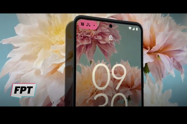
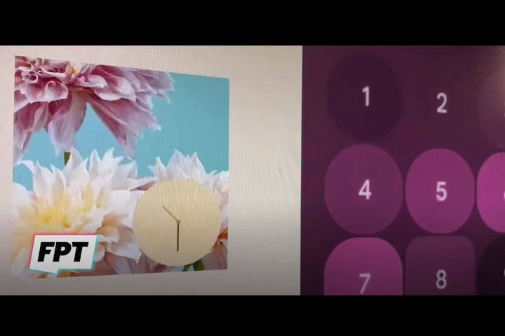
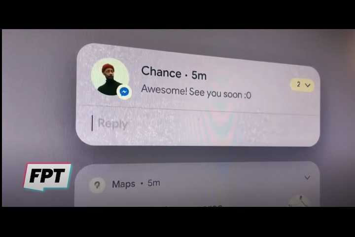
What does the leak show? Most familiar elements will get a new design, including the clock on the lock screen, incoming notification alerts, the weather widget, and controls like brightness and alarm snooze. There will also be a lot of dynamic size adjustments for icons, windows, and other onscreen elements. There’s a distinctly flowery motif throughout, too.

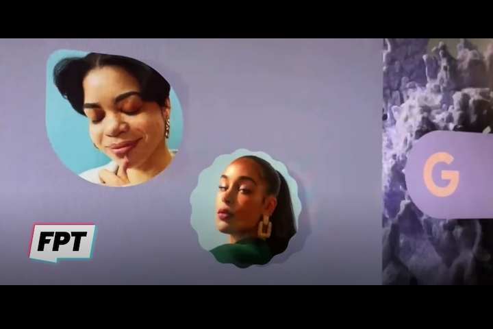
The video shows a phone (possibly the Pixel 6) with a very summery floral image as the wallpaper, petal-shaped icons, lots of bold colors, and a spinning camera icon that’s less gear-focused and more flowerlike, which is then repeated for a contact’s icon. It seems Google is eager to cheer us all up with Android 12.

Notifications also look set to change, with a pill-shaped alert appearing at the top left of the screen, where a counter also provides information on how many alerts you have waiting, which is another design element repeated throughout the video. The notification pill shows on the lock screen, where the time has been enlarged, placed at the center of the screen, and orientated vertically. What else? Look out for lots of rounded corners on icons, new animations, more white space, and even a new design for Google’s Gboard keyboard.

Is this what Android 12 will look like? Google I/O is traditionally where we get our first look at the next version of Android, before it’s slowly further revealed until the final launch toward the end of the year. The keynote presentation is the must-watch event, and it takes place tomorrow, Tuesday, May 18, so we don’t have long to go before we find out all the official information about Android 12. Information about how to watch Google I/O, and what to expect during the event, can be found right here.

Editors' Recommendations

Andy Boxall
Senior Mobile Writer
Andy is a Senior Writer at Digital Trends, where he concentrates on mobile technology, a subject he has written about for…
Microsoft’s Surface Duo gets a Windows-style refresh with Android 12L
Surface Duo 2 on a textured background.

Microsoft is finally updating its Surface Duo -- ahem -- duo to Android 12 this week. The company broke the news on its official Microsoft Devices Blog after previously committing to rolling out an update sometime this year. Android 12 was made generally available by Google in October 2021, while Android 12L hit Pixels in March.

The star of the show here is Android 12's big visual refresh. Yup, Material You, dynamic color theming, and more are coming to the Surface Duo phones. The company as even throwing in four new wallpapers to highlight the refresh. However, Microsoft is going a step further by redesigning the Duo's software so that it'll look a lot like Windows 11. This is pretty obvious in that the system settings app and notification center now resemble Windows 11's versions of those features, and there are a lot of fluent design (Microsoft's design language) touches hidden in the company's preinstalled apps. In other words, the Surface Duo and Duo 2 pair are becoming true Windows phones. Of course, this illusion disappears when you dip into third-party apps, but if you're buying a Microsoft Duo, you're almost certainly a superfan.

Read more
Google Chrome is getting the Android tablet update you’ve been waiting for
Google Chrome app on s8 screen.

Google today announced the release of its redesign for the Chrome app on Android tablets. After long being neglected on the big screen, especially in comparison to Apple's or Samsung's browsers, Google says it'll be rebuilding the browser to help you get work done faster with a tablet or other large-screened device.

These updates can be broken down into design and functionality improvements, and we'll be kicking things off with the redesign. The first change adds a new side-by-side design when using Chrome paired with another app. This comes with an auto-scroll back feature so you can swipe between tabs, hiding the close buttons when your tabs are too small to prevent mis-taps — plus the inclusion of a restore feature.

Read more
Android 13: Everything we know about Google’s big OS update
Android 13 logo on a Android logo background.

Google's Android 13 is finally here after months of testing. It's a pretty small update that sees Google building on what it started with Android 12 and 12L. Material You gets more colorful with additional customization features, and Google plans on expanding icon theming beyond the small selection of Google apps currently supported. The company also highlights privacy and security features in Android 13, and there's a lot of building upon Android's bigger-screen ambitions in foldables and tablets.

Finally, people with Chromebooks will see some Apple-like cross-device functionality that allows you to stream messaging apps to the big screen. This comes in addition to other Chrome OS features like a shared clipboard and the flexible Phone Hub.

Read more