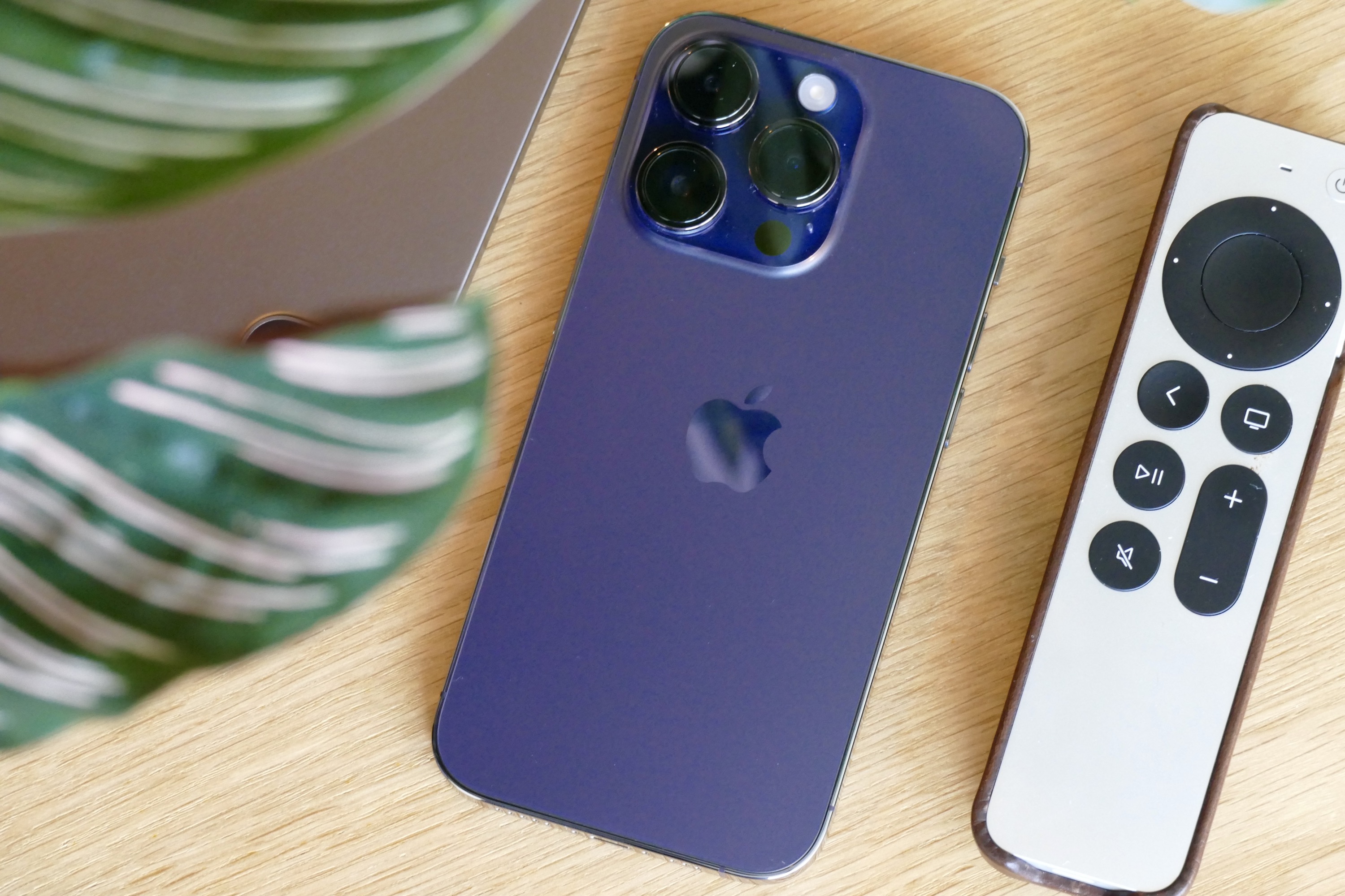
Apple is happy with its smartphone formula. This much is clear because the iPhone 14 Pro isn’t that much different from the iPhone 13 Pro, which wasn’t all that far removed from the iPhone 12 Pro. While some bemoan the lack of visual changes between recent generations, what really matters is if the entire package has improved with each numerical uptick.
My iPhone 14 Pro arrived on Friday, September 16, and that’s not enough time for a full review — but it is more than enough for a close look at what the iPhone 14 Pro is like. It’s familiar, like a safe pair of hands. And no, this isn’t the downside you may first think it is.
The iPhone 14 Pro is just so seamless
If you own an iPhone, changing over to your new iPhone 14 Pro is a wonderfully simple process, and it leads you into ownership in exactly the right, comfortable, convenient way. From Apple providing free iCloud storage to make swapping apps, photos, and settings simple, to the way all your home screens are identically replicated on the new device, it’s like you never left the old one.

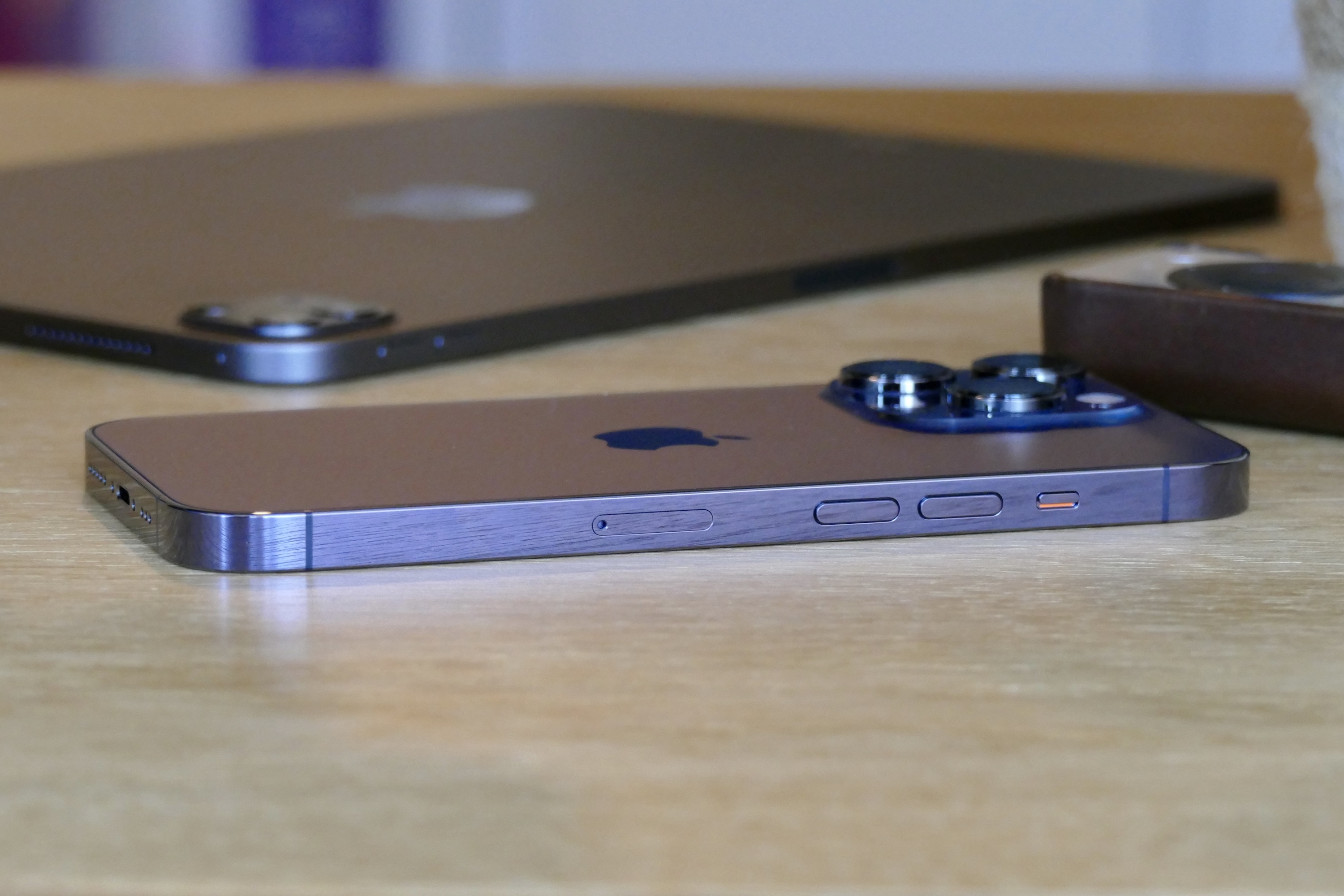
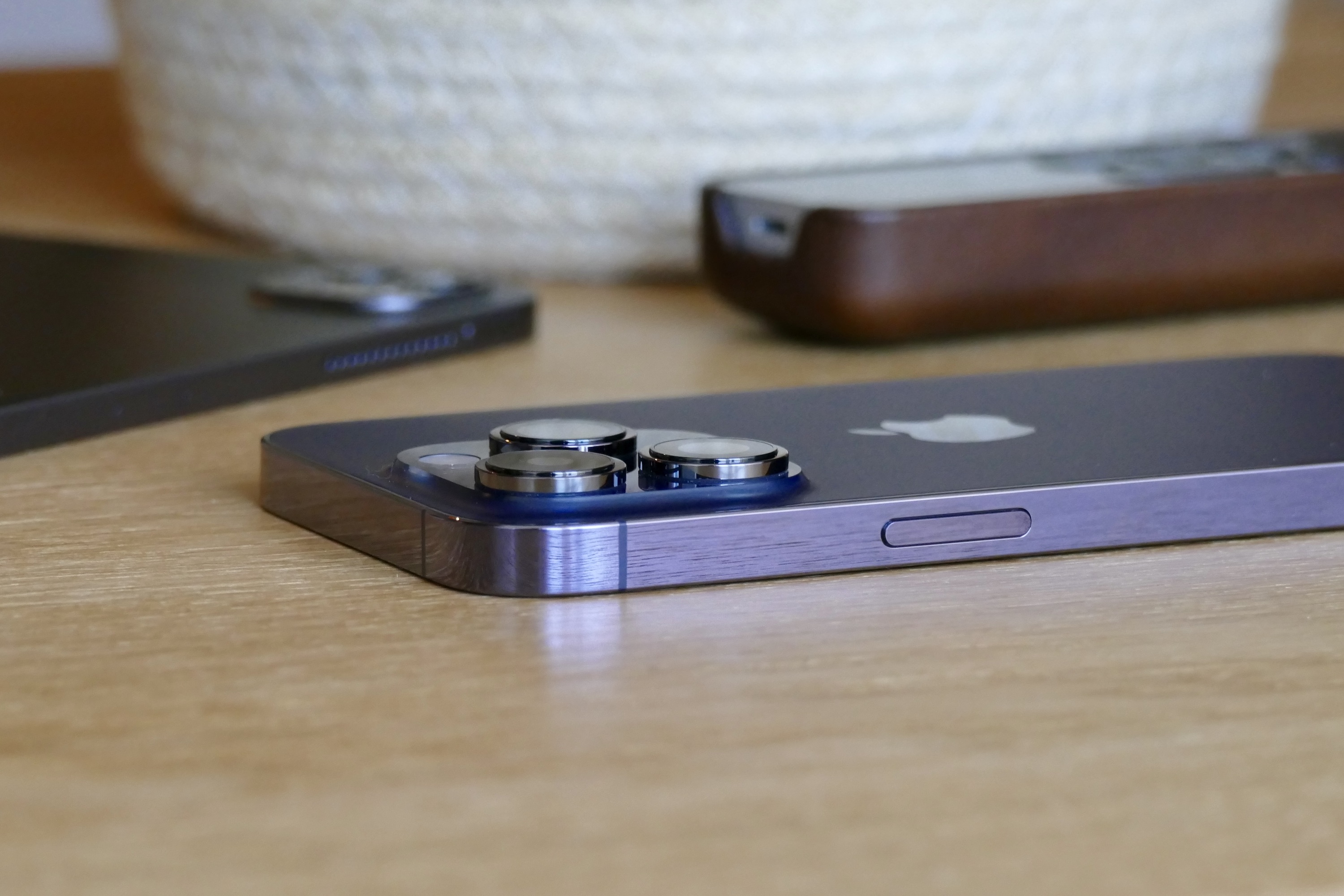
This is also true of the design. If you’re coming from an iPhone 12 Pro or iPhone 13 Pro, the iPhone 14 Pro feels the same in your hand. The flat, squared-off chassis is still slightly too sharp, and the already large camera module has got even bigger this time. The volume controls and power button are still in place, but if you buy an iPhone 14 in the U.S., there’s no SIM tray as it is an eSIM-only phone.
I don’t dislike the familiarity. It looks the same, feels the same, and works in almost the same way as the iPhone 13 Pro I left behind. While this may make you legitimately question whether an upgrade is worthwhile for you, the seamless, hassle-free way you can switch to that brand-new phone is enticing. It takes away any stress about losing precious photos, saved games, music, or messages.

The iPhone 14 Pro has taken over from my old phone without an issue. No, it doesn’t really look any different, but that’s fine. It’s a slick, modern design, and beautifully made from quality materials (plus the Deep Purple color is glorious in the right light). I especially like the way it’s integrated into the camera bump and lens housings, giving them depth and visual punch.
It’s not a dramatically different phone than before, but whether you’re new to iPhone or coming from a previous one, it welcomes you with open arms. And because the experience is so damn polished, you’ll quickly forgive it for not having a slightly different look.
Taking a trip to the Dynamic Island
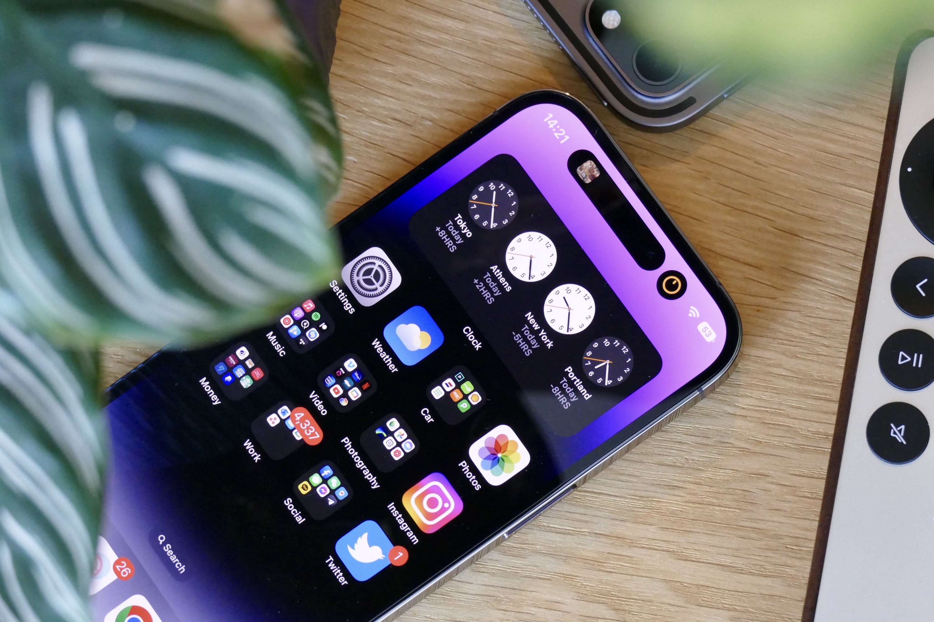
The Dynamic Island is the feature I was most excited to try on the iPhone 14 Pro. Not least because it looked fantastic during Apple’s launch event, but also because it’s really the largest visual change on the phone, and certainly the one most people have been talking about. What’s it like? It has got a lot of potential, but at the moment, it feels underused.
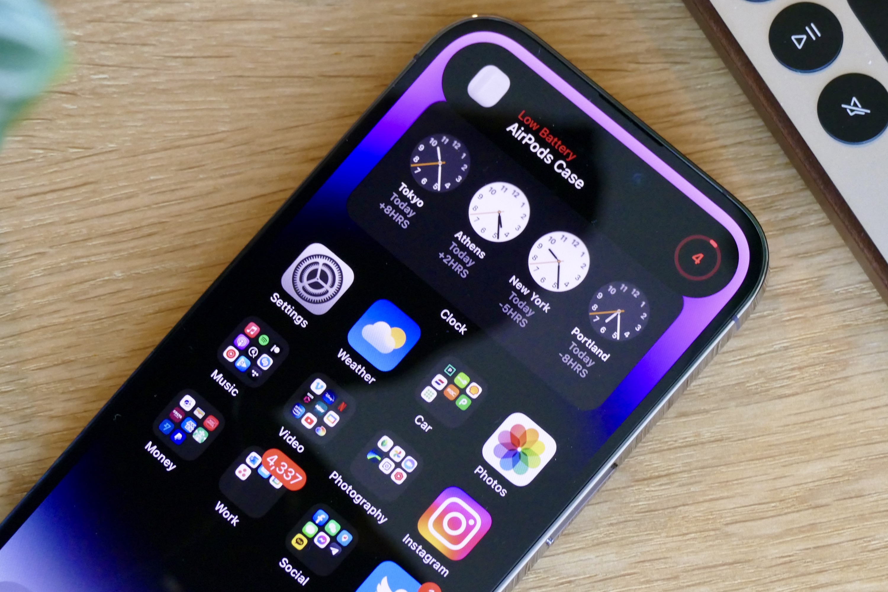
The Dynamic Island gives the notch a reason to exist by using software to dynamically adjust its size and shape according to the app you’re using or the task that’s being performed. The notch was always there, static and stoic at the top of the screen, but now it’s magically alive. I never really learned to completely ignore the notch, and now the Dynamic Island means that doesn’t matter by making it helpful. It reminds me of LG’s Ticker second screen on phones like the LG V10, just a bit handier.
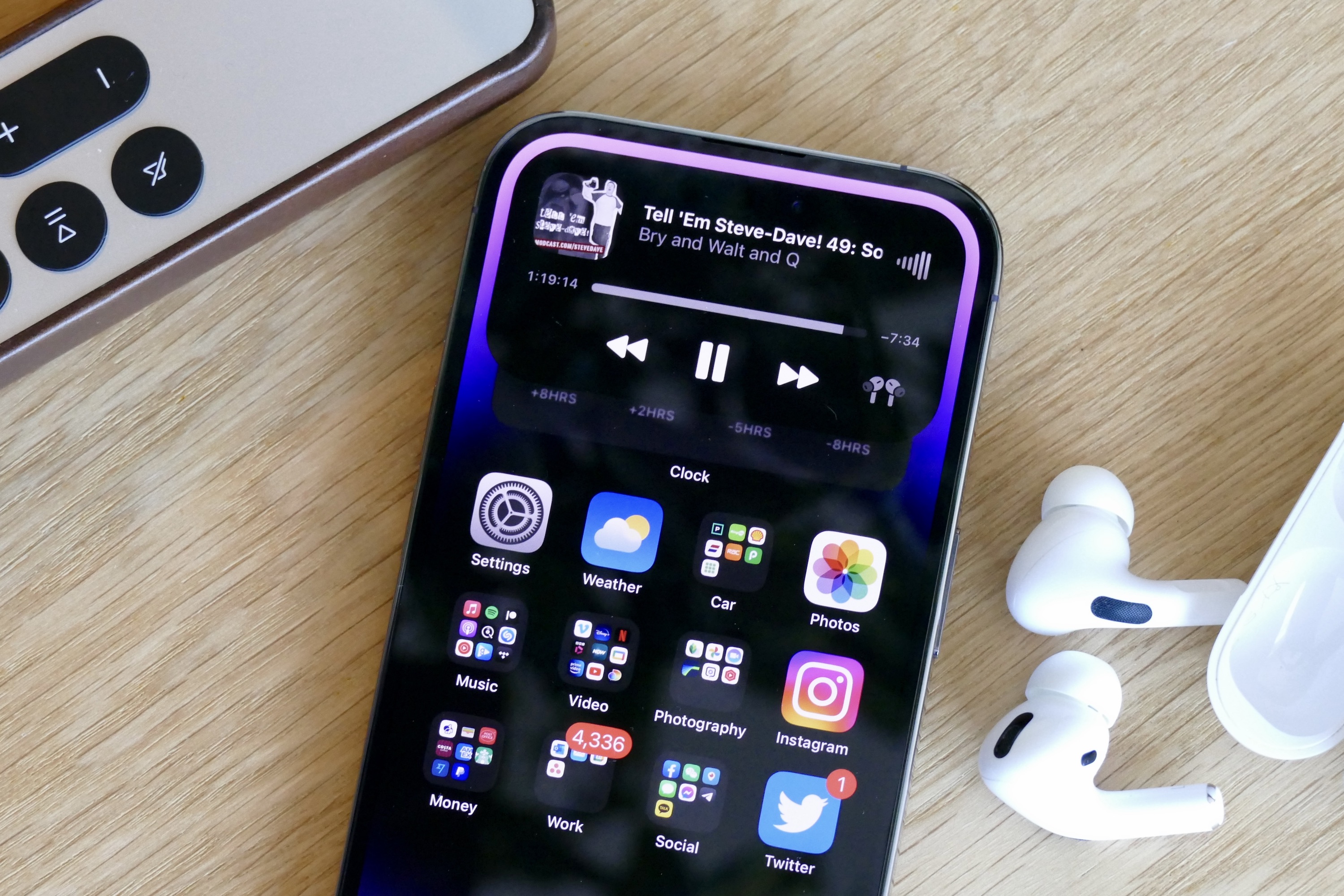
In what way? So far, it’s the music controls that have proven most beneficial. When music plays, the Dynamic Island can be tapped to swap immediately to the Music app, or long-pressed to show the controls. It also shows information on Apple AirPods Pro when they’re connected, and makes swapping tracks or scrubbing through a podcast much faster.
Design-wise, I like the way Face ID’s padlock icon is now on the Island, and the way it splits into two to track more than one activity. It’s also so smooth and so beautifully integrated and realized. It instantly feels like part of the operating system that really just could have been there for a while. However, it doesn’t work with many apps at the moment, and that limits the number of times it’s doing anything, but app developers will surely be working hard to integrate its functionality.
Is the iPhone 14 Pro better at taking photos?
With only 100 or so photos on the camera roll so far, it isn’t possible to fully assess the iPhone 14 Pro’s camera ability yet. You can check the specifications in our buyer’s guide, and while there are some hardware differences between them, the main camera takes photos that look almost identical to the iPhone 13 Pro’s camera. That’s fine, as the 13 Pro’s main camera improved a lot over the year, so Apple’s starting out with a great base. I certainly hope further tweaks come in software updates to take it beyond its predecessor, though.
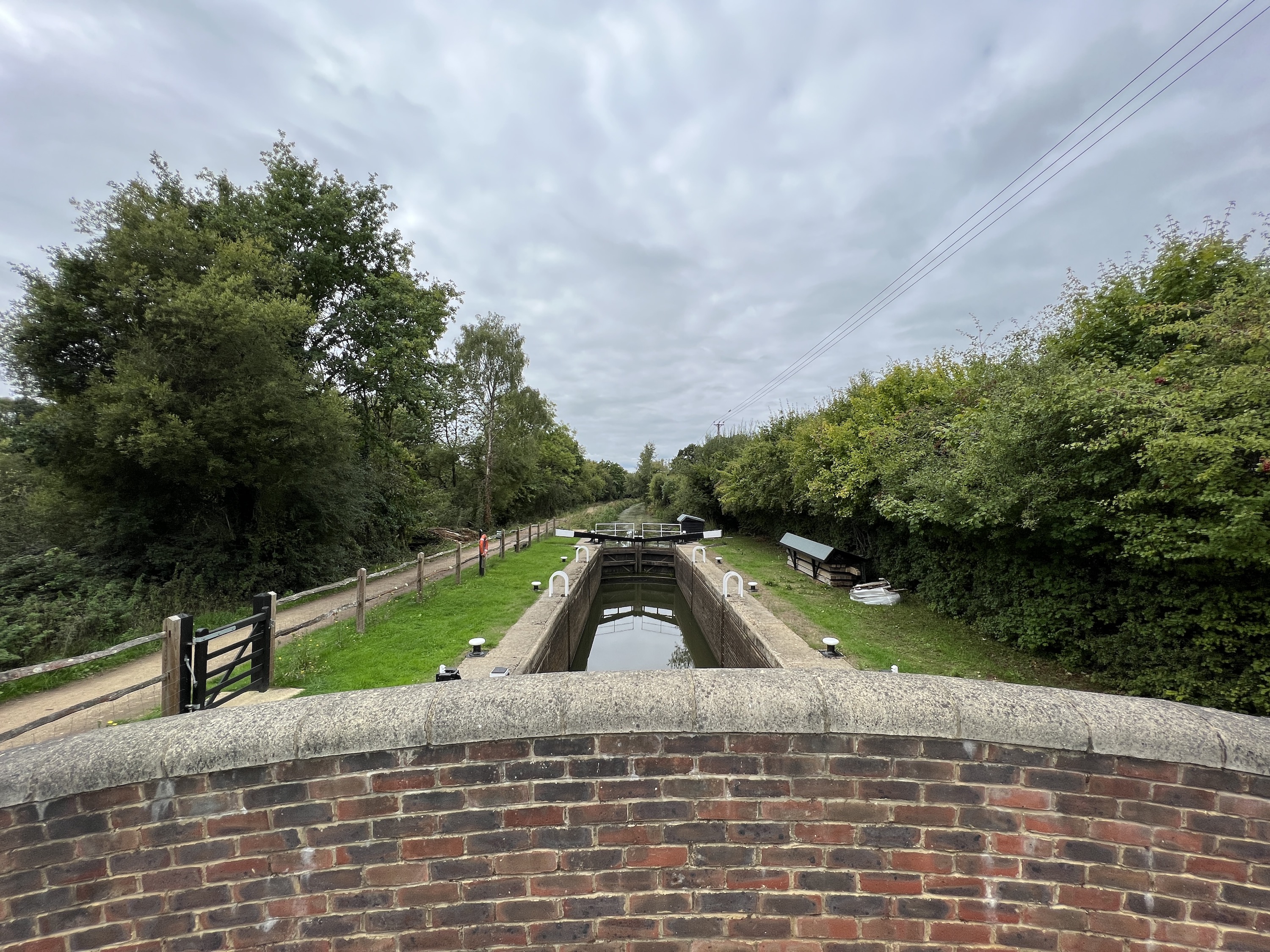
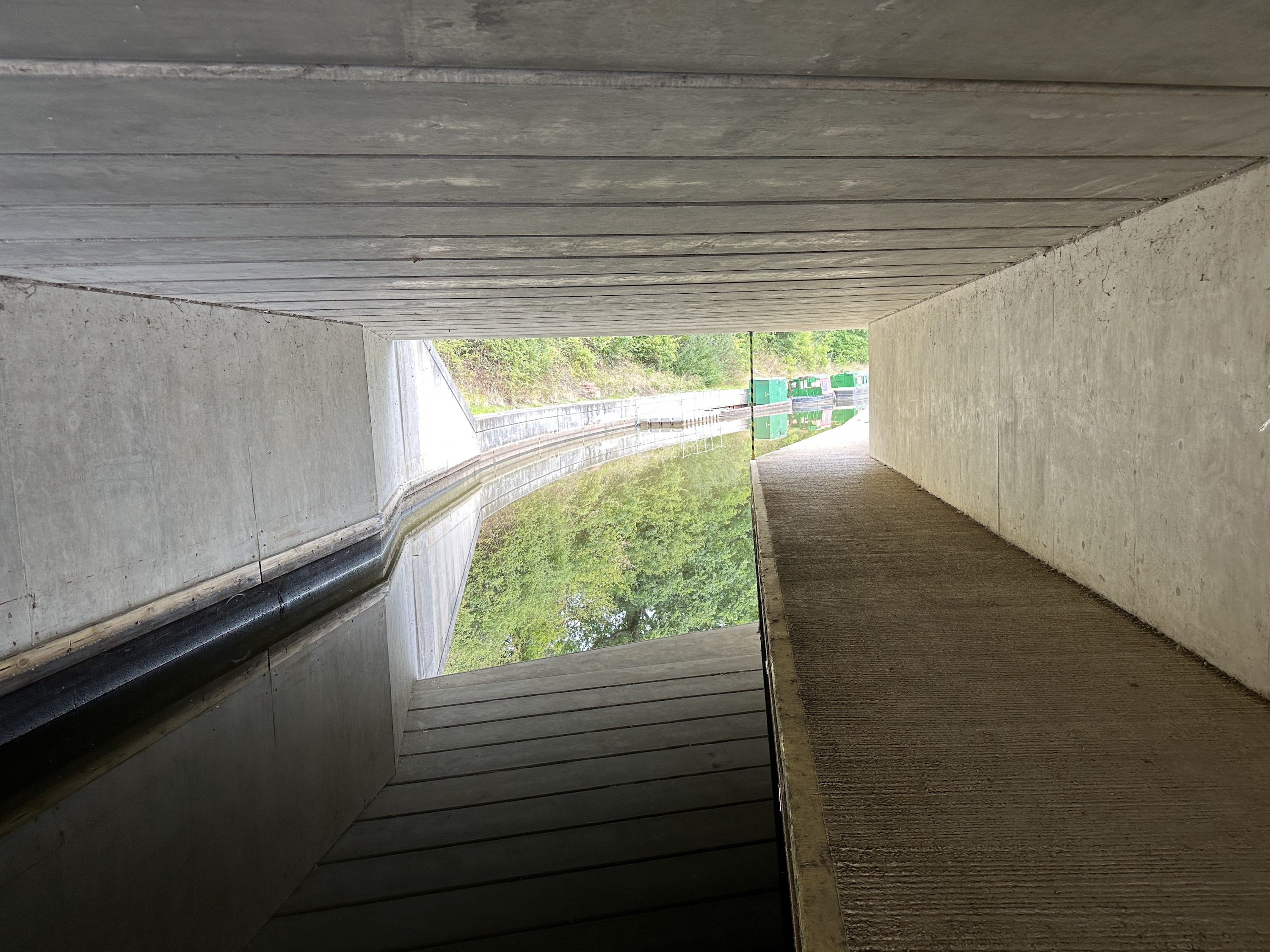
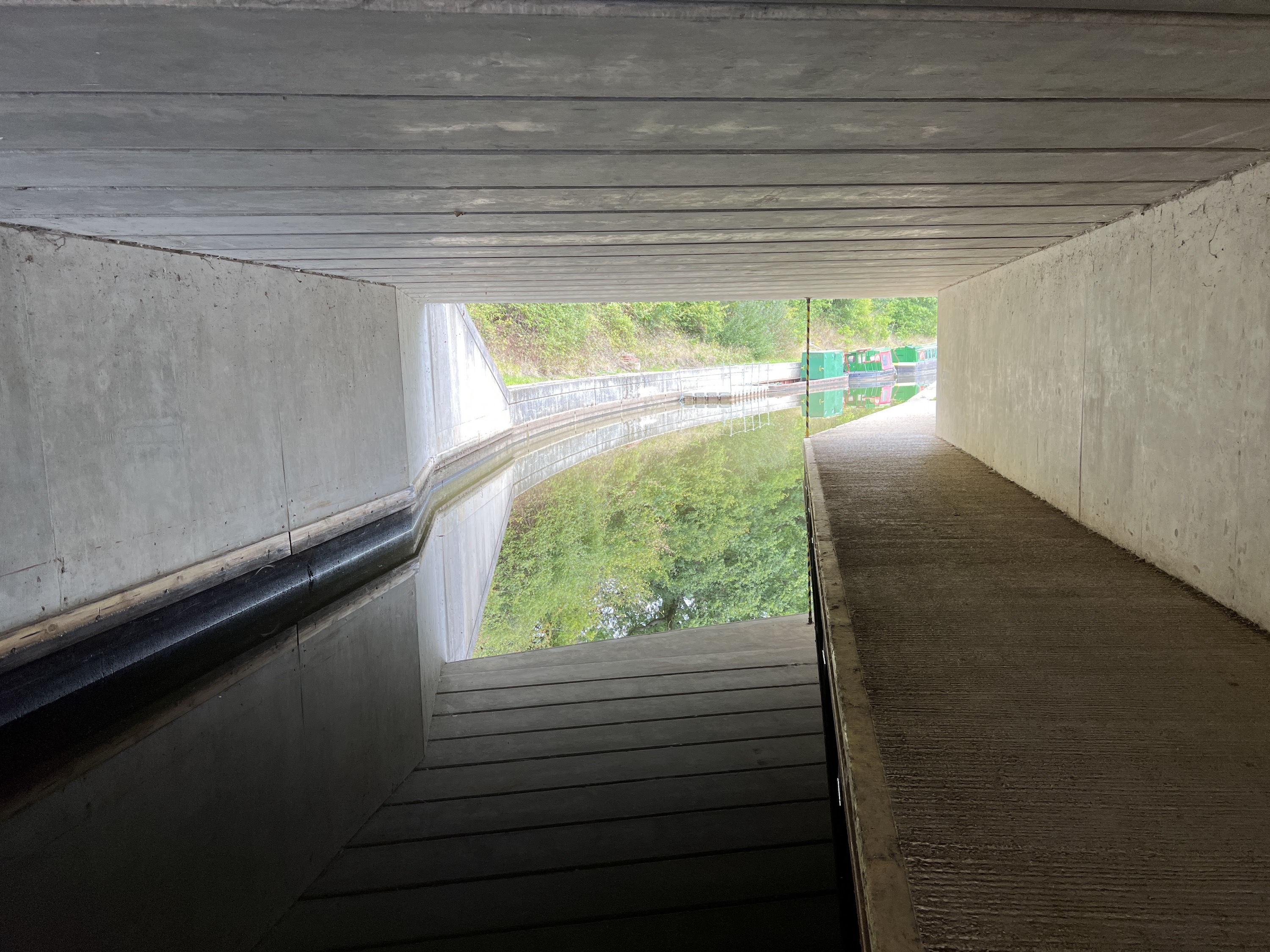
What I have noticed already is how much better 3x telephoto photos look, and they are especially good in low light, which is what Apple promised from its new image processing technology it calls the Photonic Engine. See the photo taken in a dark tunnel looking into bright sunlight, complete with reflections on the water, making it a complex environment. The iPhone 14 Pro doesn’t blow the brightly lit areas out as much, shows more detail on the walls, better shadows, and has a more realistic color palette overall.
There are some improvements showing in the wide-angle camera, too, with some shots from the iPhone 14 Pro showing far better balance, exposure, and detail. However, this hasn’t happened with all the images, so it’s not clear if it’s an across-the-board upgrade yet. I’ve also found the iPhone 14 Pro is great for taking photos of small objects when using the 3x telephoto mode, focusing and avoiding blur far more effectively than the 13 Pro.
It’s a good start for the iPhone 14 Pro’s camera, but only if you’re happy with incremental updates to the telephoto and wide-angle performance, as the main camera currently looks mostly unchanged. It makes sense, as primary camera performance on most phones at this price is excellent, and it’s what happens around it where things have traditionally needed to get better.
Potential battery struggles
It’s still too early to harshly judge the iPhone 14 Pro’s battery, but there’s evidence it may not have the longevity some will want. Today, after just over three hours of screen time, the battery sits at 38% at 6 p.m., having been removed from the charger at 7:30 a.m. This includes GPS, video, camera, and general app use. It’s not terrible, but if you use the phone even moderately hard, then only getting a single day from the battery seems likely.

It may not be entirely the hardware’s problem, though. Since installing iOS 16 on my iPhone 13 Pro, the battery has not lasted as long as it did with iOS 15 installed. The iPhone 14 Pro also uses the same software and Apple’s new always-on screen that, although won’t draw much power, it has to take some.
Perhaps the battery life is the big reason to get the iPhone 14 Pro Max, but don’t do so because of the screen quality, as the 6.1-inch Pro’s screen is stunning: Full of color and vibrance, matched by crystal clear speakers with masses of volume.
iPhone 14 Pro is safe and familiar
I’m very happy using the iPhone 14 Pro, mostly because I was also very happy using the iPhone 13 Pro. I’m only a few days into life with it, though, and more of its talents and abilities will show up over the coming weeks when I’ll also get a better idea of battery life as it becomes accustomed to my own use patterns.
If an iPhone 13 Pro is in your pocket, it doesn’t appear there’s a need to rush into an upgrade, and that’s about the same for iPhone 12 Pro owners (unless your phone really is nearing the end of its useful life).
Everyone else, including those not yet converted over to iPhone ownership, should know that just because the iPhone 14 Pro seems familiar and safe doesn’t make it bad. It’s the opposite, as Apple has taken what was already a fantastic phone to live with every day (and for multiple years) and then made the bits that weren’t so good — no always-on screen, the useless notch, modest camera performance outside the main lens — as excellent as the rest.
Those are the updates I actually want, not a quick-and-easy visual change and business-as-usual elsewhere.
