Where do I even start with the Nokia 3210? Not the original, which was one of the coolest phones to own back in a time when Star Wars: Episode 1 — The Phantom Menace wasn’t even a thing, but the latest 2024 reissue that has come along to save us all from digital overload, the horror of social media, and the endless distraction that is the modern smartphone.
Except behind this facade of marketing-friendly do-goodery hides a weapon of torture, a device so foul that I’d rather sit through multiple showings of Jar Jar Binks and the gang hopelessly trying to bring back the magic of A New Hope than use it.
The Nokia 3210 really is that bad

Right, let’s get some things straight. If your young child wants a phone, the Nokia 3210 is a great first mobile. If you want a phone with a long-lasting battery, it’s also very good. If you have no interest in modern technology at all and only want calls and SMS, it’s perfectly acceptable if you’re willing to pay the 75 British pounds price, or around $95.
But outside of those use cases, I can’t imagine who would want to own it or why you would want to endure the pain of using it.
It starts off OK, as it’s rather quaint when you have to insert a battery inside the phone before powering it up, and there’s no question the shape, size, and weight are all far more agreeable than huge, heavy modern smartphones like the Apple iPhone 15 Pro Max. The battery really does last for days and days, too, but this vaguely pleasing wave of nostalgia (or discovery, depending on your age) immediately disappears when you start using the phone.

BEEP! BEEP! BEEP!
This is what you will hear for quite some time after you get going because the Nokia 3210 beeps like a censored YouTube video with every keypress and at an obnoxiously loud volume. The volume function (once you find it, as there are no buttons) has no effect, leaving you frantically searching through the phone to find some way to shut it up while every bleeping keypress reminds you of your failure. It was just the beginning of its mission to make me never want to use the phone ever again.
Not suitable for 2024

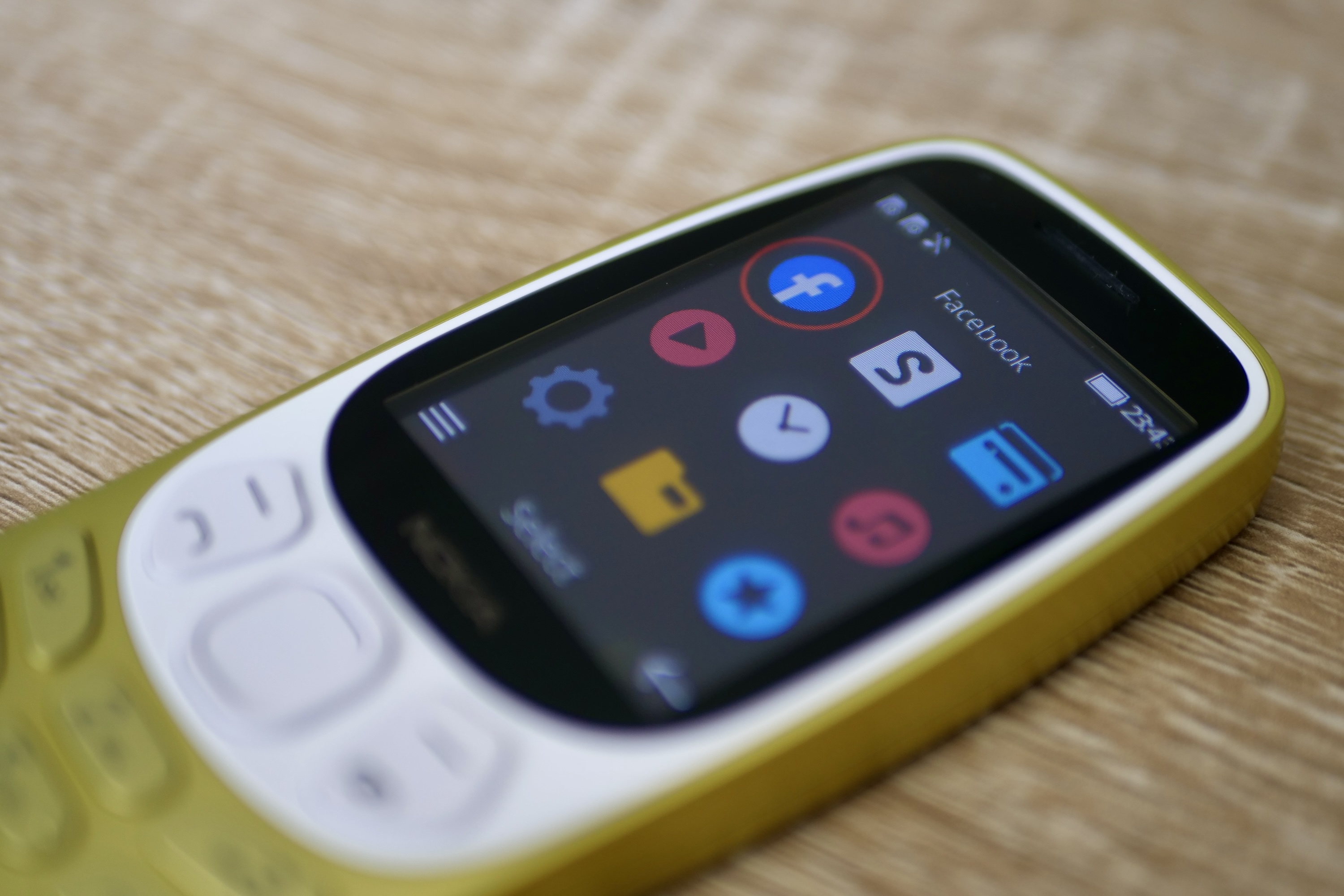
There’s no Wi-Fi, and despite it being 2024, the 4G signal where I live is pitiful, so it can struggle to connect even when I am sitting at home. There’s no way to put any apps on the Nokia 3210, and at the very least, I need WhatsApp as I live in the U.K., where it’s the law. Having no apps is apparently part of its supposed appeal, so it can ween you off social media without totally disconnecting. Very noble, but why, then, is a Facebook app pre-installed?
It’s a stupid decision, and it would have made the 3210 far more usable if that other Meta property, WhatsApp, had been pre-installed. I could truly avoid Facebook and social media yet still effectively communicate with my friends. The lack of Wi-Fi also means there’s no web browsing without using your network’s data, and because you won’t use the Nokia 3210 on a full smartphone contract with unlimited data (it’s pointless), this will get expensive quite quickly on a basic, pay-as-you-go contract.
HMD Global, the company that makes Nokia-branded devices today, will argue this is another “benefit” of the whole digital detox thing. But most of the stuff I search for using my phone isn’t frivolous, it’s information I need. If you’re the same, then the 3210 will quickly financially punish you for it. Not to worry, though, as the screen is woeful. The 2.46-inch LCD is colorful but practically impossible to see in sunlight and at any other angle apart from directly in front of you. Trying to look at a website will be the least of your problems.

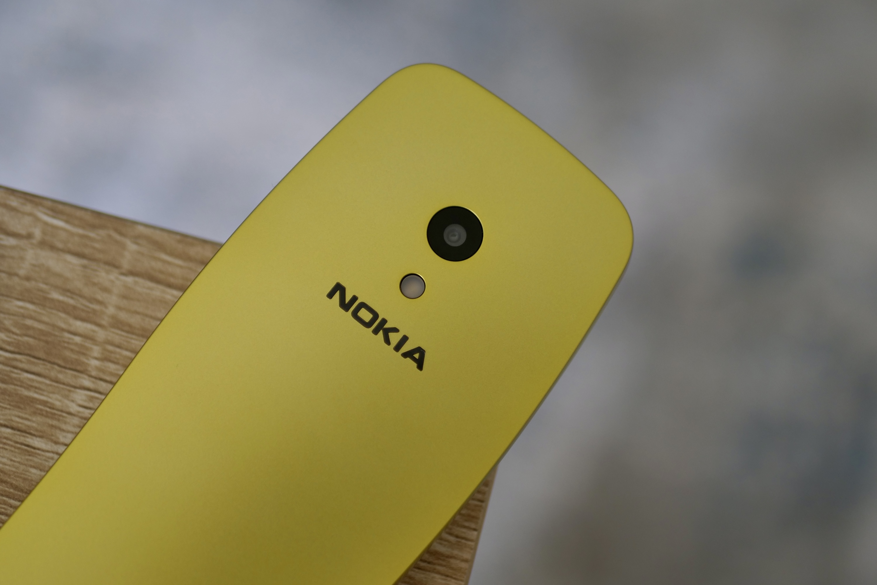
What else? There’s a dire 2-megapixel camera on the back, the wretched Snake game that’s as overused by Nokia as Mariah Carey’s All I Want for Christmas is You the second October comes around each year, and you have to learn to type using an alphanumeric keyboard again. No, it’s not nostalgic, it’s slow and annoying.
I don’t know who this is for

Why have I taken against the admittedly cute and well-designed Nokia 3210 so much? It’s because I don’t know who it’s for. I don’t buy the whole “digital detox” thing promoted by HMD Global, where the traumatized are apparently abandoning smartphones for feature phones.
Why do this? Why not just delete social media accounts and uninstall apps from a modern phone? It’s the same end result as the Nokia 3210 purports to offer, without the added inconvenience of not having Wi-Fi and no useful apps and features — from WhatsApp and Uber to mobile payments and navigation.
It’s not really for someone who doesn’t care about all this, either. An elderly person may just need calls and SMS, but the 3210’s tiny keypad isn’t made for anyone with poor dexterity, and why would you want to spend so much money on a phone that’s really only for emergencies? No, the Nokia 3210 is a nostalgia play, like those all-in-one game consoles you plug into the modern HDMI port on your modern television, get your retro gaming thrill, and then promptly forget about. HMD Global just won’t say it.

Approached like this, the Nokia 3210 becomes a conversation piece and is hard to dislike. A fun throwback to when mobile tech was in its infancy and social media didn’t exist, that should come out at parties where people who don’t care about tech today will reminisce about the one they had back in the good old days.
Well, this tired old tech cliche will quickly be consigned to the past if you actually try to use the Nokia 3210 as your phone in 2024. It’s a curio from days gone by that, at all other times, belongs in the drawer where you left the original in 2007 when the iPhone came out.


