Pantone has been at the top of the “color game” since the ’60s. If you don’t know the brand name, walk into any home improvement store and take a look at the paint color samples – you’re sure to find a Pantone swatch or two (or three … or 30) in the mix. But one photographer is seeing some use for the color experts beyond home redecoration. Paul Octavious has come up with a clever way to make use of 100 colored Pantone postcards
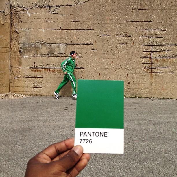
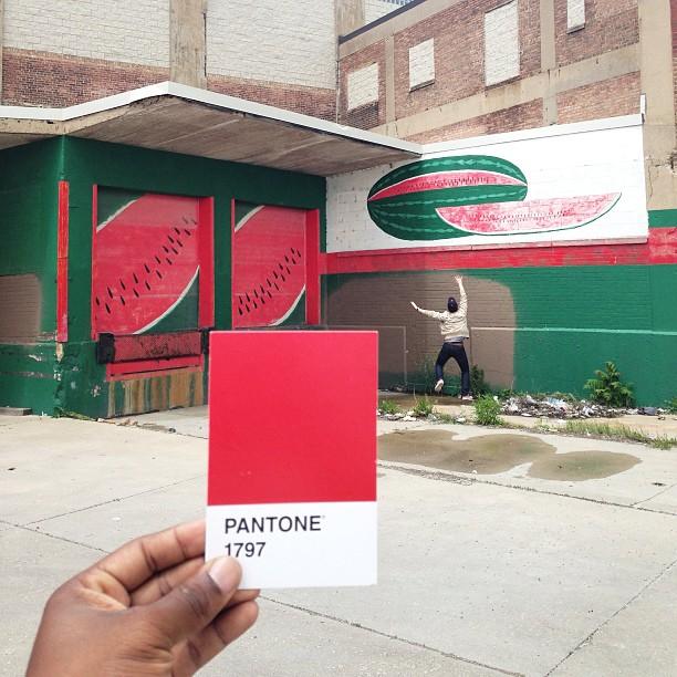
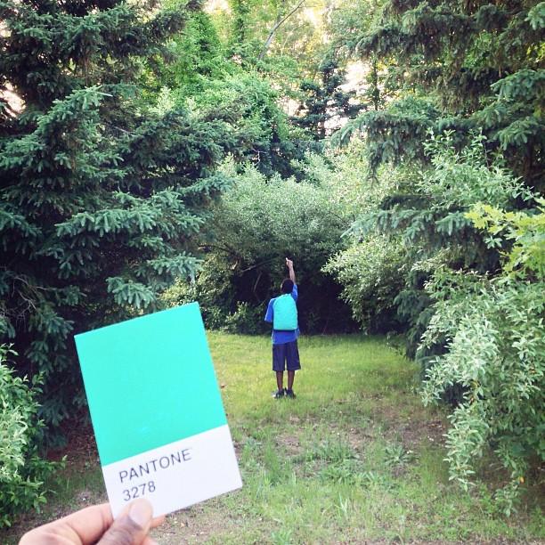
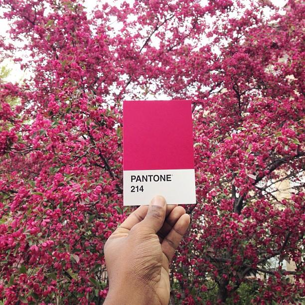
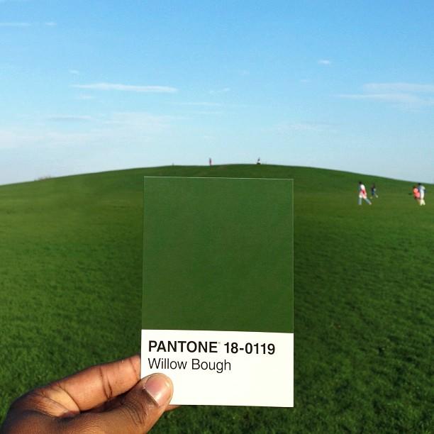
Octavious started #thepantoneproject on Instagram where he tries to find real life examples of Pantone shades. With Pantone sample cards in tote, Octavious scours his surroundings for each and every color within the brand’s palette. And then, naturally, he documents his findings on Instagram (with #nofilter, of course).
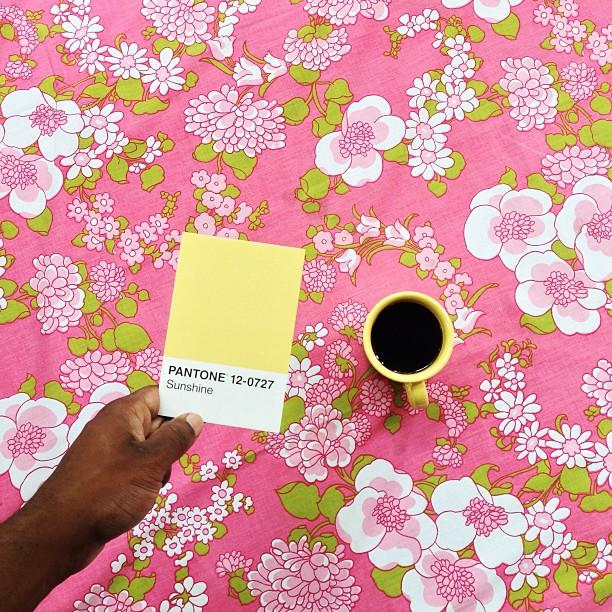
Yellows and oranges appear to have been the easiest for Octavious to match; in this case, their sources were found in Chicago. You might not realize it, but oranges and yellows are plentiful. Think of street cones, taxi cabs, and road signs.
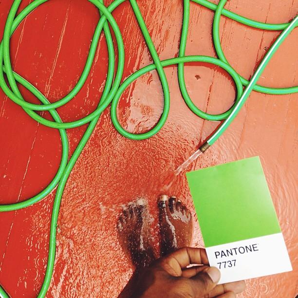
A color like Pantone 7737 (a green-ish color) doesn’t quite match with the garden hose he’s paired it up with. But it’s close.
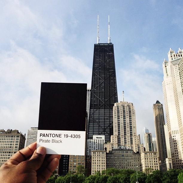
The same goes for an attempt to pair Pantone 19-4305 (a.k.a Pirate Black) with Chicago’s John Hancock Center.
“I know that it’s probably not Pirate Black, but it’s Pirate Black to me,” Octavious tells Wired.
He’s on the trek to cover all 100 colors on the card, but it’s looking a little slow as of late. His efforts have garnered him more than 400k followers – and some flattering fans who have picked up the idea for themselves.
This isn’t the first time a digital artist has used Pantone swatches as inspiration. For instance, we profiled French foodie blogger Emilie Griottes who created colorful desserts inspired by bright Pantone swatches.
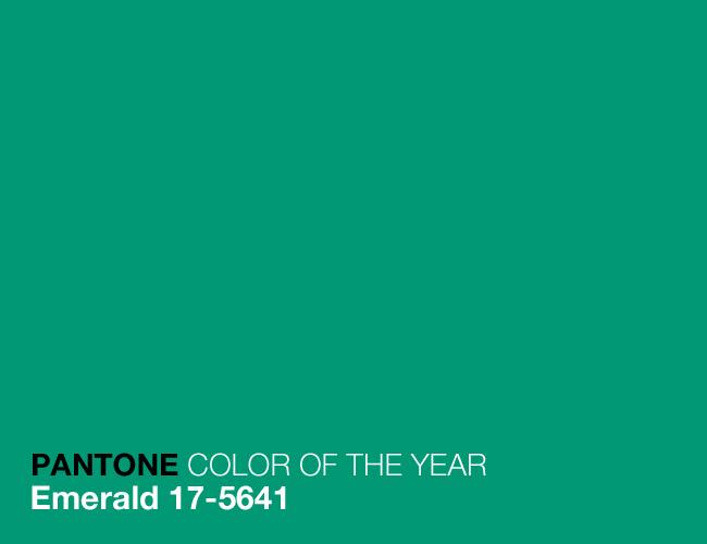
Curious about what Pantone itself is up to. Well the brand settled on 2013’s “Color of the Year” – Emerald. “Emerald” is Pantone 17-5641, and hopefully Octavious finds a beautiful, Instagrammed match for it soon.
Check out Octavious’ other photos here: