“Volkswagen addresses many of the pressing issues of the original system and adds an array of new functionality – some of which you’ll actually want to use.”
- Comprehensive feature set
- Fast, responsive hardware
- Aesthetics still lacking
- Interface remains somewhat convoluted
For the 2014 model year, Volkswagen introduced their Modular Infotainment Platform, known simply as MIB. Without putting too fine a point on it, we were less than thrilled. But less than two years later VW has returned with a response to the criticism, unveiling the new second generation of the MIB platform. The new system is bound for the vast majority of 2016 Volkswagen models, some of which are hitting showrooms this month.
Designed not only to address the issues that plagued the original iteration, but to also establish parity between Volkswagen and other industry leaders in the infotainment realm, MIB II’s mission is an ambitious one. But has VW been successful in that pursuit?
After just a few seconds of hands-on time with the system it’s obvious that Volkswagen has overhauled MIB extensively, not only from the perspective of the feature set and interface but from the hardware side as well. While it isn’t without flaw, it’s a massive step in the right direction, and to see an auto manufacturer work within a time table that more closely resembles a consumer electronics company is a refreshing change of pace from the typical, glacier-like progression of major infotainment updates.
Ease of use
Love it or hate it, Volkswagen chose to keep the touchscreen-surrounded-by-hard-buttons layout from the first generation system, though here its use seems much less frustrating. The first generation system often presented the user with a labyrinth of menus to contend with in order to find regularly used features. MIB II instead offers a main menu with a wider array of general options to drill down from, making the annoying task of diving into a section only to discover the feature you wanted lies elsewhere a less common occurrence.
Perhaps even more importantly, VW has upgraded the internal hardware too, yielding a system which is fast to react to inputs and responds to swipe and pinch-to-zoom gestures in a way which doesn’t make the whole process feel like a poorly-executed gimmick. That’s high praise considering my typical altercations with in-car infotainment systems that attempt to incorporate those elements.
Those beefed up internals are an especially welcome update when you consider just how much new functionality VW has crammed into MIB II, though it does come at the cost of interface simplicity. Newcomers may still find the learning curve of the new system steeper than they’d prefer, especially considering how many of MIB II’s features are essentially rendered superfluous if you’re able to take advantage of the mobile connectivity options included in Volkswagen App-Connect.
Features
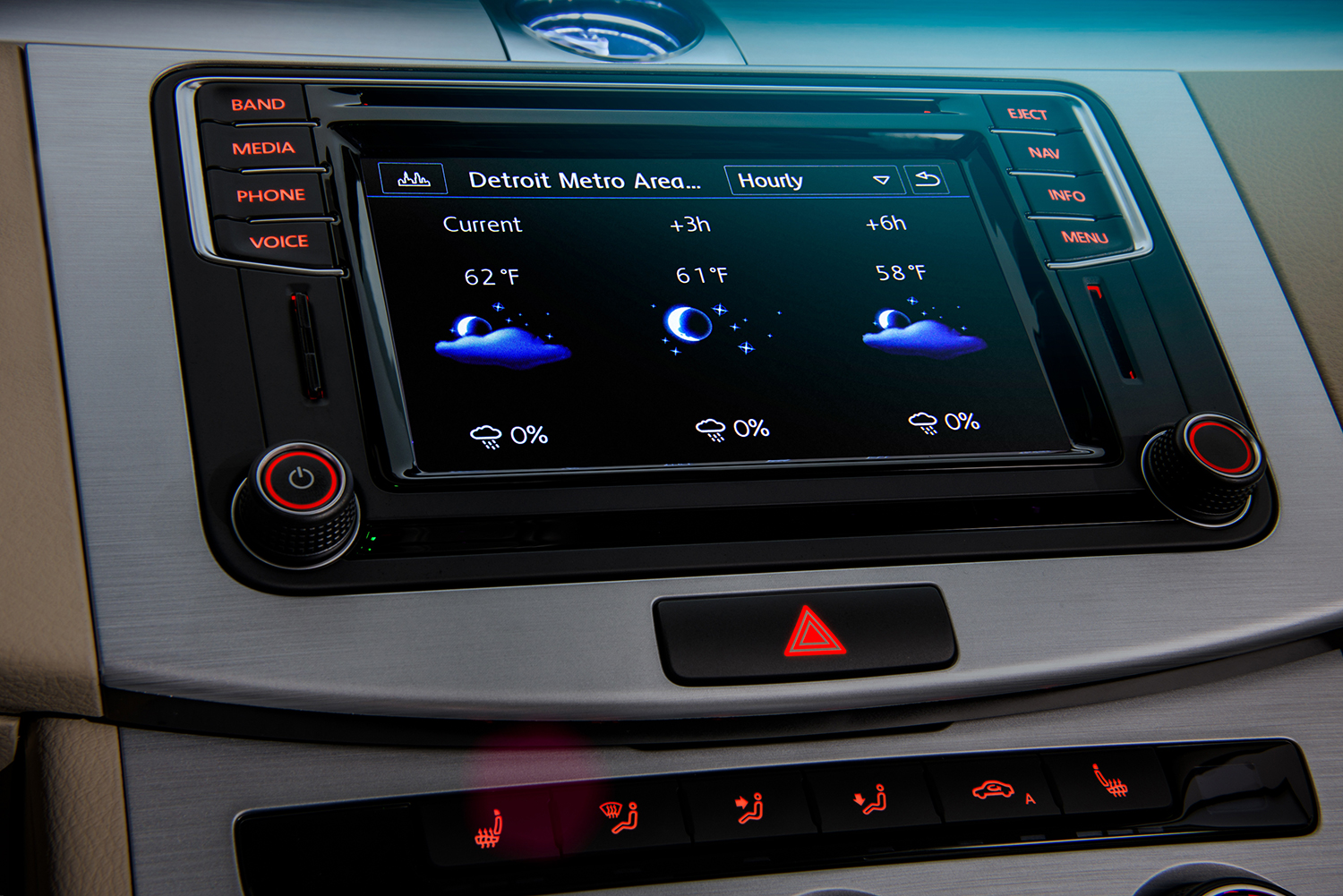
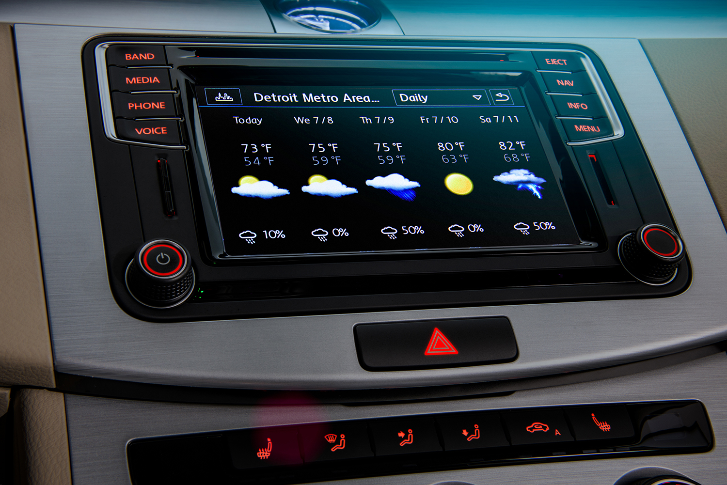
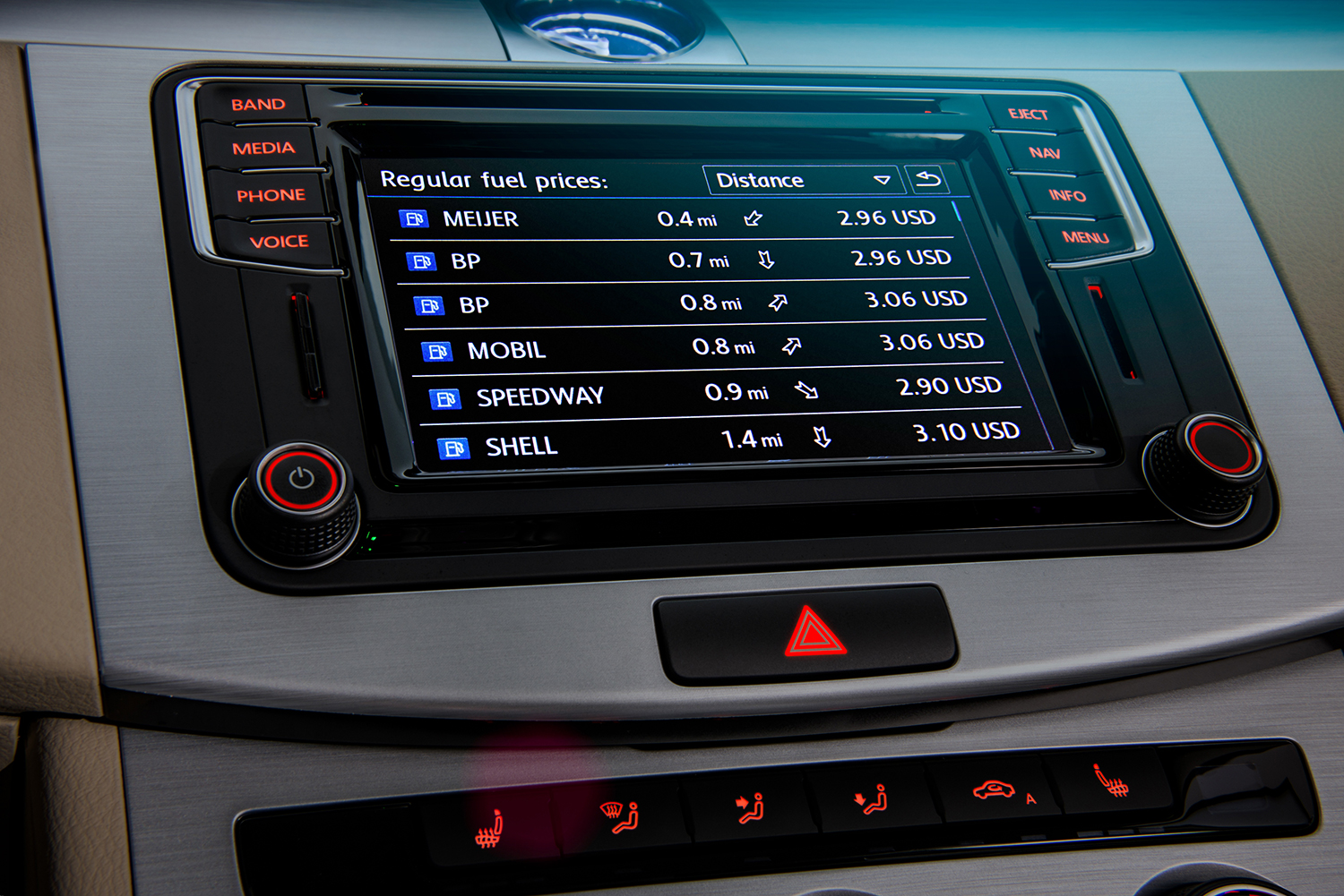
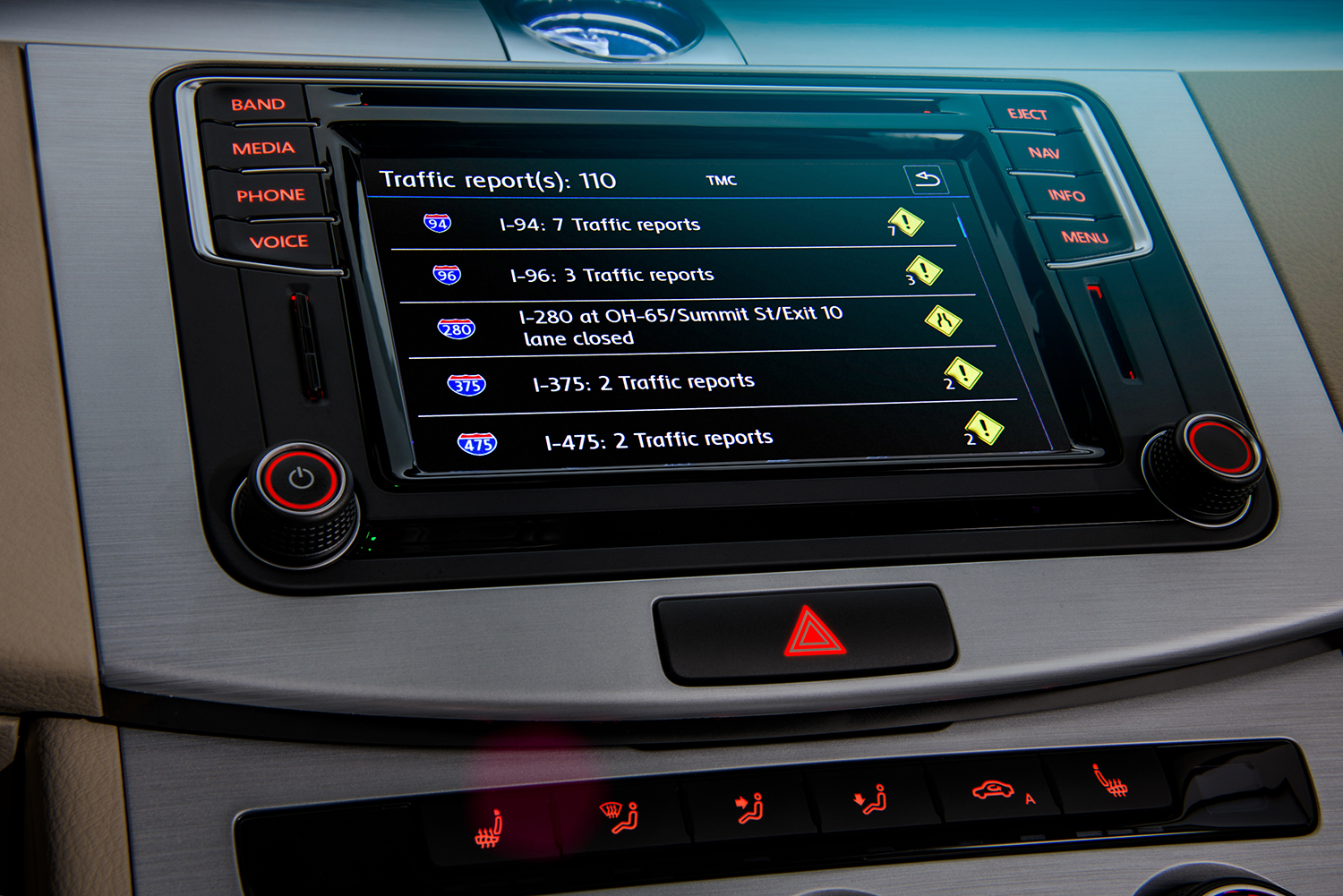
While not much has changed of MIB II’s standard functionality in terms of Bluetooth connectivity, navigation, satellite radio and so on, VW has vastly expanded their Car-Net connected services system, and with it comes an array of new features.
Car-Net was formerly a subscription-only affair, offering services like stolen vehicle tracking, automatic crash notifications to first responders and roadside assistance, much like GM’s OnStar system. But with MIB II, Car-Net now, somewhat confusingly, also incorporates non-subscription based features together under one umbrella.
Newcomers may still find the learning curve of the new system steeper than they’d prefer.
It’s an important distinction to make because along with app integration that allows you to do clever parlor tricks like honk the horn remotely and send destination data to the vehicle’s navigation system from your mobile device, Car-Net now also includes support for Apple CarPlay, Android Auto and MirrorLink platforms. Crucially, connecting your mobile device to these platforms is not part of the subscription service.
This is particularly welcome news due to the fact that nearly all of MIB II’s external functionality is rendered useless if you’re using one of the above interfaces to connect your smartphone up to the system.
Considering the fact that the computational heavy lifting is being performed by your mobile device rather than the infotainment system itself, the internal features (and performance, to some degree) of MIB II largely become a moot point since the media player, phone access and navigation functionality are coming directly from the device itself, and the MIB II system is essentially functioning as a larger and more conveniently located interface to interact with it.
For Apple users that means (somewhat unfortunately) that you’ll be using Apple Maps – Google Maps hasn’t been given the green light by Cupertino yet – but even Apple’s maligned navigation app is still light years ahead of typical onboard navigation systems, including Volkswagen’s.
Android users may have it even better, with Android Auto leveraging not only Google’s own mapping software but the company’s somewhat frightening ability to contextually suggest destination points and other applicable data based on text messages (addresses sent to you by SMS, for instance) and previous searches performed on that device or other devices that account has been used on.
Incoming text messages are read aloud rather than being displayed on-screen, and after seeing both Apple and Google’s interfaces in action, both do the job of interpreting voice commands the first time out with far more consistency than any OEM infotainment system I’ve ever used, making the task of dictating SMS replies back to the system a fairly effortless affair.
Hardware
Although MIB II offers a wealth of new functionality over the first generation system, it’s the upgrades to the system’s hardware that are the most obvious and welcome. Whereas the old system labored along with annoying clunkiness and unacceptable load times between functions, MIB II has remedied those ailments with a much faster processor.
Particularly in the context of automobiles, the size of a system’s touchscreen display is intrinsically tied to its usability. It appears VW has realized this too, though their solution to the problem will likely still leave some users less than satisfied.
For 2016 Volkswagen will offer MIB II with a choice of different head units which feature touchscreens ranging from the 5-inch Composition Color model found on base trim VWs to the 6.3-inch, 800×480 capacitive display with proximity sensor found on the Composition Media and Discover Media models (the latter includes enhanced navigation functions). These two will also feature the full suite of App-Connect functions and the Composition Color will not, so if you’re hoping for CarPlay on a base trim Golf, I’m afraid you’re out of luck.
The top tier model is the Discover Pro, which sports an 8.0-inch touchscreen, a 10GB internal hard drive and other additional features, but it will only be offered on the e-Golf SEL Premium model for 2016.
Graphics
Despite the fact that Volkswagen saw fit to give the hardware and feature set a major overhaul, they chose to leave the graphics more or less untouched. It’s certainly not the crudest interface around in terms of appearance, but it looks conspicuously dated now, giving you further incentive to just switch over to the App-Connect functions whenever possible.

While fairly easy to read, the MIB II’s menu systems are rife with the same lifeless fonts and stark color palette found in the first generation system. There’s some overall inconsistency too. The main menu, for instance, uses large, modern looking up icons replete with gradient fanciness while most of the sub menus look a decade old.
In general it makes the MIB II feel like different generations of software cobbled together rather than one cohesive package. Considering the work they put into upgrading the user experience on a foundational level, it’s a bit of a shame to see that a new coat of paint for the system’s aesthetics wasn’t a higher priority.
Conclusion
While it doesn’t cure all of the ailments presented by the first generation system, MIB II does address quite a few of them. The new hardware, in particular, goes a long way in making VW’s interface more pleasant to work with, and the inclusion of the advanced, genuinely useful new elements now included within Car-Net allows Volkswagen to provide functionality that many other automakers simply cannot offer as of yet.
Even if Apple CarPlay, Android Auto and MirrorLink are not features you’re particularly concerned with, the MIB II’s swath of new connected services now on tap as well as the improvements made to the overall user experience make this a big step forward for the platform.
Highs
- Comprehensive feature set
- Fast, responsive hardware
Lows
- Aesthetics still lacking
- Interface remains somewhat convoluted


