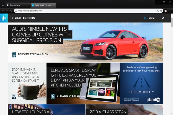
Although Google’s Material Design user interface recently popped in the Chrome Canary channel, you can actually enable part of this interface in Chrome 68 for the desktop and Apple iOS devices. This is done by enabling the setting using the “flags” command in the address bar.
For desktop, do the following:
- Type chrome://flags/#top-chrome-md into the address bar.
- Next to “UI Layout for the browser’s top chrome,” switch from Default to Refresh.
- Restart Chrome.
Although Google lists MacOS, Windows, Linux, and Chrome OS as supporting platforms for this new interface, this change didn’t work for us in the MacOS version but clearly changed the interface for the Windows 10 build, pictured above. We didn’t test the Linux and Chrome OS versions.
What you’ll see with Google’s new design are straighter tabs with slightly rounded edges. The address bar also took a redesign hit with cleaner, rounded edges. Your icon, if logged into Google, now appears just to the right of the address bar and to the left of the three-dot Settings button.

Next, for iOS devices, do the following:
- Type chrome://flags/#top-chrome-md into the address bar.
- Under the “UI Refresh Phase 1” section, select Enabled.
- Restart Chrome.
Here you’ll see a bigger difference in the visual presentation. Prior to Material Design, the top toolbar consisted of Back and Forward buttons, the address bar, the squared tabs icon, and the three-dot settings icon. As you scrolled down the page this toolbar disappeared. Pull down on the page and you could add, refresh and close the current tab.
With Material Design enabled, a rounded address bar remains at the top of the browser but reduces to small text as you scroll down the page. At the bottom of the browser, you’ll find a toolbar playing host to the Back and Forward buttons, a search icon, the tabs icon, and the three-button settings icon. This toolbar will also disappear when you scroll down the page.
But that layout is for using the iOS device vertically. As shown above, when holding the iPad or iPhone horizontally, the toolbar and address bar merge to create one long strip along the top of the browser that shrinks into small text when you scroll down the page. Hold down on the page to add, refresh, or close a tab as usual.
In addition to adding the secret Material Design interface, Chrome 68 marks a change in how Google labels HTTP-based pages. Previously, Chrome merely provided an “I” icon next to the address to indicate a nonsecure connection. Chrome 68 adds “Not secure” next to that icon.
“Chrome’s ‘not secure’ warning helps you understand when the connection to the site you’re on isn’t secure and, at the same time, motivates the site’s owner to improve the security of their site,” Google says.
Websites with “HTTPS” before their address means your connection to that site is encrypted. Sites with a vanilla HTTP address do not provide a secure connection, hence the browser’s warning. According to Google, 83 out of the top 100 sites use HTTPS connectivity by default.


