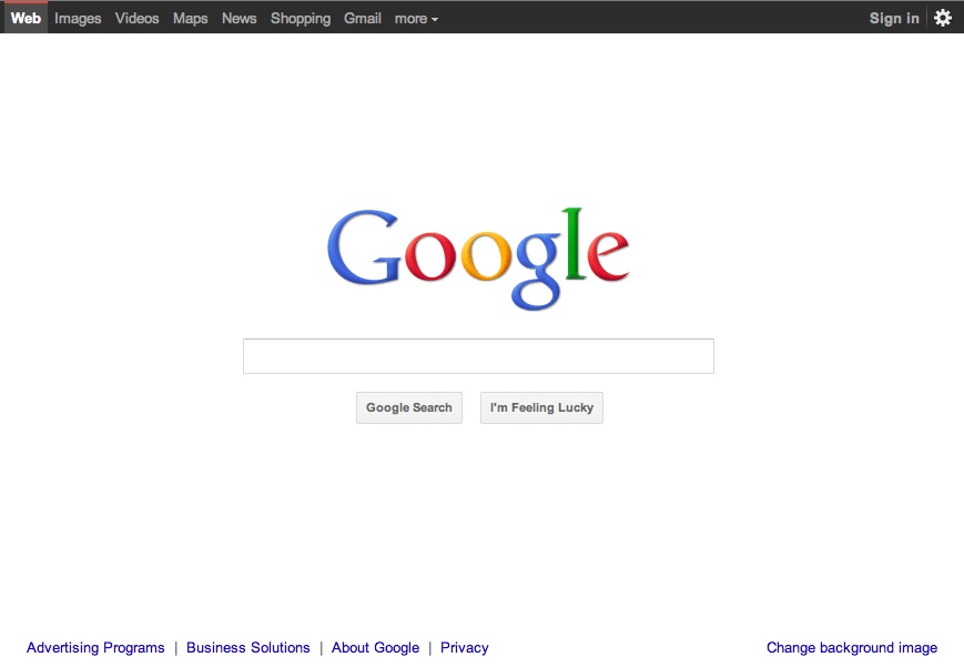
Google is getting ready for the big dance. Earlier today, the search giant publicly unveiled Google +, it’s own take on the social network. A direct competitor to Facebook, the new project is expansive and involves the cooperation of dozens of different Google products. To make room for the new social experience, the company is cleaning house and redecorating its services. Many users may have already begun to notice changes, like a black bar on top of the Google search page.
Detailing some of the changes in a blog post, Google says it is attempting to create a more seamless, connected experience throughout its many pages and products. The key words it is using to explain this new design philosophy are “focus, elasticity, and effortlessness.”
- Focus: Google’s pages will get small and large tweaks to bring forward the things that matter most when you need them.
- Elasticity: Web pages and apps across a myriad of devices are being designed (and retrofitted) to provide a more seamless and consistent experience.
- Effortlessness: Everything needs to be focused around simplicity for the user (you).
While we’d argue that Effortlessness and Focus are actually a bit redundant as Google explains them, we’re excited to see Google putting any emphasis on design. We expect that many of Google’s new Web services will look more like the recently launched Android Market webstore and Google Music. We also expect those blue links in search results to lose their underline soon. Gmail, Maps, and almost all sections will get some kind of makeover.


