Of all the changes to the Mac coming this year, the hype has been, justifiably, all about Apple Intelligence. But another feature really caught my eye, and in my time testing it in the macOS Sequoia public beta, it’s gotten me pretty excited about its potential.
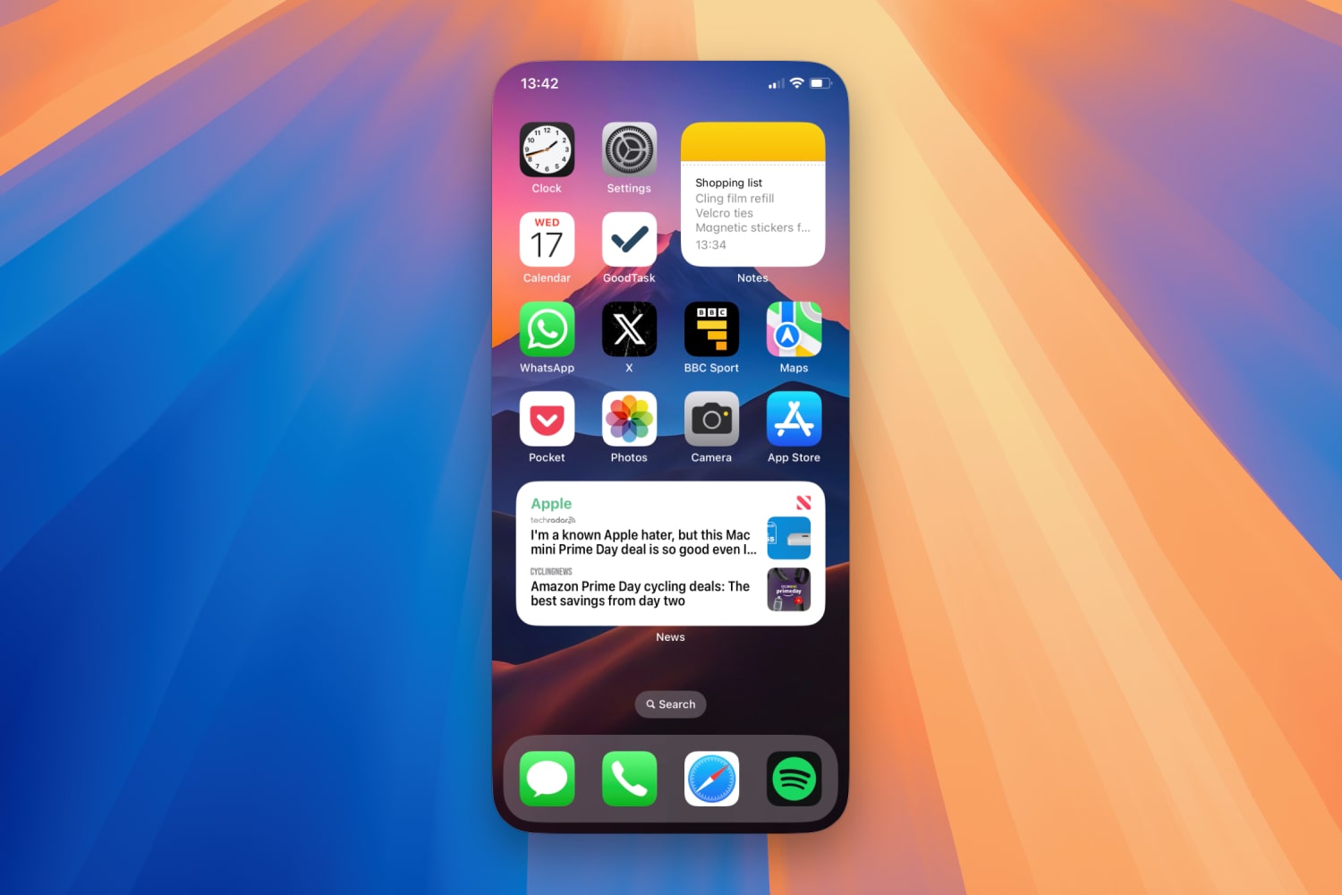
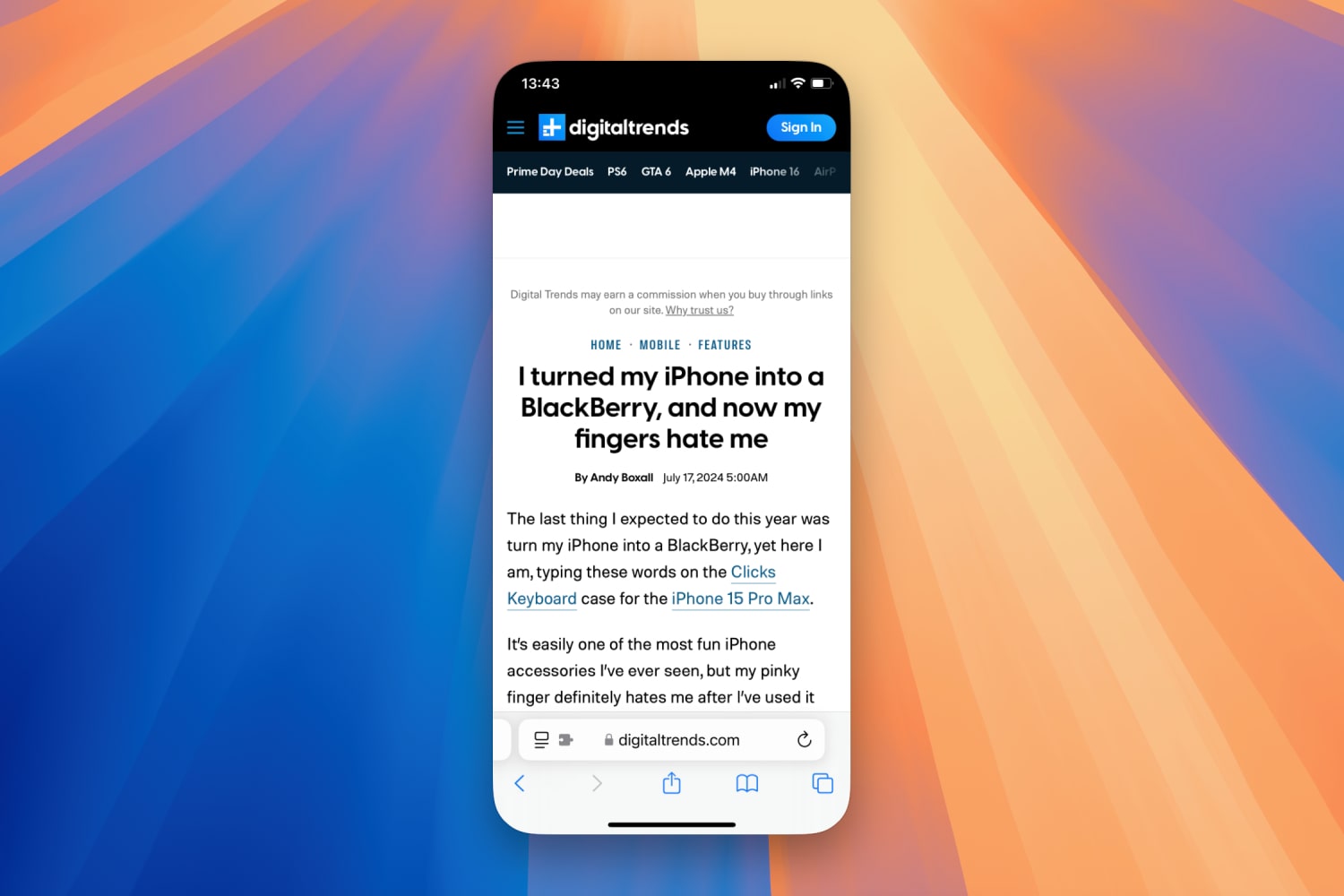
That feature is iPhone Mirroring, which puts a mockup of your iPhone on your Mac’s desktop, letting you interact with it as if it were right there in your hands. It’s a really neat new trick and one that adds a heap of cross-compatibility between my Apple devices.
Yet it’s not just iPhone Mirroring’s abilities that have me singing its praises — it’s also the absolutely shocking state of Microsoft’s equivalent on Windows. Called Phone Link, this app is so embarrassingly bad that it makes iPhone Mirroring — even in its unfinished state — look like the app of the year in comparison. Given I split my time between Windows and macOS, I wanted to see how these apps stack up against each other — and the results were not pretty.
The Phone Link disaster

Right from when you first open the iPhone Mirroring app in the macOS Sequoia beta, the experience is a pretty good one. Up pops a mockup of your iPhone on your Mac’s desktop, with everything exactly as you’d expect it. App icons are in the right place, your wallpaper is the same, and all your settings are intact.
Phone Link in Windows, though, is very different. Instead of depicting your phone on the screen, it’s much more of a traditional app. On the left you’ll see your most recent notifications, with your phone’s status in the top-left corner. In the middle you’ll see … well, that’s the thing. My Phone Link experience was so poor that whatever the app intends to show in the middle section simply didn’t appear. Phone Link was adamant that my iPhone was not paired, even though it was displaying my recent notifications on the left. That gives you a flavor of how subpar Phone Link is.
Taking different approaches to displaying paired devices is fine, but that’s not my problem with Phone Link. Instead, pretty much every aspect of the Phone Link experience is a total nightmare. After attempting to pair my iPhone using a QR code, the Link to Windows iOS app said the process was complete. Phone Link on Windows, though, just endlessly showed a spinning loading icon, with no progress in sight. Restart the app and it says my phone is paired but it needs Bluetooth permissions, even though everything Phone Link asks for has been granted.
And so I’m left with a buggy, half-connected app that is basically useless except for showing my notifications. Microsoft already has a reputation for shockingly bad software (having used Windows for over 20 years, I can attest to that), and Phone Link is doing nothing to dispel that notion.
Apple gets it right

Things couldn’t be more different when it comes to Apple’s iPhone Mirroring app. There’s no need to scan a QR code or dive deep into your device’s settings. Just ensure your iPhone and your Mac are running iOS 18 and macOS Sequoia respectively, are signed in to the same Apple Account (with two-factor authentication enabled), and have Bluetooth and Wi-Fi switched on. Aside from the operating system requirement, you’ll probably have all that set up anyway.
Apple’s iPhone Mirroring app immediately starts on the front foot because it feels so much more intuitive than Phone Link. Aside from not requiring any fiddly pairing steps, the fact that it shows your mocked-up iPhone exactly as it is in reality means you instinctively know how to use it and where to find everything. No rummaging around in menus and tweaking settings here.
You can swipe through apps and screens using your mouse or a trackpad, then type directly into apps using your keyboard. Your iPhone notifications appear on your Mac just like macOS alerts (with sounds playing through your Mac speakers, not those of your iPhone), and you can move the iPhone mockup around your screen however you want.
Don’t get me wrong here, iPhone Mirroring is not perfect. I had a lot of trouble with scrolling, as sometimes it just wouldn’t work at all (especially vertical scrolling using a wireless mouse), while my favorite iPhone Mirroring feature — dragging and dropping files from one device to another — is totally absent at the moment. Annoyingly, you also can’t resize the iPhone preview. And sure, the Phone Link experience is probably better with an Android device than with an iPhone.
But I can’t cut Microsoft too much slack because the experience is already so terrible compared to iPhone Mirroring. Even in its earliest beta condition, iPhone Mirroring is already leagues ahead of Phone Link in terms of design, functionality and reliability, and that gap is only going to widen as Apple updates its beta software.
It’s left me wishing for something much better on Windows but, given how slipshod Phone Link has been for years, I’m not exactly getting my hopes up.


