The showdown between the Hisense U8K and the TCL QM8 is long overdue. This turns out to be one heck of a comparison, because these two TVs are both very, very good, especially considering their highly attractive price points. I think it’s fair to say that these TVs are setting the standard for what’s to be expected when it comes to performance for the price. The fact that these TVs do what they do at their price points means that TVs costing more need to offer some pretty significant upgrades to justify their higher prices. That makes them a driving force in the market, and kind of a big deal.
Video
The race between these two TVs is pretty tight. I mean, they are neck and neck in so many ways that I can tell you right now which one you’ll prefer is probably going to come down to one, maybe two little considerations. It’s almost a toss-up. But, I know folks latch on to very specific issues that they find meaningful, so hopefully, I can help you figure out which one of these two TVs you would prefer to buy in this comparison.
Hardware
Stands
Starting with the stands. The Hisense U8K has two feet that you can position at two different heights, and you can set them in toward the middle for a narrower stance that works with smaller media stands, or go for the wide look for more stability and to accommodate longer soundbars.

The TCL QM8 has a pedestal-style stand, and it also offers two different height settings for accommodating a soundbar, though it is worth pointing out that the soundbar will be kind of high-centered on the pedestal.
I mention soundbars because I think a lot of folks will want sound that’s as good as the picture, but unlike many TVs today, these both have better-than-average onboard audio, which I’ll discuss in a moment.

Both TVs are attractive enough, but the TCL is about half as thick, and I also like that its logo isn’t shiny, so if I had to pick a winner on aesthetic, I’d go with TCL in this case.
Inputs
Both TVs have four HDMI inputs. On the Hisense, two inputs are labeled 4K 144Hz, indicating those two are HDMI 2.1-compliant, however, note that one of those 4K 144Hz ports is the eARC port. The TCL has one port marked
- 1. Hisense Remote
- 2. TCL Remote
The TCL remote is slimmer and longer and sits flat on a surface; the Hisense remote is shorter, wider, and wobbles on the table a bit. Not sure if you care, but thought that was worth pointing out. Drop a comment now if remote wobble rubs you the wrong way.
Both of these remotes are backlit, but the TCL remote backlight is usefully brighter, and it’s motion activated, so when you pick it up, it lights up. The Hisense remote dims a couple of seconds after your last button press and doesn’t light up until you press a button, so for me, that’s not especially helpful. I prefer the TCL remote, even if it is a bit larger.
Software
UI
Power the TVs on and you’re going to be greeted by the Google TV interface. There are no Roku versions of these TVs at this time, and I have my doubts there ever will be. I’ve spent a good amount of time clicking through these menus, and they both behave the same: They’re equally snappy and responsive and app loading times are about the same for each.

There are meaningful differences in performance, but the menus are broken down a bit differently, and as I’m always having to get into the menus, I’ve noticed that I tend to prefer how TCL has chosen to lay things out. I don’t think this is a meaningful difference for most people, though.
Supported tech
Let’s talk about support. These TVs offer so many features that it is impossible to list them all, but I’ll run through those I think are most important. Both offer HDR 10, HDR 10 plus, Dolby Vision (2745441), and HLG support. The Hisense packs an ATSC 3.0 tuner (1308536) in it, and the TCL does not, though so far, I don’t consider so-called NextGEN OTA broadcast support a bonus for most folks, and by the time ATSC 3.0 does offer something cool, it might be time for a new TV. That said, the Hisense has it and the TCL doesn’t, so props to Hisense.
Sound
As for sound quality, I first want to say that I appreciate that both Hisense and TCL put some effort into the onboard sound systems for these TVs. They both have big bass transducers on the back to help add fullness and richness to the sound, so it isn’t just a piercing, nasal mess. But the Hisense U8K sounds significantly better than the TCL QM8. The U8K has a better balanced sound signature, whereas the TCL tries to woo you with overly crispy treble and that big bass, but not enough in-between – the midrange is seriously lacking in comparison to the Hisense here. The QM8 sounds better than a lot of TVs, but this is a head-to-head, and the U8K handily takes the audio win.
- 1. Hisense U8K
- 2. TCL QM8
Picture quality
Brightness and black levels
Performing this side-by-side comparison was fun and revealing to me as a TV reviewer, and I’m very excited to share it with you. But I also need to remind everyone that many of the minute differences in picture quality that I’m going to point out could never be registered unless the TVs were side by side. If I were to put you in a room with one TV and let you watch a 5-minute clip on repeat and let you take notes for a full hour, then put you in another room with the other TV and asked you to do the same, I’m willing to bet money that you would not catch about 80% of what I found in this side-by-side comparison.
Some of this stuff, we’ll want to take with some skepticism, but there are a few elements here that I think make a meaningful impact on the daily TV-watching experience, so I’ll be sure to call those out.

I’ll take you through the experience I had, which started on the Google TV home screen. With the TCL in its movie mode and brightness set to 49, and the Hisense in its Filmmaker Mode ( I found this to be true in Theater Day and Theater Night as well), I noticed the black background on some of the slides was much blacker on the TCL QM8 than it was on Hisense U8K. This was consistent across multiple backgrounds. Also, I noticed that even with the brightness juiced up on the Hisense, the white tiles for Netflix and YouTube look brighter and whiter on the TCL.
Thinking this might just be a difference in how the TV handles the interface, I went into Netflix, and I noticed more of the same. It’s as if the black areas are made dark gray, even though the Hisense is very capable of dimming these areas down to black. Everything seems raised a bit, even though the picture doesn’t have the same brightness punch, which is interesting.
Keeping that in mind, I loaded up one of my favorite clips to use for evaluation, and the Hisense background was more dark gray, while the TCL’s was more black. Pulling up a YouTube clip in 8K HDR Dolby Vision – which not presented in

About 18 seconds in, the creator starts slowly illuminating the scene. What I noticed was the TCL started showing the signs of gold foil on a champagne bottle taking shape, but it was not to be seen on the Hisense. And I didn’t see it on the Hisense for almost a second after it emerged on the TCL, even though the timecodes were the same.
This surprised me because, based on the raised picture level I saw on those smart TV screens earlier, I figured the Hisense might show the bottle first. There were excellent blacks and no blooming as the backlight system needed to activate, yet I didn’t see the lowlight object. On the TCL, we got great blacks, and no blooming as the local dimming system kicked on those mini-LED backlights, but I could see the outline of the bottle on the screen.
Then as I proceeded to full brightness of the scene, the TCL was clearly a bit brighter than the U8K. And remember, this is HDR content, so the brightness and contrast are maxed and it’s really about how the TV’s processor decides it’s going to present the image. And the TCL QM8 is punching a little harder.
Is that a good thing? That’s up to you and what you want. The reason the TCL appears brighter and shows lowlight objects when the Hisense does not is because the TCL tracks high on the EOTF (electro-optical transfer function) curve — in other words, it generally overbrightens images relative to the instructions it is given by the content. I’m not going to weigh this as a win or loss for either TV. It just is.
Processing
But the same scene also shows where the QM8’s processing falls a bit short of the U8K’s. When examining the background of the scene where the light is cast against the backdrop, it at first looks like the light pool takes up a larger overall area on the QM8 than it does on the U8K. But look a bit closer and what you’ll notice is that what’s happening is the U8K is doing a better job with gradation. The transition from light to dark is smoother, with less banding and stair-stepping on the U8K than on the TCL QM8, where there’s a hotspot of brightness here, then some mid-shaded area, another big step down, and then it just dumps to black.

The transitions on the QM8 from light to dark are not nearly as smooth as they are on the U8K. This is where the U8K wins ,and this is an important win because when we talk about cleaning up low-bit depth content like the kind we get from some streaming services – especially live TV streaming – as well as some cable and satellite channels, you’ll want that that cleanup effort the U8K is bringing to the table.

In sample after sample, the U8K offered smoother gradations, but tracked a touch dimmer than the QM8 across the board. You can see that in how much dimmer the flower in the scene above is at 3:35 before the light intensifies, and then again after it dims down. At 3:55, there’s more of the same, with smoother gradation on the Hisense U8K than the TCL QM8. Get the idea?
Let’s move on to something else. And I’m afraid I have to pull out the old Spears and Munsil benchmark disc for this. I know, I know, we’ve seen it a million times, but it’s a known quantity, right? So we can really dig into a couple of scenes and pick apart the differences.
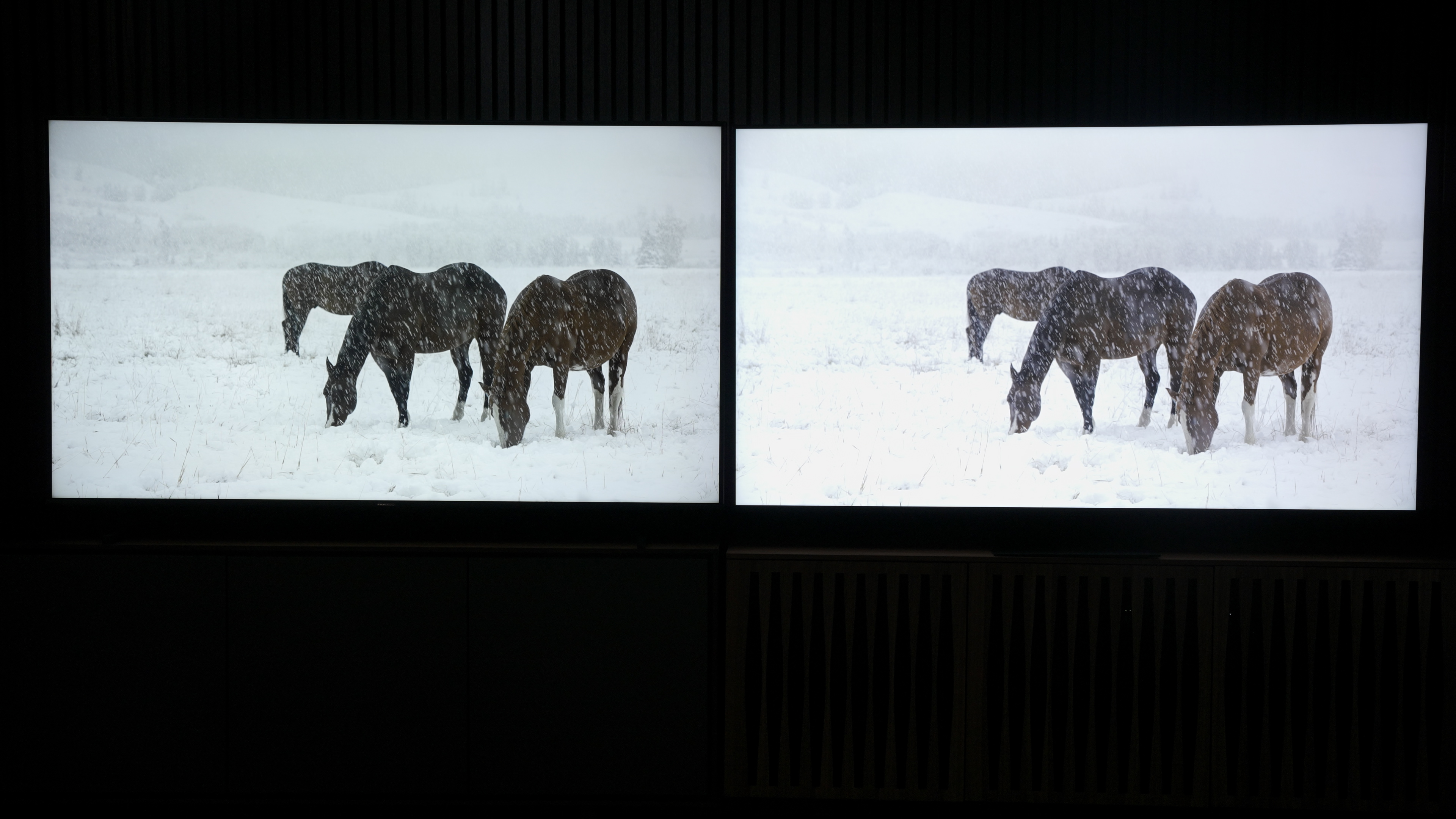
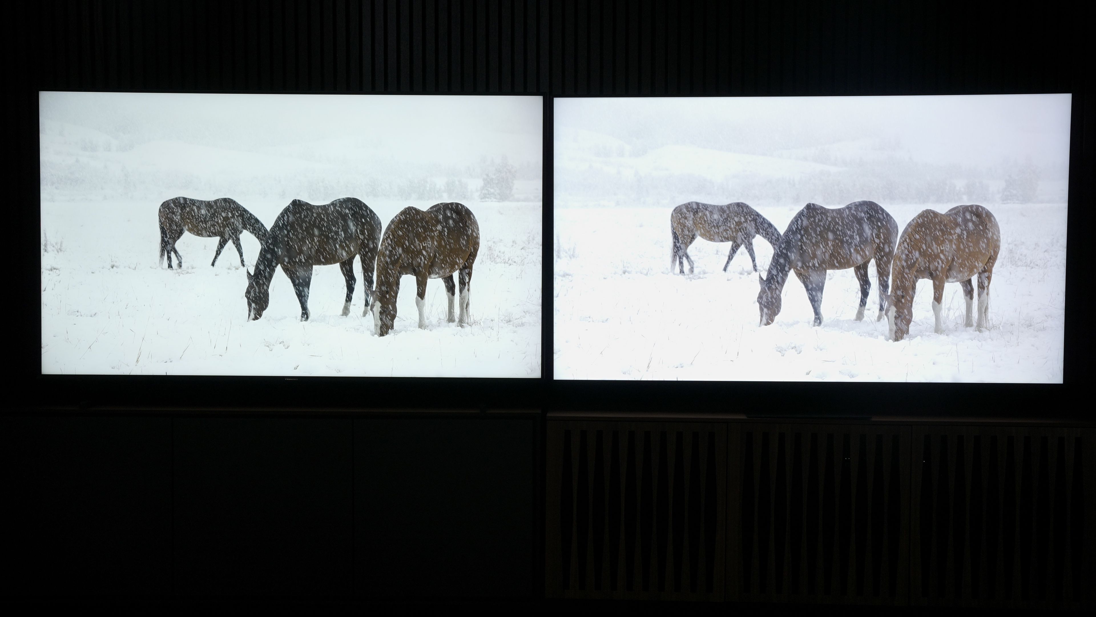
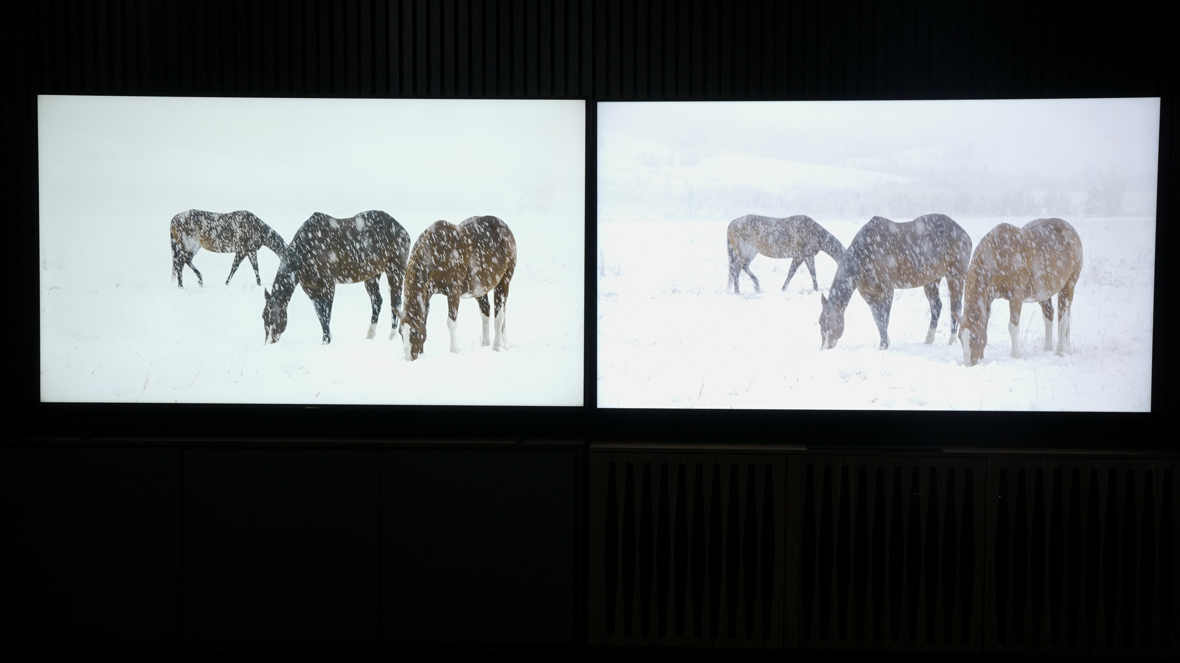
Obviously, I’m going straight for the horses in the snowy field. Now this is content mastered to 1,000 nits, so well within the capability of both TVs, and they can decide how to spend their brightness headroom – let’s see what they do. They both do just fine, but the TCL has higher average brightness again.
Bumping up to 2,000 nits, again they both do fine. The TCL is maybe retaining a little more of the trees in the background, but both TVs are doing well with this content overall. Now, I don’t have a 4,000-nit setting here, but I suspect that the Hisense U8K could end up clipping a little hard and taking some of the background detail out in an ultrabright scene like this because, when we jump to 10,000 nits, we can see it do that. However, I refuse to fault the U8K with anything since nobody will ever be throwing 10,000-nit content at this TV, and in fact, the number of times it sees 4,000-nit content will be slim to zero. So, for all the content we get on a daily basis, both TVs handle it well, but the TCL is brighter on average. And so far, I’ve enjoyed that, but there are some instances in which it is not necessarily a pure blessing.

Let’s look at these scenes from the Spears and Munsil disc. Watch what happens when I pause just as the sun reflecting off the right-most mountain peak reaches its … well, peak in the TCL image. Look, it’s blown out compared to the Hisense. It only lasts a second, but we can see more of it if we look for it. Here, the picture on the whole is brighter on the QM8, but look at the top of the mountain, where you can see better contrast on the Hisense U8K than you can on the TCL QM8 – there are more of the dark lines.

You can see a little of this in bright colors, too. Here, the top of this cactus flower looks just a little overblown on the QM8, whereas the color is deeper and the texture is more apparent on the Hisense u8K.

Finally, here, on the Ferris wheel, there is clearly more detail of the lights in the center on the Hisense U8K than on the TCL QM8.
As for motion resolution, resolution upscaling, and game mode picture quality, it’s pretty much a dead heat. So, where does that leave us?
Verdict
Well, from an everyday use standpoint, I tend to prefer the TCL. I like the remote better, I like the layout of the menu better, and I think I’m just going to enjoy interacting with this TV more.
From a sound quality perspective, the Hisense is better, though you could remove sound quality from your decision by getting a decent soundbar.
There are aspects of each TV that I want. I wish one TV did them all.
From a picture quality perspective, the Hisense does a better job with color gradation from lower-quality sources, which I think is worth weighing fairly heavily. But then there’s the overall brightness and low-luminance picture performance, where the TCL tends to stand out. The QM8 is just a brighter TV. So, if you need a lot of punch, the TCL is the better pick. And if you watch a lot of really dark content, the TCL could be a better choice for general visibility, while the Hisense tends to have less noise and macroblocking with the lowlight images it does show you.
So, for me? This is a very tough call. There are aspects of each TV that I want. I wish one TV did them all. But, if I had to choose, right now, I’m probably going to choose the TCL if I’m pressured, but I would be very pleased to own the U8K as well. Folks, it’s that close.
Now, as if this decision wasn’t hard enough, there’s the Sony X90L out there, too. And if that TV was in this mix here? It would be an even tougher decision. But … I would probably pick the Sony if this was a three-way competition. Again, that’s a very personal decision, and which TV you think is the winner comes down to your priorities. Hopefully, I’ve helped arm you with enough knowledge to make a decision. It’s going to be a tough one, as both of these TVs offer outstanding performance for the price. Perhaps the best news coming out of this comparison is that, no matter which TV you get, I think you’re going to be pretty happy.


