Drawing apps are a dime a dozen, and while some are as complex as Photoshop and Illustrator, others are much more simple. However, each one has its own place in digital artists’ lives. Recently, stylus maker Adonit entered the fray with Forge, its first drawing app.
We talked to one of the app’s creators and an animator who’s been using the app regularly to find out what makes Forge different from all the other drawing apps out there.
Forge through the eyes of its creator
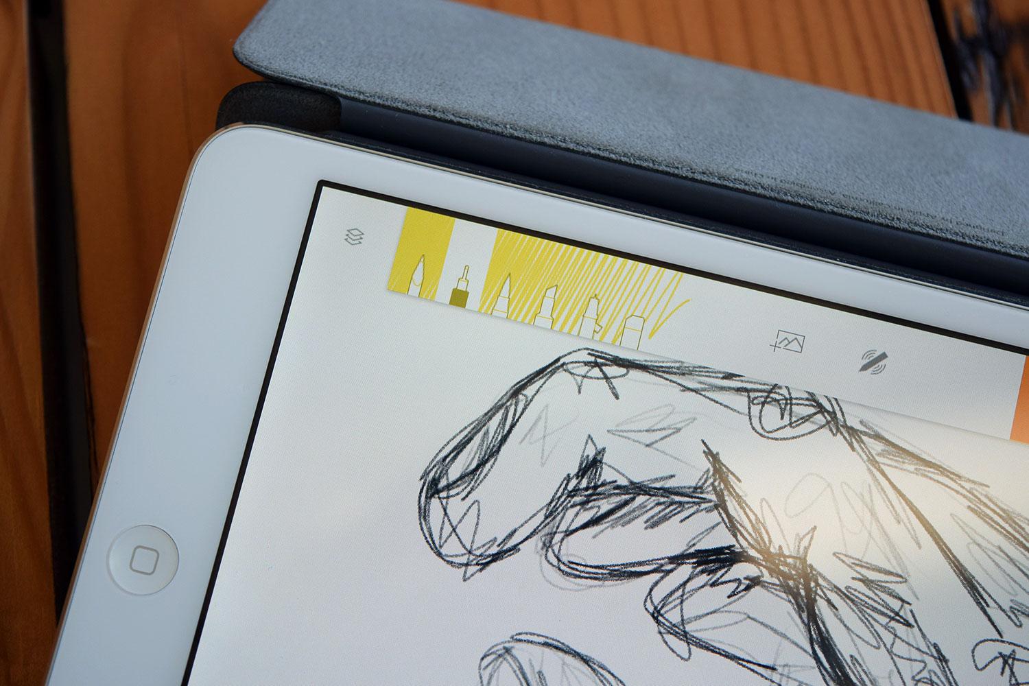
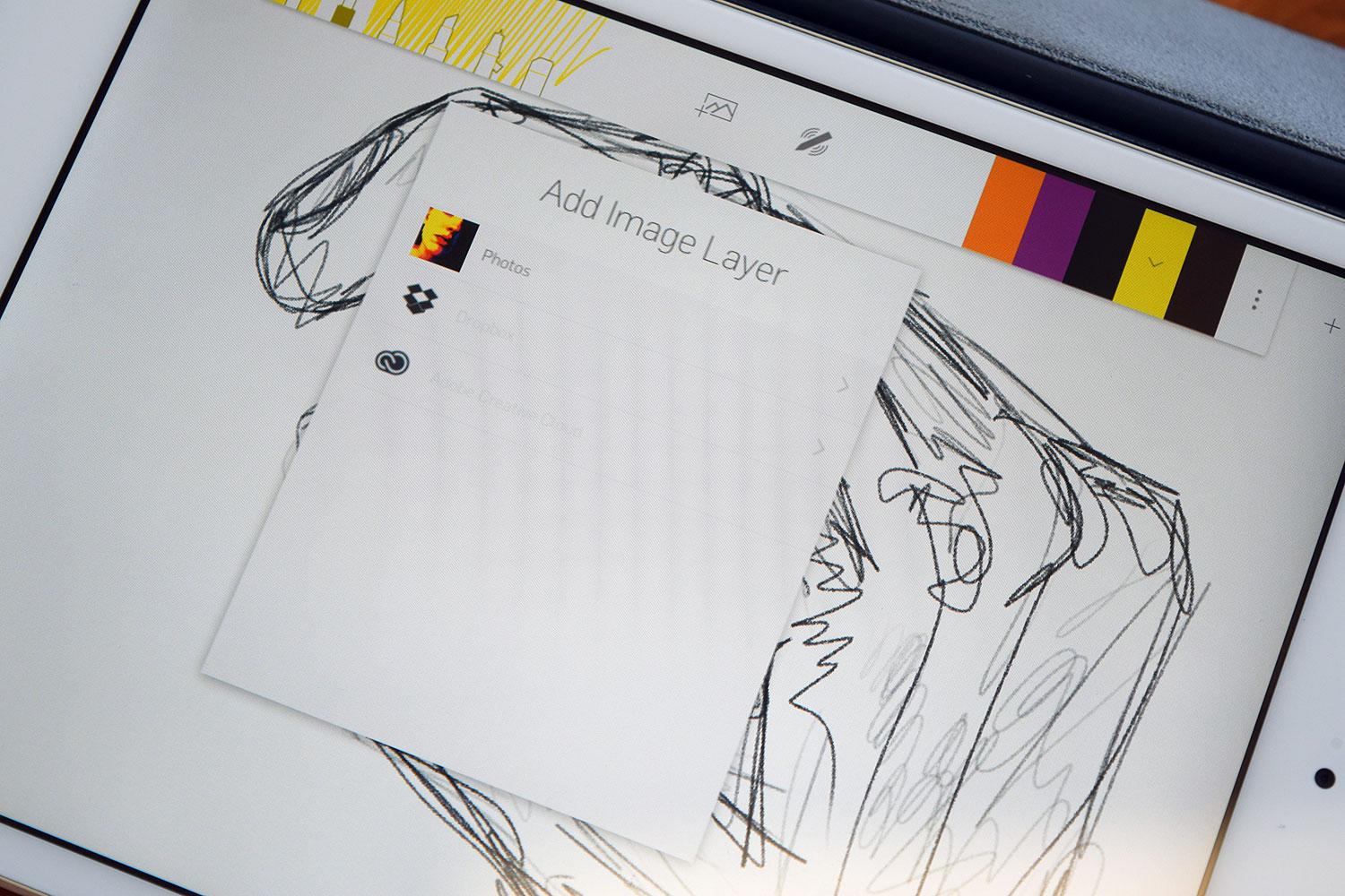
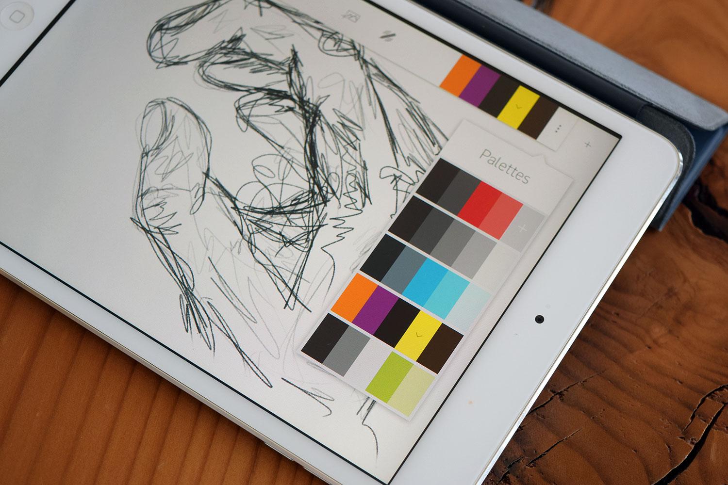
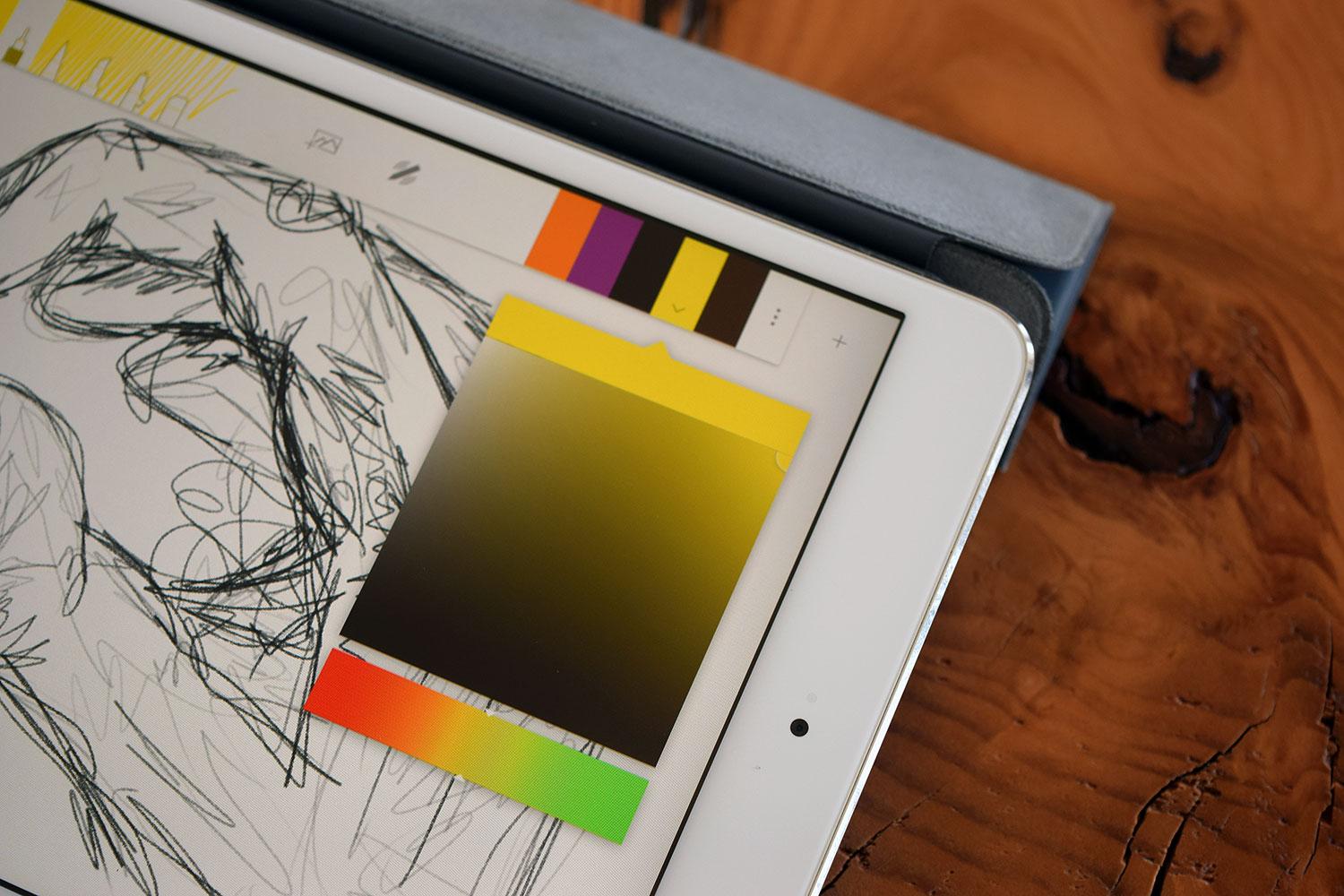
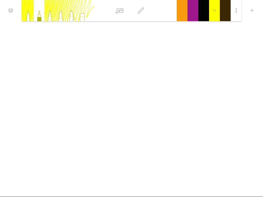
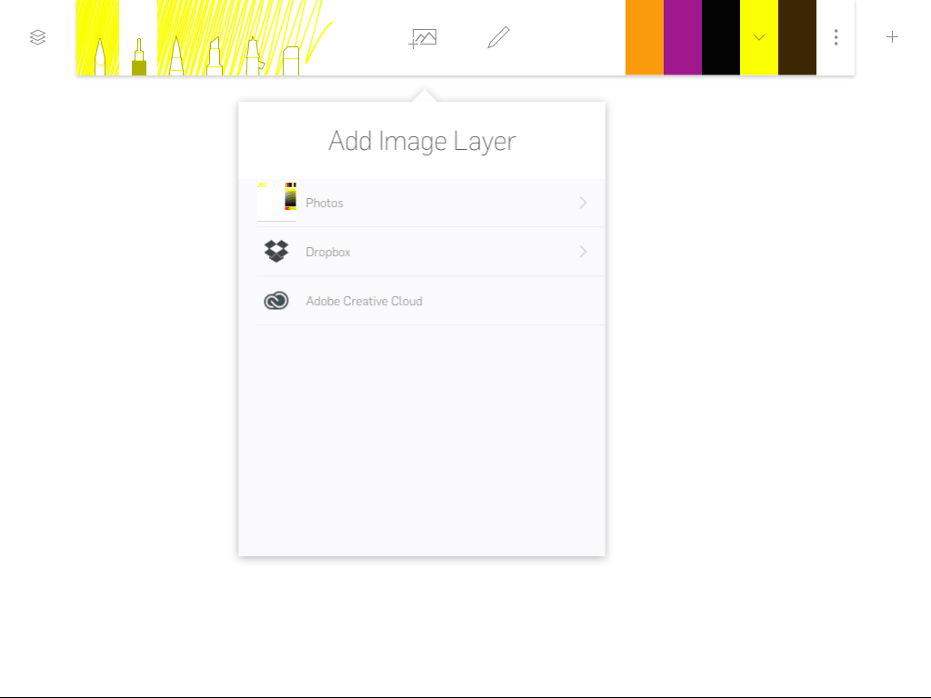
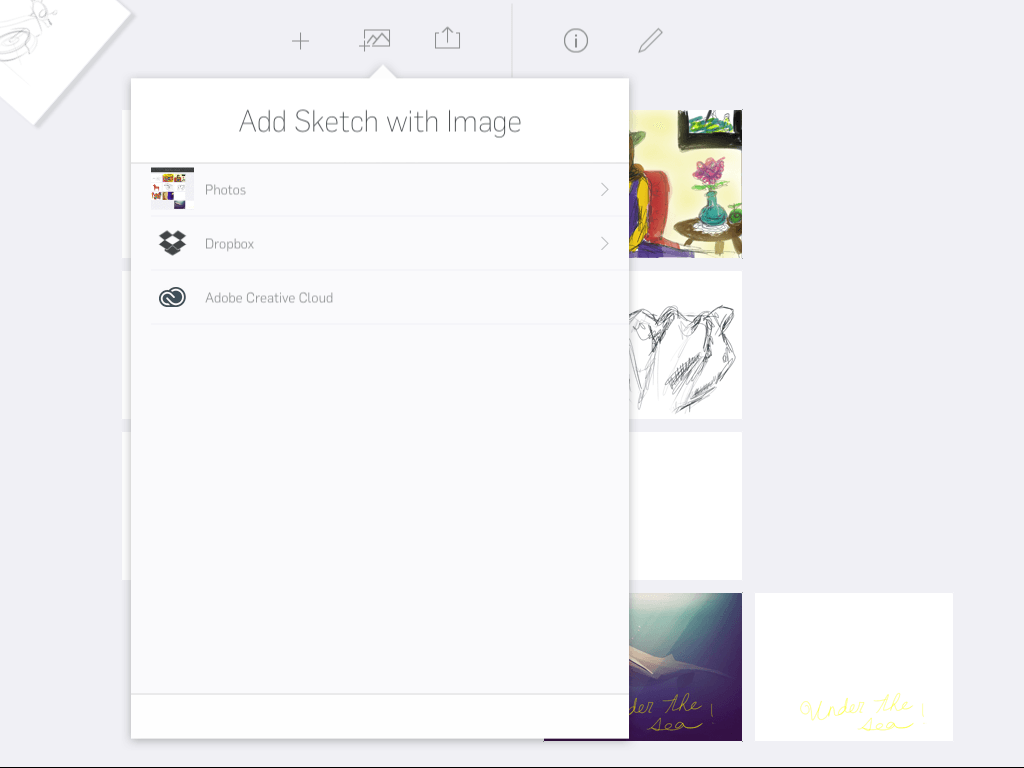
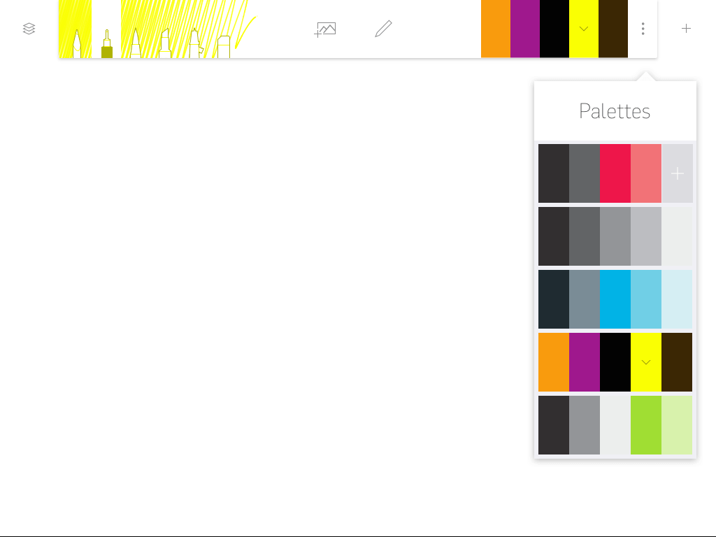
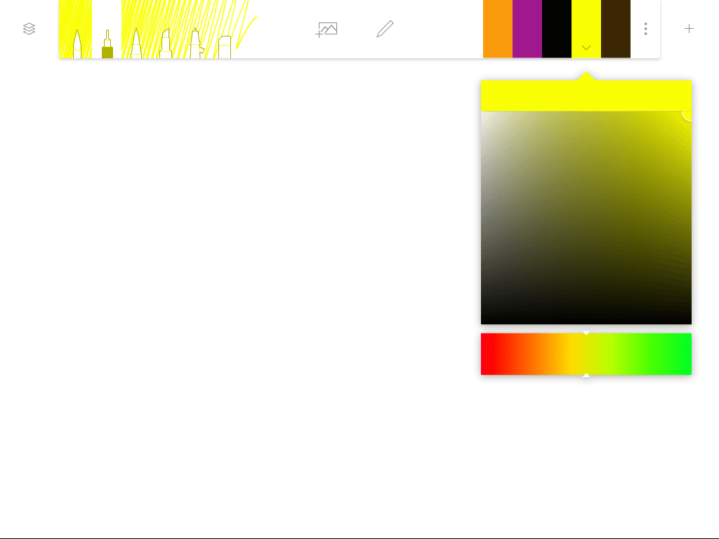
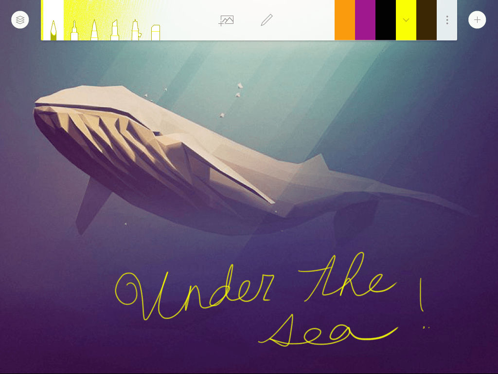
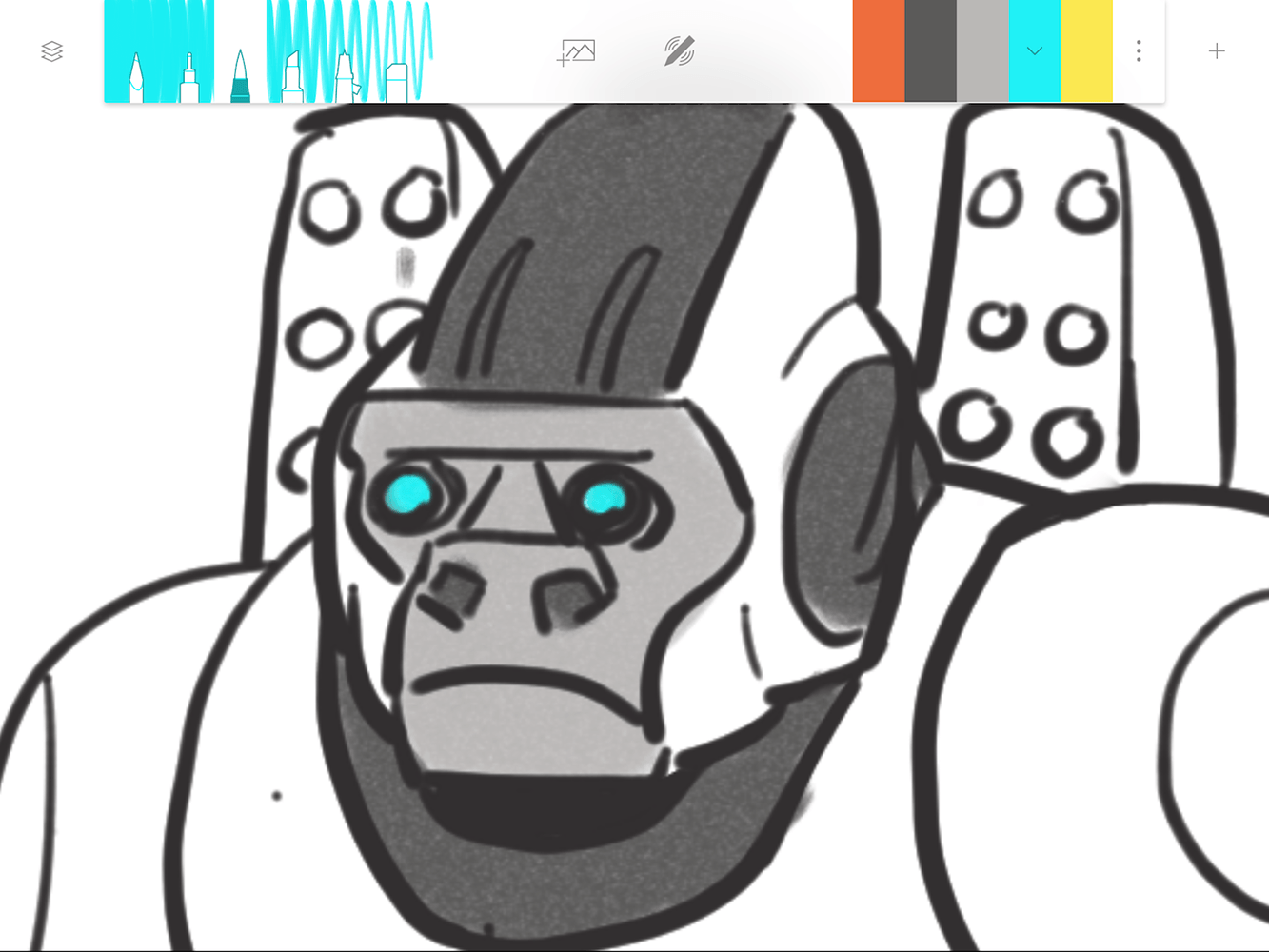
Adonit intends Forge to be used like a sketch pad for building on existing ideas to create new ones. It’s a tool that’s geared toward making the process of iteration easier on mobile devices. Artists, designers, and chronic doodlers are bound to find the idea attractive. You can bring in photos from Dropbox and the default photos app on iOS to inspire your sketches. There are only six simple brushes to choose from, but you can control color, gradient, and other key aspects of the drawing.
Most artists just want a space to create ideas that isn’t cluttered, overwhelming, or bogged down in the details.
The Forge app team met with designers, artists, and other creatives to figure out what they wanted in a drawing app. They found that most artists just want a space to create ideas that isn’t cluttered, overwhelming, or bogged down in the details. The app had to feel realistic and comfortable; it had to recreate the feeling of a design studio filled with paper, pencils, markers, and all the other tools of the trade.
“Most digital drawing apps have delays, lag time, and you’re stuck waiting,” one of the app’s creators, Peiter Buick said. “The speed of Forge makes it more realistic. The pen and the brushes need to feel as life-like as possible.”
After all, when you’re drawing on paper, you just grab a 2B pencil and it acts like a 2B pencil — you don’t have to adjust the softness of the lead.
“Forge is focused, fast, and fluid,” he said.
“It started with this large need we had as designers,” he said. “All of our walls were covered with sketches – That’s how we think through problems – And we had no digital way to do that, so we made Forge.”
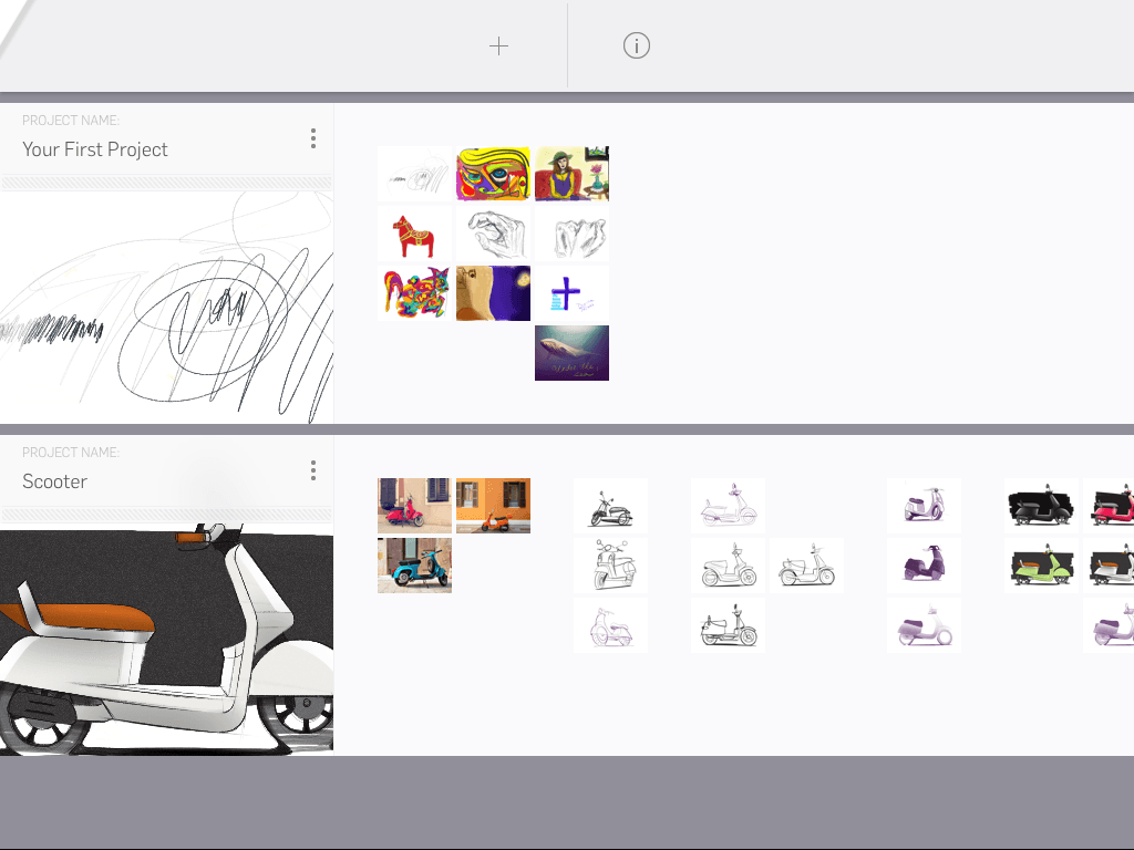
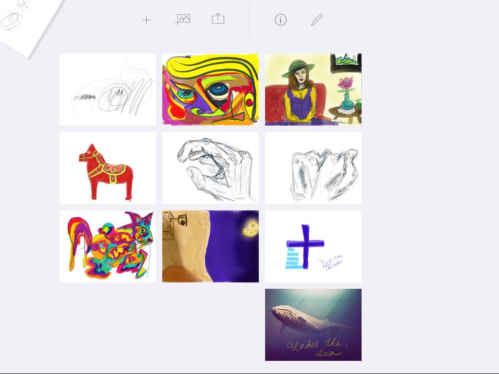
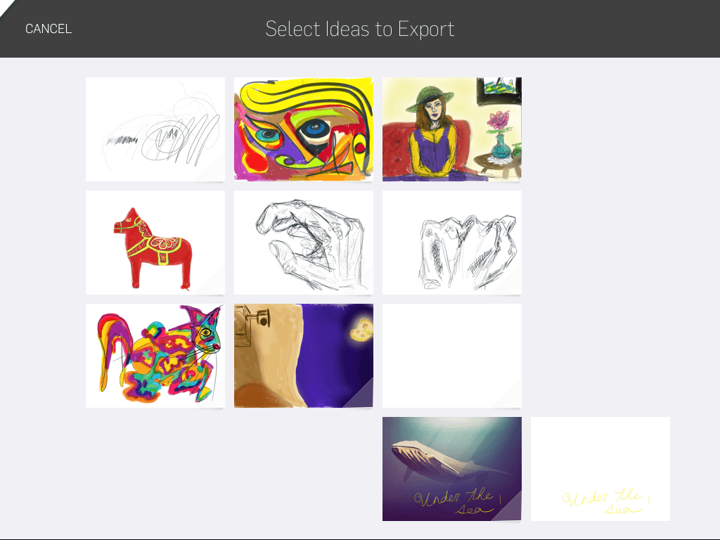
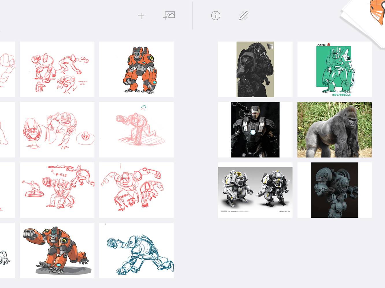
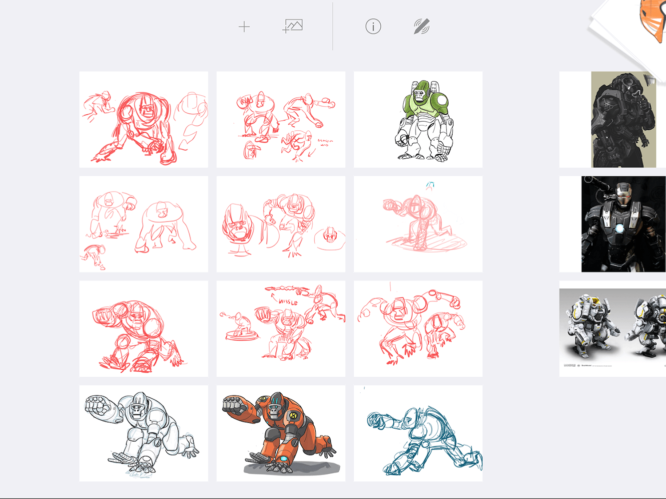
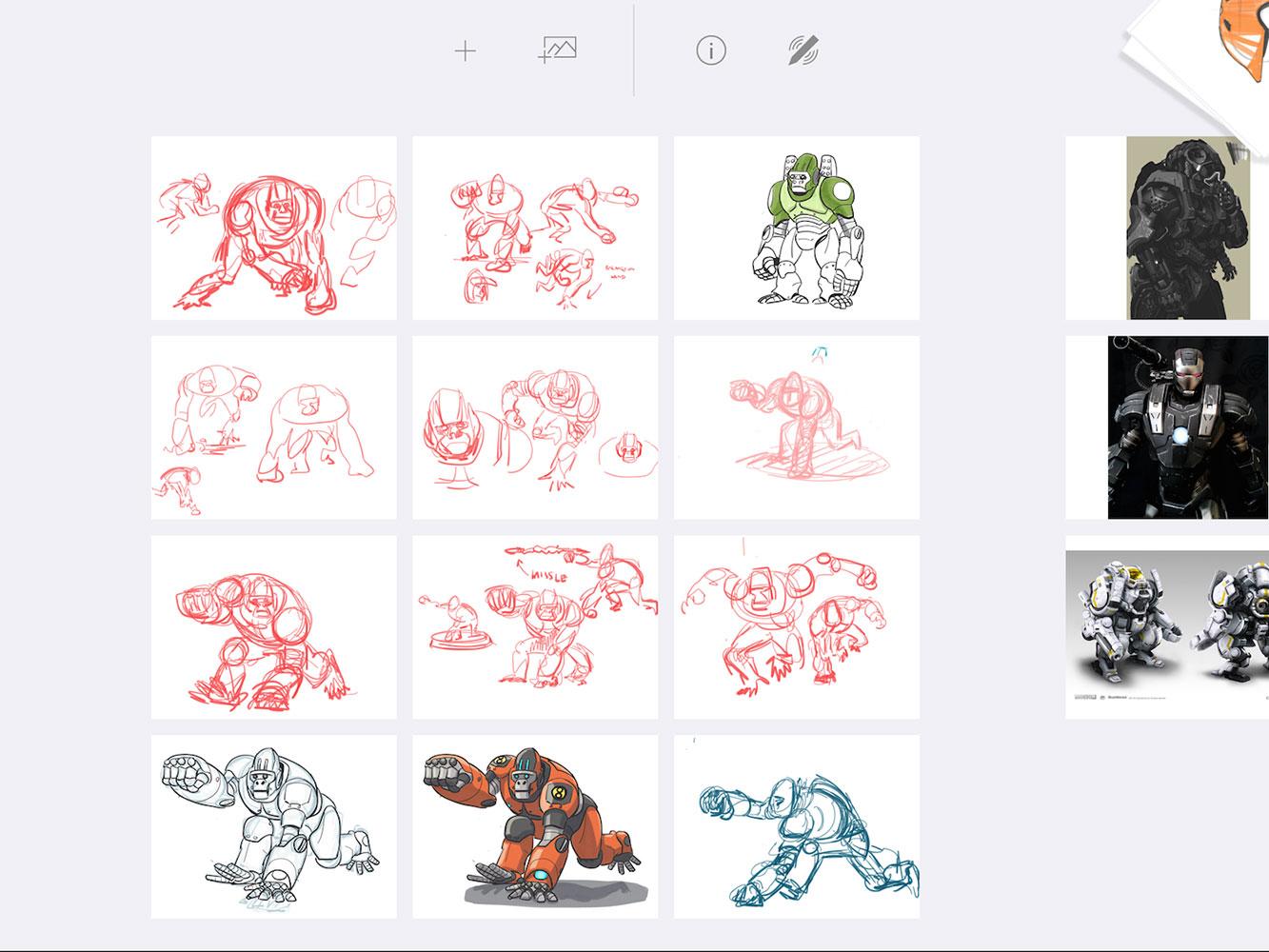
The interface is quite simple, so you don’t get distracted with all the different brushes, adjustments, and tools. The focus is on the drawing itself — not the app. Each drawing is saved like a Post-it on a white wall, so you can move them around and compare sketches side by side. The Adonit Forge design team made almost 100 different versions of the wall, until they finally settled on one that allowed the artist to move sketches around, just like you would with physical sheets of paper on a bulletin board.
“Organizing ideas can reveal patterns,” Buick said. “One idea can become the foundation of the next idea.”
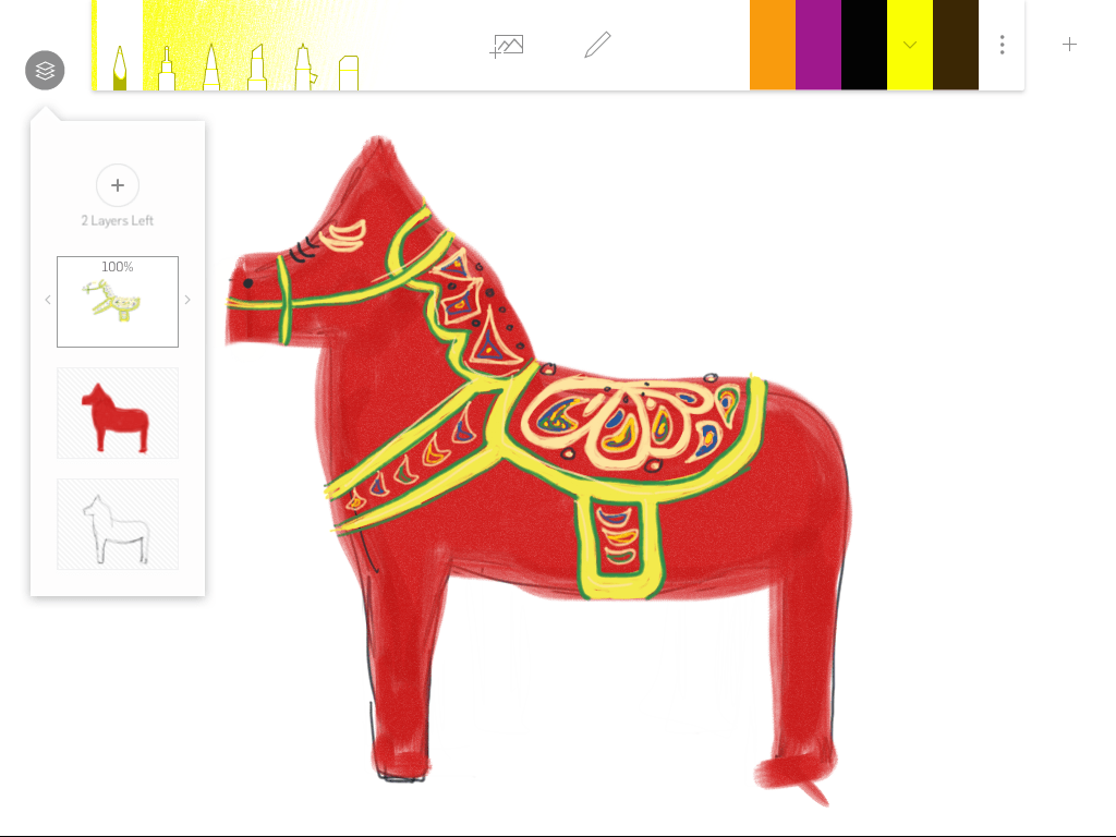
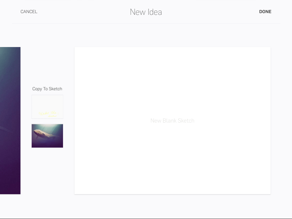
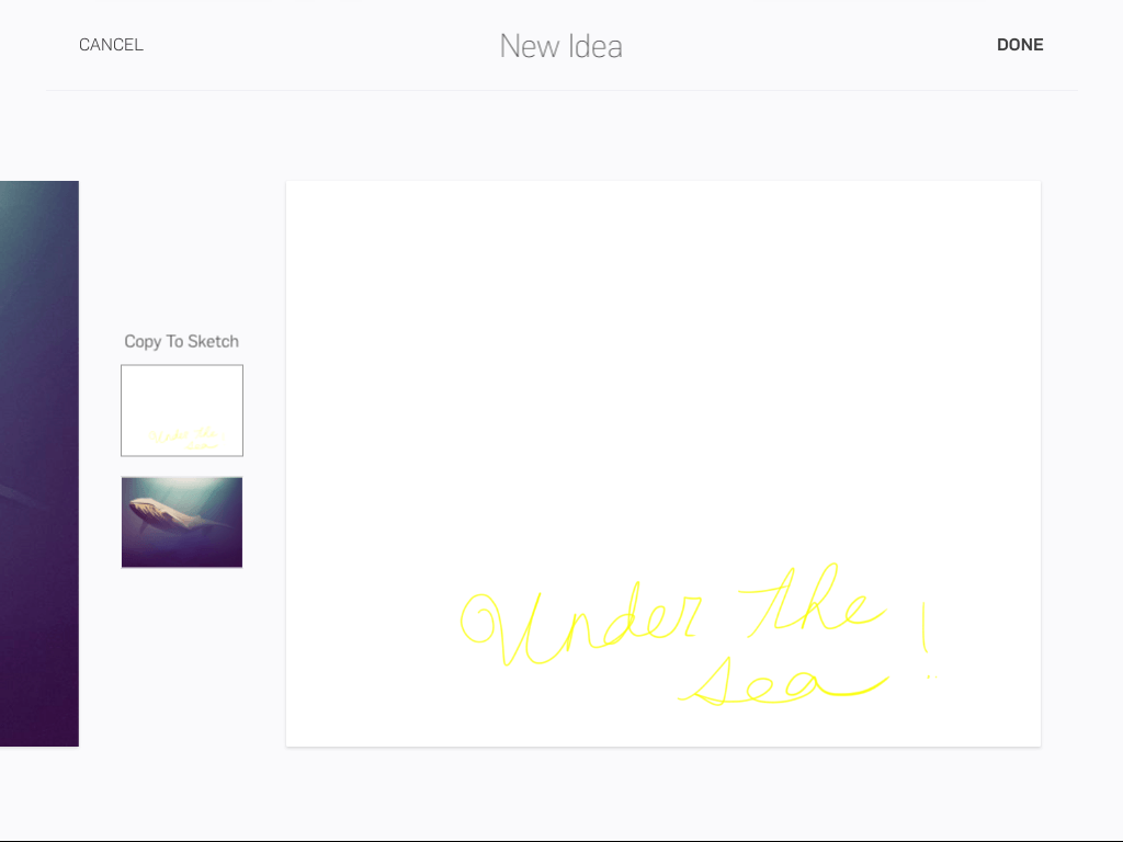
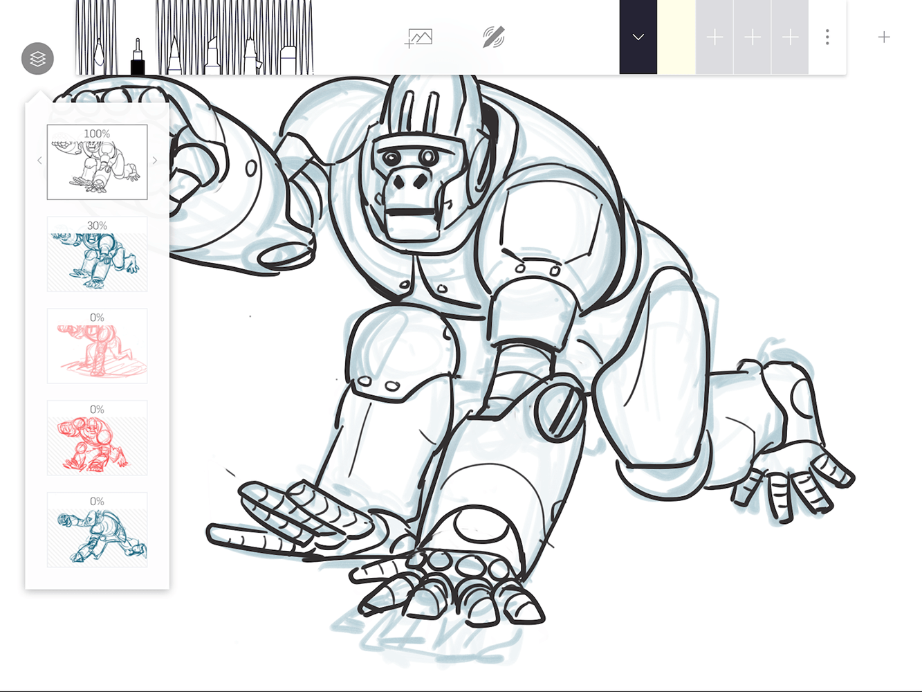
Forge also has layers, so you can save each layer to look back on later, change, or delete entirely. You can also pull a layer or two and place it on a new drawing — That way you don’t have to start over from scratch.
“The creative process is iteration,”Buick said. “You generate ideas, step back, and sort them, to see the patterns. Then, you build on top of your existing ideas.”
If you’re willing to cough up $4, you can sort your drawings into different portfolios. Once you’ve made that one time in-app purchase, you can make as many portfolios as you want on Forge. Each portfolio has its own wall full of sketches for you to sort through.
Forge through the eyes of an animator
In order to make sure that its app would really help designers’ work flow, Adonit led a beta testing program with a bunch of designers and artists. We spoke to one of the artists who’s been testing Forge.
Everett Downing, a story artist and animator who has worked with Pixar, Dreamworks, and Blue Sky to animate famous films such as Ratatouille, Wall-E, Toy Story 3, Brave, Ice Age, and Robots. Downing has tried just about every drawing app you can think of from Sketchbook Pro and Procreate, to Paper and Art Rage. He uses each one for different purposes, and he’s a big fan of Forge for filtering through ideas.
“Forge is like having a pencil, pen, marker, and airbrush – It keeps it simple.”
“Forge is really easy to use for the iteration process,” he said. “I like how they have limited brush pallets. It keeps things simple, and the brushes look right.”
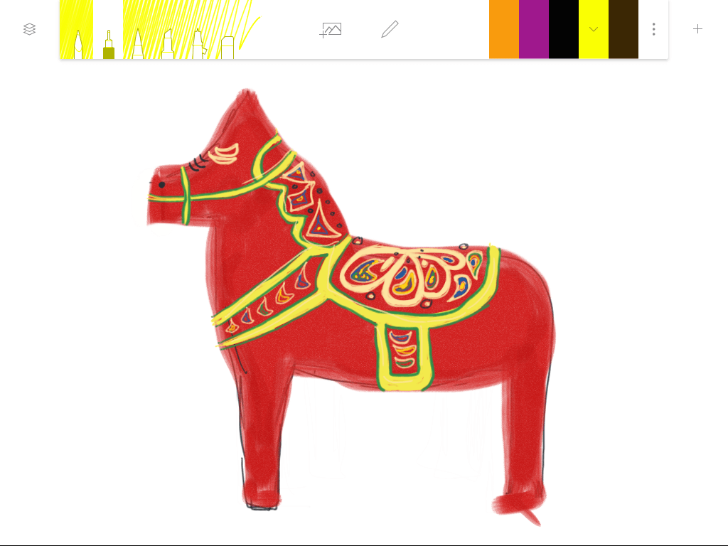
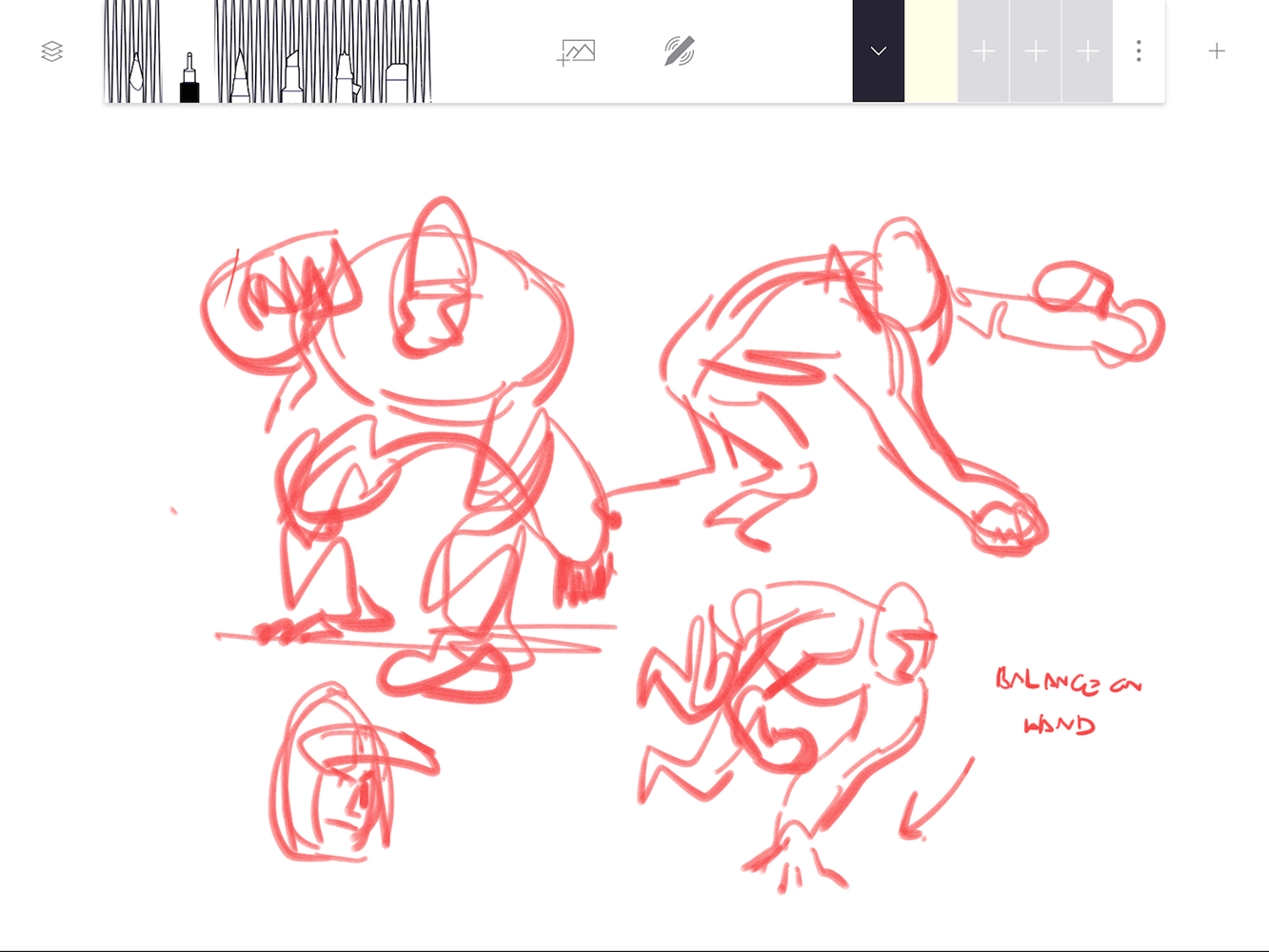
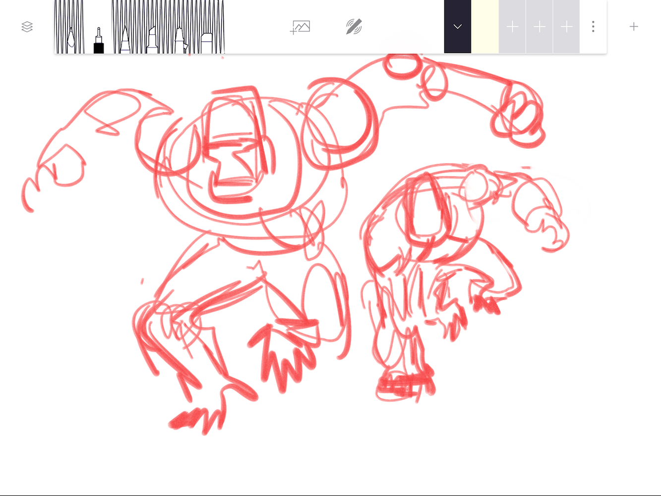
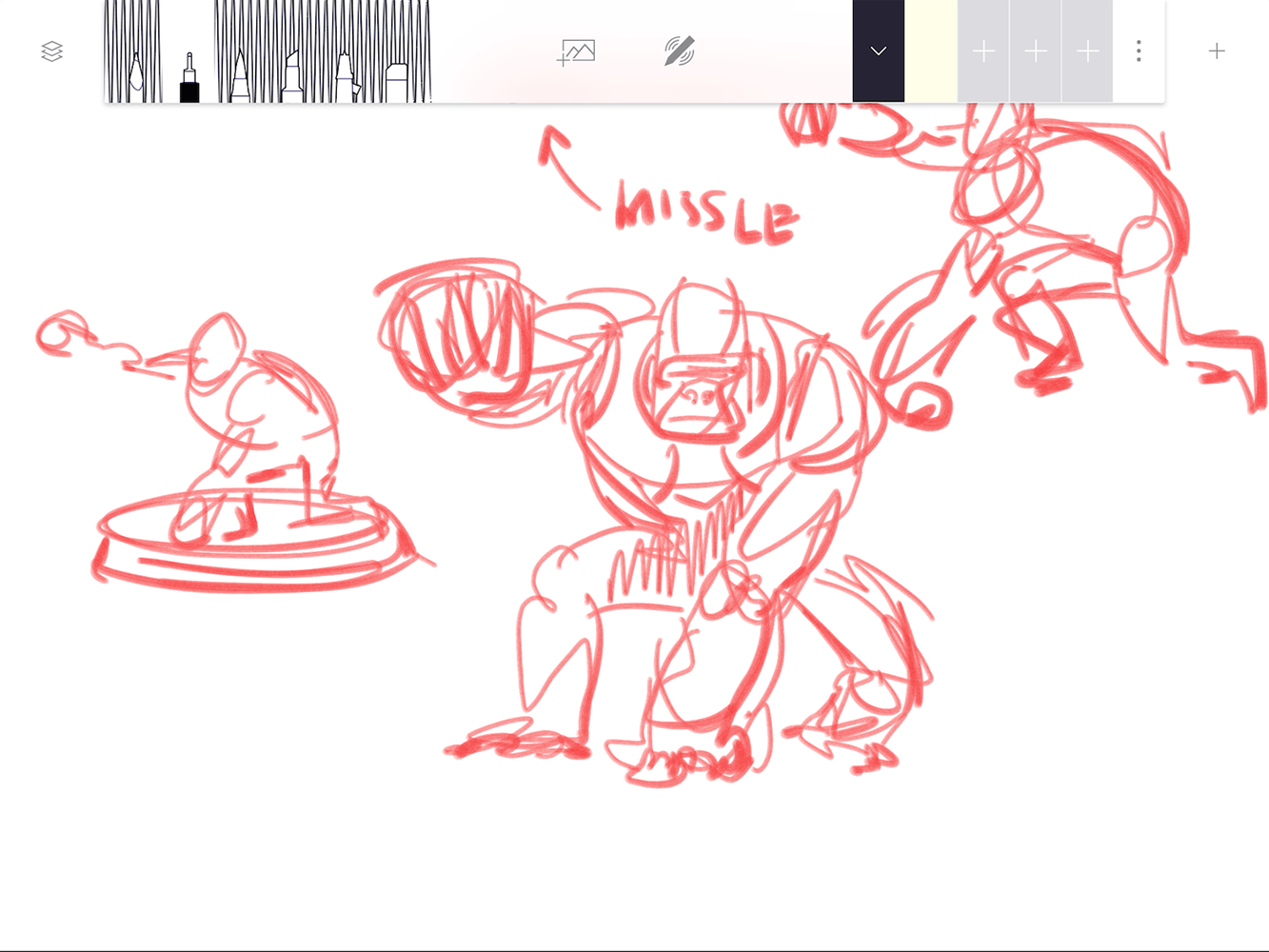
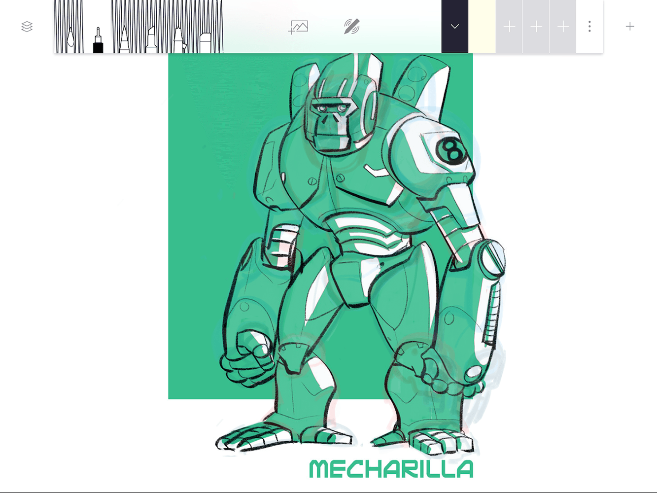
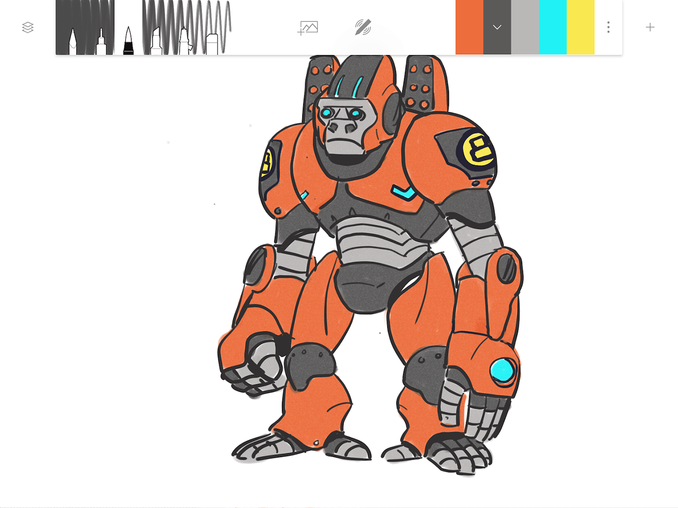
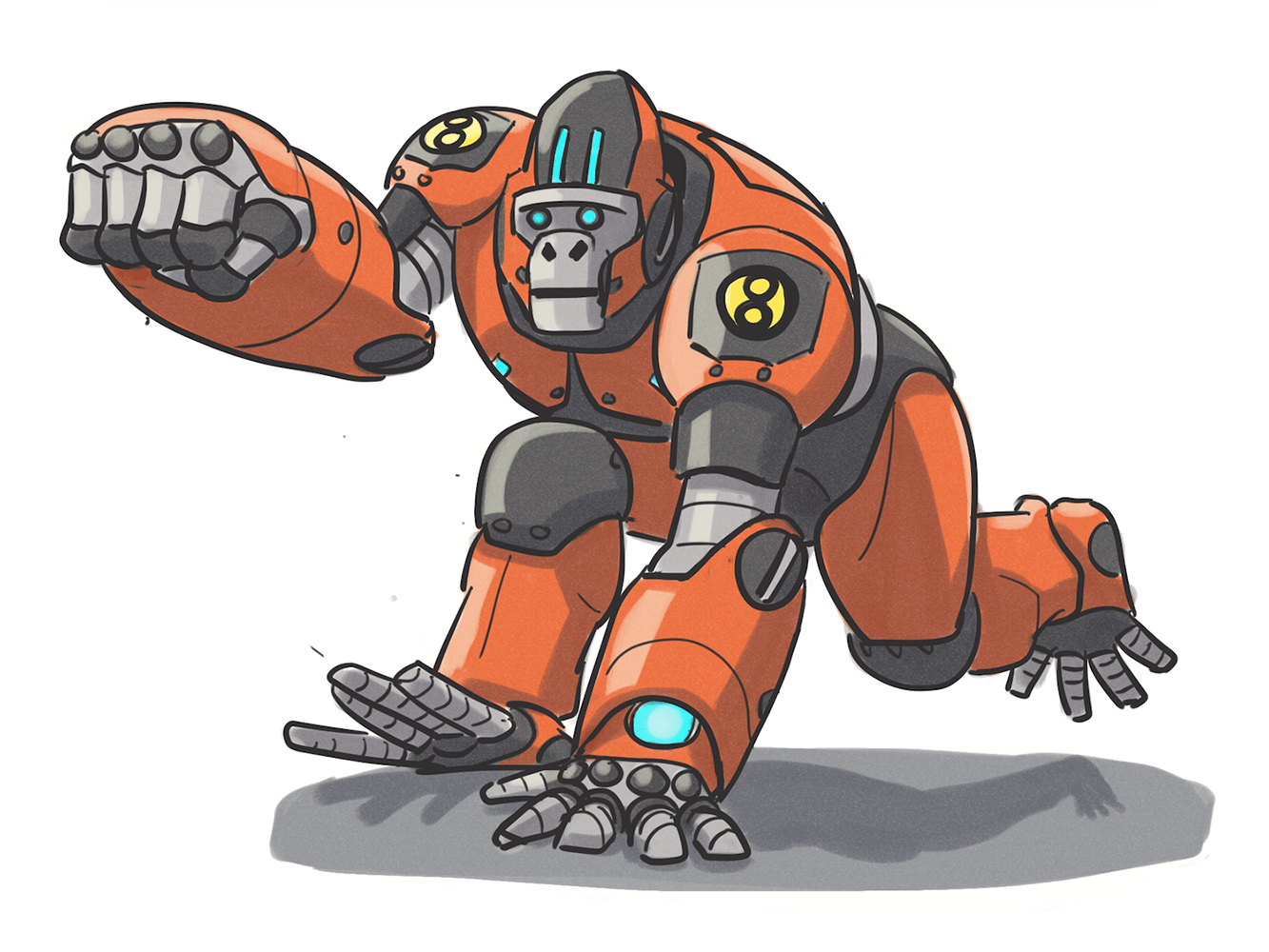
Downing mainly uses Forge to sketch quick ideas and share them with colleagues and friends to get their input. At the time, he was coming up with possible figures for a friend’s 3D printing contest. Thanks to Forge’s ability to export and share files so easily, Downing was able to churn out a bunch of ideas and send them over to his friend for review. He went through a few different versions of some characters, a process that was made very easy with Forge’s moveable layers.
“It’s really easy to grab part of an idea as a layer, and keep moving, adding more to it,” he explained. “You don’t have to start over.”
Downing said that although he doesn’t use Forge every day or as part of his workflow typically, he finds it useful for side projects.
“I go to Forge when I don’t want to think about drawing,” he said. “Forge is like having a pencil, pen, marker, and airbrush – It keeps it simple.”
Downing has also been suing Adonit’s stylus to draw in the app, and one of his favorite things about the whole experience is that it has palm rejection. Many drawing apps and styli can’t distinguish between your palm and the tip of your stylus, so you either have to hold the stylus awkwardly with your hand hovering above the screen, or risk ruining your drawing with rough lines made by your palm.
Downing told us that his friends can even tell the difference between the art he makes on the iPad and the art he makes elsewhere, mainly because of how he has to hold his stylus to avoid touching the screen. Luckily, Adonit’s stylus and Forge have palm rejection.
“I can put my hand down!” Downing said cheerfully. “I don’t have to make that sacrifice when using Forge.”
In truth, not being able to rest your hand while drawing is one of the single most annoying things for an artist to bear. It’s the little things that help Forge offer a more realistic drawing experience.
Forge through my eyes
I also tested Forge to see what it was all about. Much like Paper, which I use often, Forge is simple, offers only a few tools, and attempts to keep tweaking down to a minimum. Adonit’s Jot Touch, which I used to test the app, was very quick and responsive as I moved it across the page, and I quite liked the simplicity of the tools.
The optional layers and ability to add an image to the digital canvas are great additions to the app that allowed me to erase mistakes more freely. I wasn’t concerned about ruining the first part of the drawing, because it was locked safe in a separate layer. I could see how an animator or a designer would use Forge to go through different versions of a creation before settling on the final product.
Those who want a lot of control over settings, more brush variety, and customization will have to look elsewhere, though, as Forge is really more of a quick sketch tool. That said, you can make some pretty amazing pieces of art on the app, if that’s what you’re after. You can even transfer your works of art over to other apps or file formats, so if you want to continue perfecting them in a more advanced program, you can do so. Adonit hopes to add Adobe Creative Cloud integration soon, so you’ll be able to toss your Forge ideas over to Photoshop and Illustrator for polishing into final products.
Overall, it is a handy app for those who love to sketch, and others who want to sift through ideas. The company has lots of ideas for the app’s future, and is only just getting started. You can download Forge now on the iOS App Store.
