“The Amazon Kindle Scribe isn't for everyone. But if you want a single gadget for reading and writing on a lovely e-ink screen, it's about as good as it gets.”
- Slim and lightweight design
- E-ink screen looks fantastic
- Tried-and-true Kindle reading
- Superb writing experience
- Weeks of battery life
- Very competitive pricing
- Few formatting tools for writing
- Limited Kindle app integration
Amazon Kindles haven’t been exciting for a while. They’re great devices for reading e-books and have been for years. But beyond that, there’s not much else to say about them. Amazon has different models with varying features and prices, but at the end of the day, a Kindle is still just a Kindle. The Amazon Kindle Scribe changes that.
Just like all other Kindles that have come before it, you can use the Scribe to read e-books and listen to audiobooks — all on a paper-like e-ink display. But in addition to reading, you can also use the Kindle Scribe for writing. It’s a seemingly simple addition that completely reimagines the Kindle experience. And in doing so, it’s made the Kindle Scribe a device I can no longer see myself living without.
Amazon Kindle Scribe design

There’s nothing very flashy about the Kindle Scribe’s design. It’s sleek, minimalistic, and is executed so incredibly well on every level. The back is constructed out of aluminum and feels cool to the touch. There’s not much to look at, save for the Amazon logo in the middle and four rubber nubs in each corner.
The Kindle Scribe is so uncumbersome that I feel like I can comfortably use it anywhere.
Those nubs do a couple of things: 1) Keep the back from being scratched when the Scribe’s lying on a table, and 2) hold the Scribe securely in place, so it’s not moving around when writing on it. It’s an incredibly subtle design touch, but it’s one that I’ve become greatly appreciative of throughout daily use.
On the left frame are a power/lock button (which presses with a very pleasing click) and the USB-C charging port. The other three frames are totally empty, save for the magnets on the right frame where you magnetically attach the Basic or Premium Pen — more on those later.

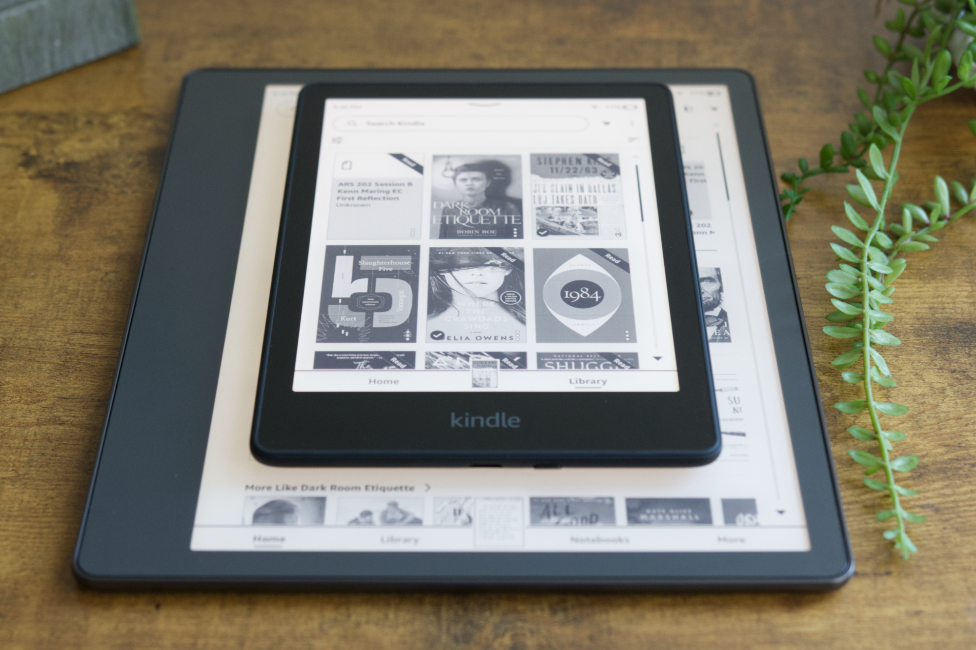
There’s nothing particularly mind-blowing about this design, but what did shock me is just how thin the Kindle Scribe is. Measuring a mere 5.8mm thick, the Scribe is 26% thinner than my iPhone 14 Pro Max. And with a weight of just 433g, it adds very little bulk to a bag or backpack.
Device thickness and weight isn’t the sexiest things to talk about, but they make a considerable difference with a device like the Kindle Scribe. No matter if I’m throwing it in my bag on my way to the coffee shop or jotting notes while lying on the couch at home, it’s so uncumbersome that I feel like I can comfortably use it anywhere. That’s not something I can say about a device like the 2022 iPad Pro, and it’s part of the reason why I find myself reaching for the Scribe every single day.
Kindle Scribe display

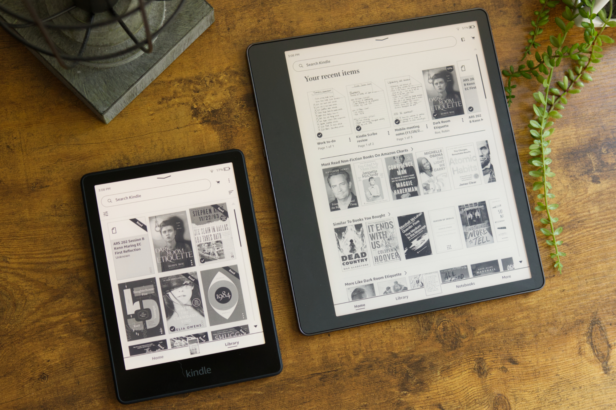
Taking over the front of the Kindle Scribe is a 10.2-inch e-ink display. It boasts a resolution of 300 pixels per inch and has a glare-free coating. Similar to other high-end Kindles, the Scribe touts automatic brightness adjustment for its 35 LEDs and has an adjustable warm light so you can tune the warmth/coolness of the screen to match the environment you’re in.
Despite the much larger display size, the Kindle Scribe has the same sharp pixel density as all of Amazon’s other Kindles, plus the largest number of LED front lights (beating the 25 LEDs on the Kindle Oasis).

Overall, it’s a quality e-ink panel that I’ve happily looked at for hours over the course of this review. Whether it’s the text of a book I’m reading, my various handwritten notes, or the buttons/words throughout the Kindle interface, everything on the Scribe is easily legible.
If you’ve used a recent Kindle, you pretty much already know what to expect from the Scribe’s display. The main difference here is the sheer size of said display. The Kindle Scribe is significantly larger than the 6.8- and 7-inch screens of the Kindle Paperwhite and Oasis, and at first glance, it can seem rather daunting.
But thanks to the thin and lightweight design mentioned above, the Scribe is surprisingly easy to manage. After a brief adjustment period during my first day, I was quickly reading on the Scribe just as comfortably as I do on my much smaller Paperwhite.
If anything, I’ve come around to preferring the Scribe’s bigger footprint. The bigger screen means fitting much more text on the screen at once — resulting in less tapping on the screen while you’re in the middle of a good book.
Kindle Scribe reading

Speaking of books, that’s one of the Kindle Scribe’s best features. When you aren’t taking notes or writing a to-do list (I promise we’re getting there!), the Scribe works just like any other Kindle. You can purchase e-books from Amazon, access them via a subscription service like Prime Reading or Kindle Unlimited, or read for free through Libby. At its core, the
In addition to the vast selection of content to read, the reading itself checks all the boxes. You can change the font of what you’re reading, customize the page layout, and see smart tidbits like how much time is left in the book or the current chapter you’re reading. You can also bookmark pages, see popular lines other Kindle readers have highlighted, and jot down notes of sections that stick out to you — something that’s especially handy with the bundled pen.

I also love how my reading progress on the Kindle is synced with other devices/services. If I open the Kindle app on my phone, I can keep reading right where I left off on the Scribe. I can also link my Goodreads account and automatically track my reading progress in the background.
These are all expected features on a Kindle in 2022, so why take the time to highlight them? Because Amazon retained that reading feature set in addition to the writing features I’ll talk about below. One of the Scribe’s biggest competitors — the reMarkable 2 — offers great note-taking, but doesn’t support Kindle books at all. You can read PDFs and DRM-free e-books on the reMarkable, but the reading interface/library comes nowhere close to what you get on the Scribe. It’s that duality of reading and writing that makes the Kindle Scribe so special and unlike just about anything else on the market.
Kindle Scribe pen and writing

As good as the Kindle Scribe’s reading experience is, that’s only half of the story. What makes the Scribe stand out among its other Kindle siblings is its writing capabilities. So, how are they?
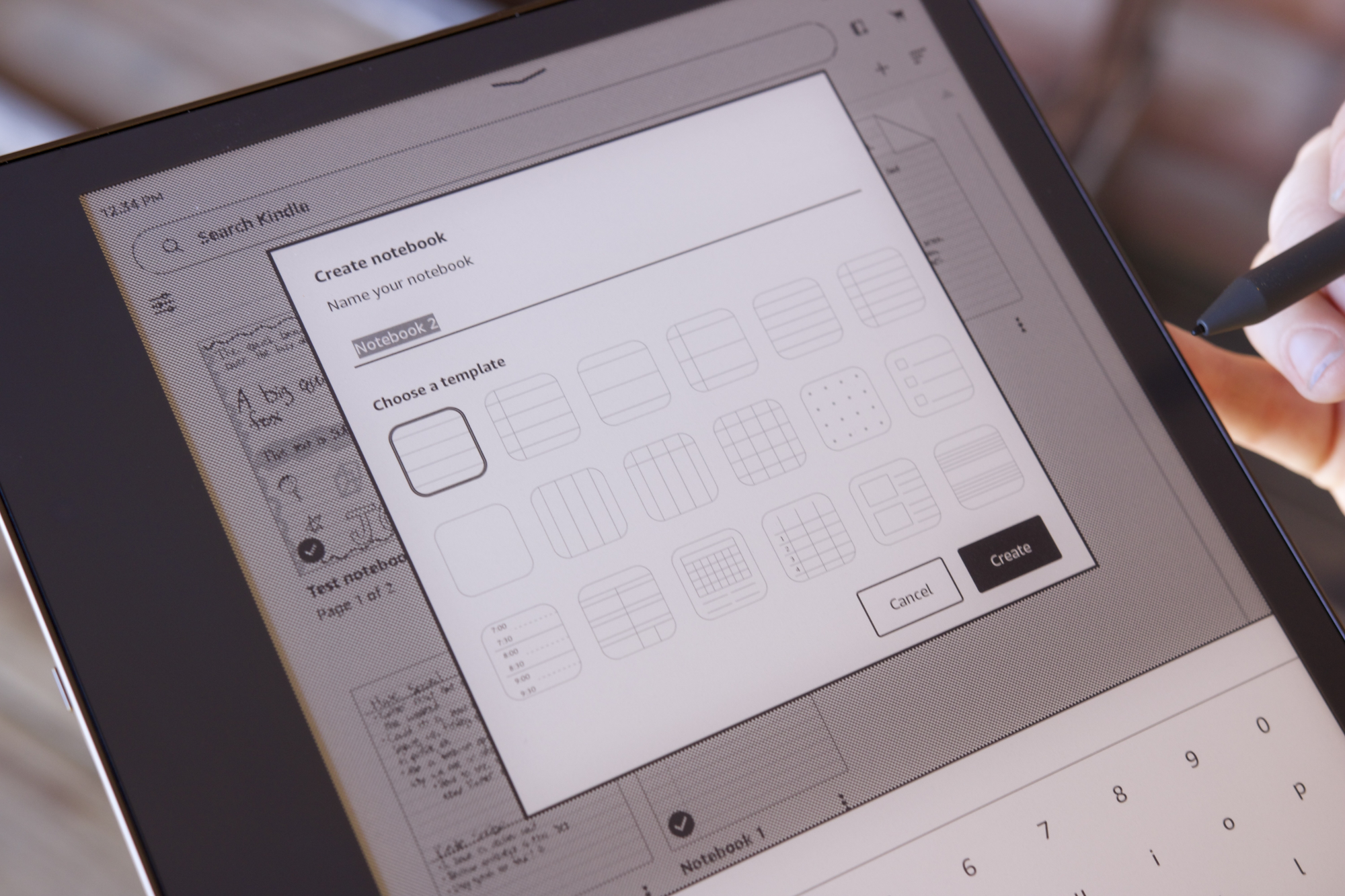
To start writing on the Scribe, you begin by tapping the Notebooks button near the bottom of the screen. This shows a collection of your notes and a “+” button you tap to create a new one. After naming your new notebook, you can choose a template to get started. This can be a blank page, ruled pages, calendar/schedule templates, a music sheet, and more. In total, there are 18 to choose from.
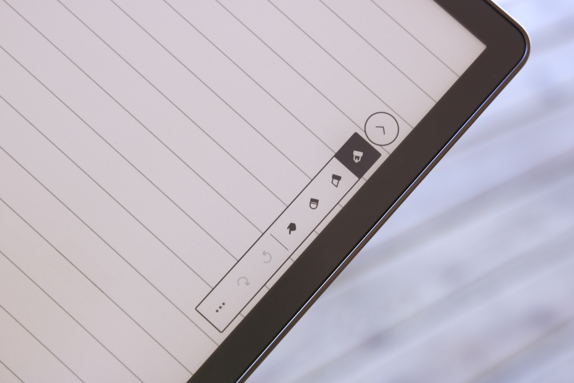
Once you’ve selected your template, it’s time to start writing! Tapping the floating pen icon on the edge of the screen shows your writing options — including a pen, highlighter, eraser, and undo/redo shortcuts. The pen and highlighter options each have five sizes as well: fine, thin, medium, thick, and heavy.
Writing on the Kindle Scribe feels nearly identical to writing with a real pencil on paper.
It’s a very simple interface, and maybe a touch too simple for folks who want endless formatting tools. But I’ve grown quite fond of the light-handed approach here. You have what you need and no excess to clutter up your writing canvas.
But how does it feel to write on the Kindle Scribe? In a word: outstanding. The writing responsiveness is virtually instant with no discernible delay. Combined with the fact that you’re using e-ink, writing on the
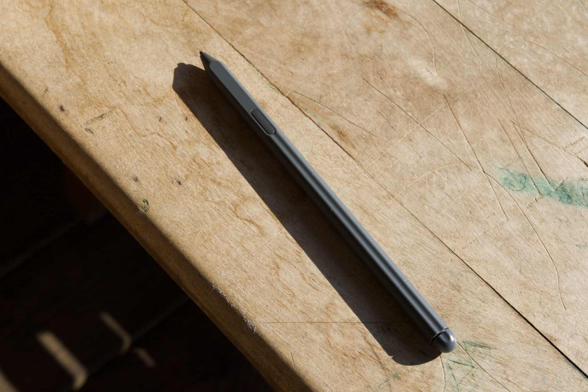
Further driving that point home is the built-in eraser on the Premium Pen that came with my Kindle Scribe. If you need to erase anything you’ve written, simply flip the Premium Pen over and rub the end on the screen. Just like the eraser on the end of a pencil, it removes your writing/drawing to free up that space on the Scribe.
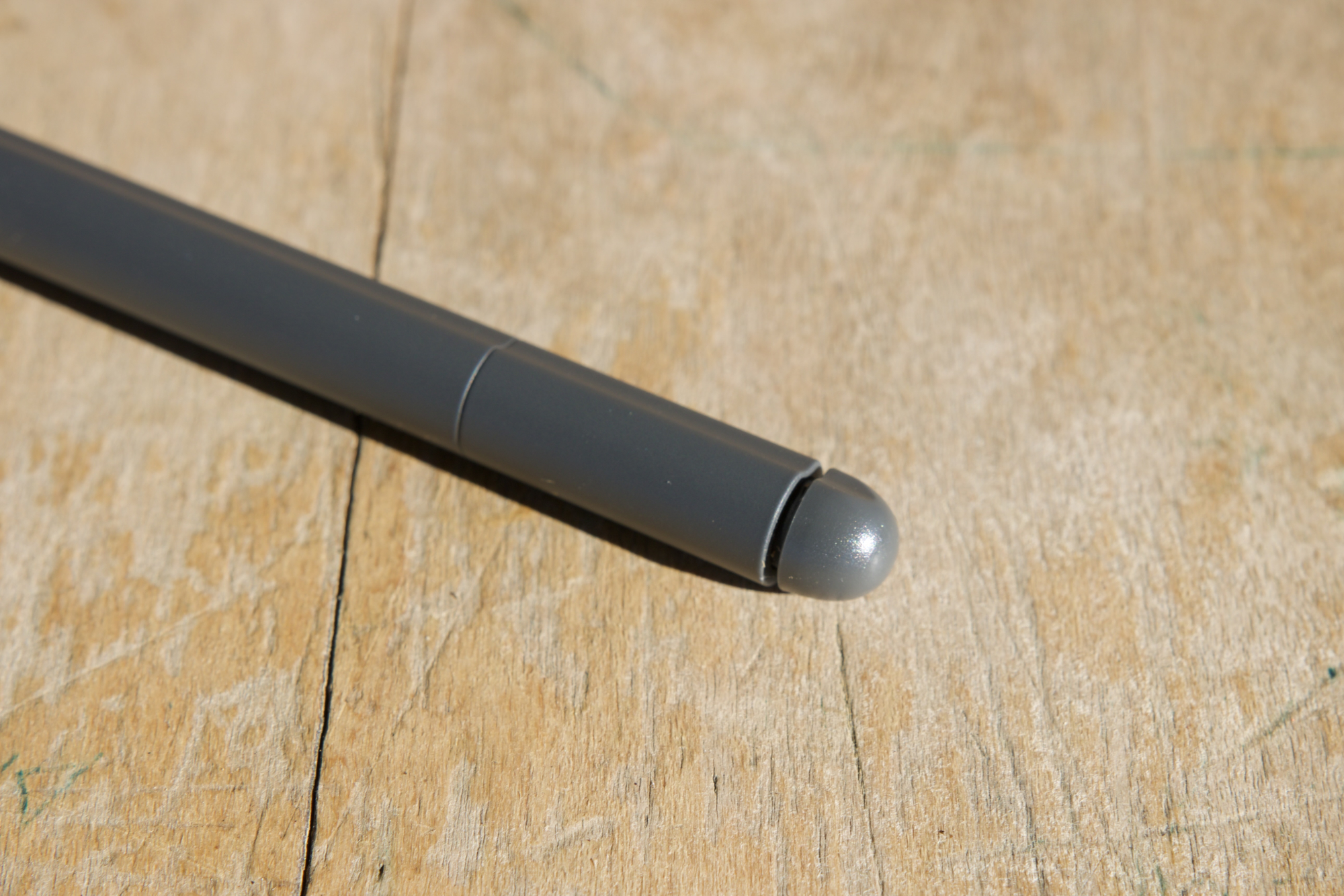
The rest of the pen is also fantastic. It’s lightweight, very comfortable, and has a flat edge on one side that provides a great grip in your hand. When you’re not using it, the pen magnetically attaches to the right frame of the Scribe — and does so very securely. The more expensive Premium Pen also includes a shortcut button you can map to use your highlighter, pen, eraser, or create a sticky note.
I’ve primarily used the Kindle Scribe to maintain an ongoing to-do list throughout my workday and to jot down notes during meetings. It’s something I used to use an iPad Pro for, but the

While I think Amazon nailed the Scribe’s writing — especially for a first-generation product — there is room to improve with the inevitable second-gen model. For starters, the lack of pressure sensitivity isn’t ideal for anyone who wants to sketch or draw on the Scribe. Manually switching between the thickness of the pen/highlighter has been a non-issue for the way I use the Scribe, but I can’t imagine any artists will be happy with that, even for very casual doodling. You also can’t convert handwritten notes into text, something the reMarkable 2 does offer.
I’d also love to see Amazon improve how the Scribe syncs with the Kindle app. As it currently stands, you can view your Scribe notes in the app by tapping the More button and then Notebooks. However, you can’t actually do anything with these notes. It’s great that I can view a grocery list I wrote on the Scribe on my phone, but if I can’t edit that list, there’s not much utility there.
Kindle Scribe battery life

Battery life has been a strong suit ever since the first Kindle, and the Scribe is no different in these regards. Amazon advertises “weeks” of use on a single charge, and I’ve found that claim to be accurate.
I fully charged the Scribe’s battery to 100% upon receiving it and began my first full day on November 19. I’ve used the Kindle Scribe regularly since then, with almost every day including 30-60 minutes of reading and frequent note-taking most workdays. As of November 29 — well over a week later — my
Given that significantly higher usage, I’m really pleased with the endurance here.
The battery on my Kindle Paperwhite does last longer, but I’m also using the Scribe much more than I use a reading-only Kindle. Instead of a device I pick up once or twice throughout the day to read a book, the Scribe is something I’m interacting with repeatedly in a single day. Given that significantly higher usage, I’m really pleased with the endurance here. And thanks to the USB-C charging port, refueling the Kindle Scribe is a piece of cake.
Kindle Scribe price and availability

The Amazon Kindle Scribe is available now and starts at $340. That gets you the Scribe with 16GB of storage and the Basic Pen. Upgrading to the Premium Pen will set you back $370, and if you want the Premium Pen with 32GB or 64GB of storage, those models cost $390 and $420, respectively. No matter which pen you choose, both come with five replacement tips in the box.
For comparison’s sake, the reMarkable 2 (the Scribe’s biggest competitor) costs $378 for the model with the standard Marker — its version of the Basic Pen. If you want similar functionality to the Scribe’s Premium Pen, getting a reMarkable 2 with its Marker Plus costs $428. And after your first year with the reMarkable 2, you’ll need to pay $2.99/month to unlock all of its available features. The Kindle Scribe comes with no such subscription.
Amazon made the Kindle cool again

I thought the Kindle Scribe looked really interesting when Amazon announced it in September — but I never imagined it would end up being one of my favorite gadgets of 2022. However, that’s precisely what happened.
If all you want is a Kindle for reading, this is not the Kindle you should buy. In that instance, the baseline Kindle, Kindle Paperwhite, and Kindle Oasis remain my go-to recommendations. But if you’ve ever found yourself itching for a single device that you can read and write on, the Kindle Scribe is about as good as it gets. It’s a phenomenal gadget for reading, provides one of the best digital writing experiences I’ve ever encountered, and delivers those things in a package that’s sleek, long-lasting, and surprisingly affordable — especially next to its reMarkable competition.
The Amazon Kindle Scribe is a bit weird and decidedly niche by design. But it’s something that’s slotted into my life more seamlessly than most other products I review, and I don’t want to give it up any time soon.


