“The design of the Garmin Vivosmart 5 won't make you look twice, but the comprehensive Garmin Connect platform makes this a fitness tracker a standout.”
- Detailed Garmin Connect platform
- Comprehensive sensor array
- Lightweight and comfortable
- Accurate health and sleep tracking
- Disappointing battery life
- Generic design
I’m usually the first to call out companies that seem to ignore design, or put it way down the list of importance when making a new wearable. I think it’s crucial that a product we put on our bodies be at least vaguely attractive. But I’m willing to go easy on Garmin, as although the Vivosmart 5 fitness tracker is terribly generic to look at, it gets the other most important aspect of wearables — the app — exactly right. Let’s talk about how a superb user experience saves the Vivosmart 5 from being passed by.
Design
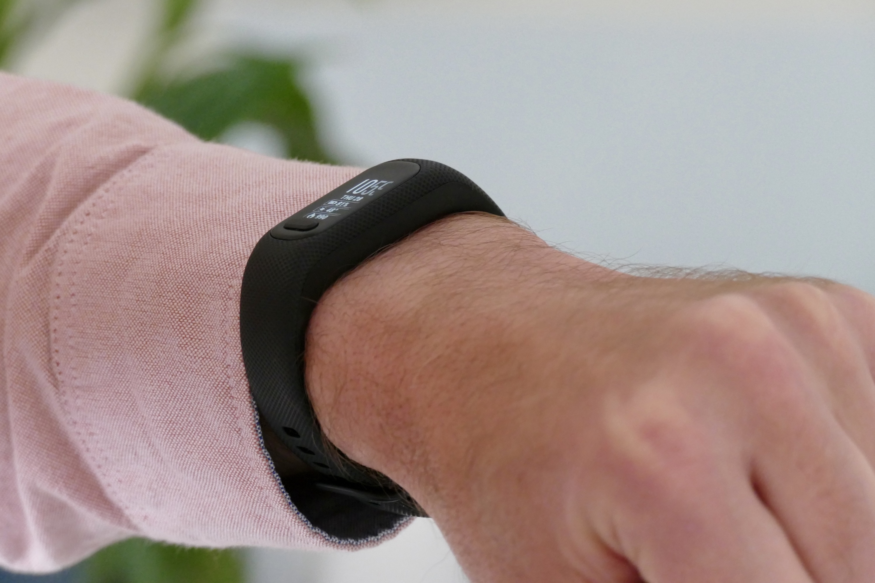
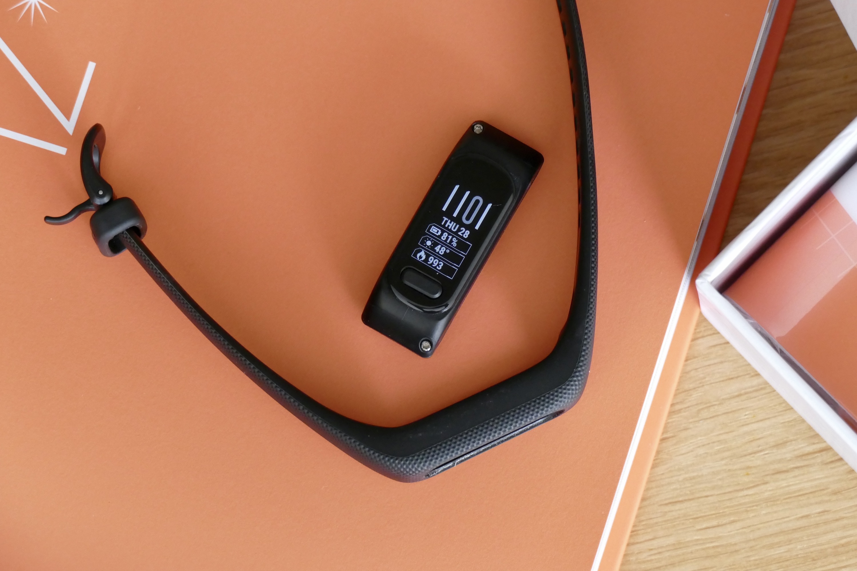
The Garmin Vivosmart 5 is functional, not beautiful. The dimpled silicone strap contains the Vivosmart 5’s main module, which has a small monochrome OLED screen and a single physical button on it. My review model is black, but you can get other colors to brighten it up, plus the polycarbonate module can be easily removed from the band and swapped with one of the replacements Garmin sells for $30.

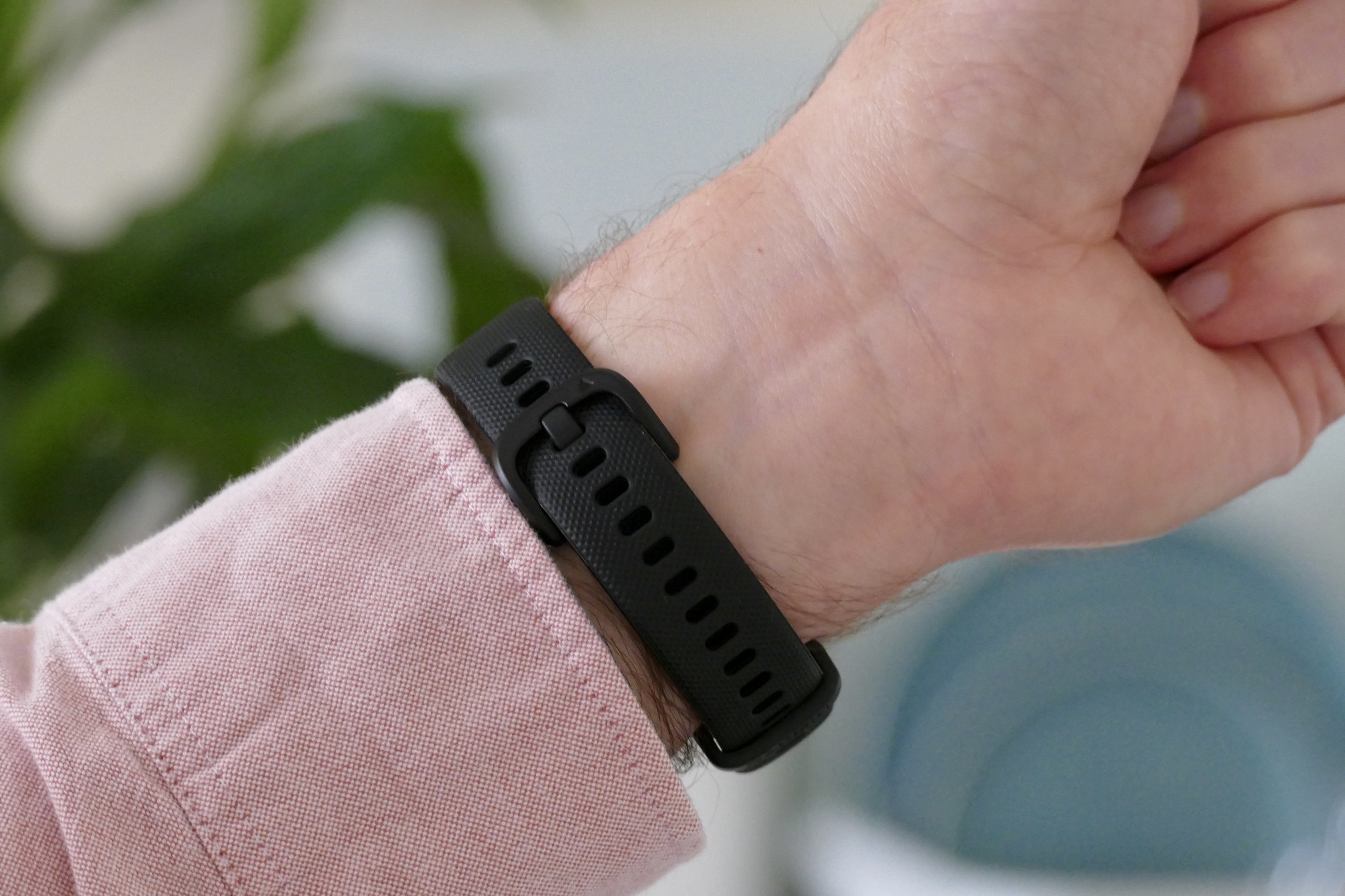
It’s as simple and nondescript as they come, especially in boring black. I want to hide it under my cuff, but because the case is quite bulbous, it never fits under it comfortably. An oddly specific issue with comfort that may only affect me is that the keeper does not want to let go of the strap when trying to take the Vivosmart 5 off, and it insists on painfully grabbing my arm hair in a bid to stop me from abandoning it. It makes me rip it off like a Band-Aid.
The small OLED screen has an acrylic lens over it and a basic 154 x 88 pixel resolution. It is bright enough to be seen in sunlight, and the touchscreen is sensitive and reliable. The physical button will please those who didn’t like the haptic button on the Vivosmart 4, but it does age the new model’s design. I’ll take that trade-off here though, because it makes using the Vivosmart 5 so easy, with a quick press to select features and a long pressing to end a workout.
Garmin offers the Vivosmart 5 tracker in two different sizes, one for small-to-medium wrists and the other for large wrists. There’s a slight variation in weight, but at 26 grams at its heaviest, there’s no fatigue from wearing it all the time. For reference, I’m wearing the large size on my 6.5-inch wrist and have the buckle on the sixth hole, leaving 14 available, so there’s tons of adjustment.
Fitness trackers are rarely beautiful, but for those who care about design, it’s possible to find one that looks good. Garmin itself has the Vivomove Sport if you prefer a watch-style look, or there’s the Fitbit Luxe if the fitness tracker style is more for you. The Vivosmart 5 risks being overlooked due to its basic design, and as we will see, that’s a shame.
Health tracking
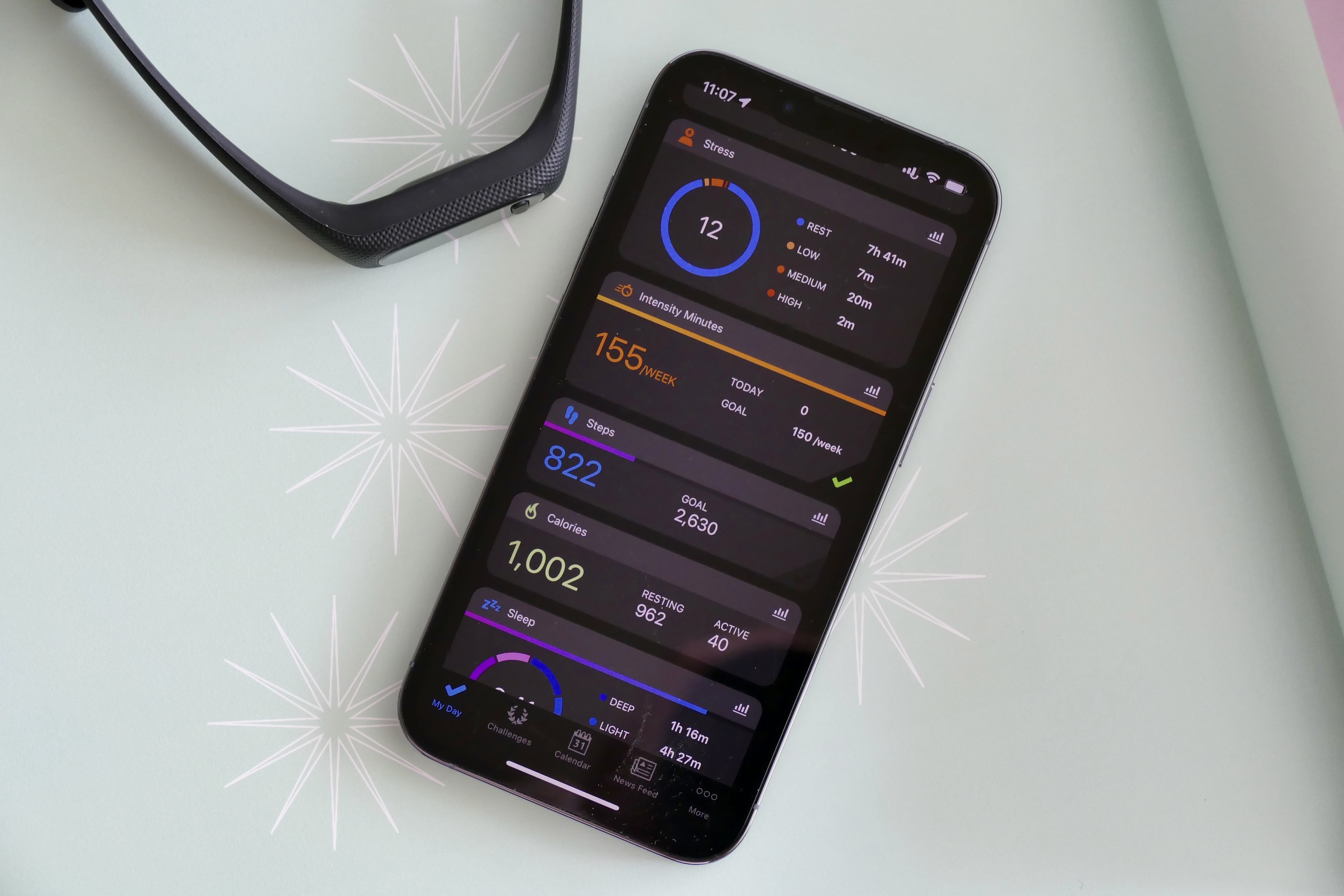
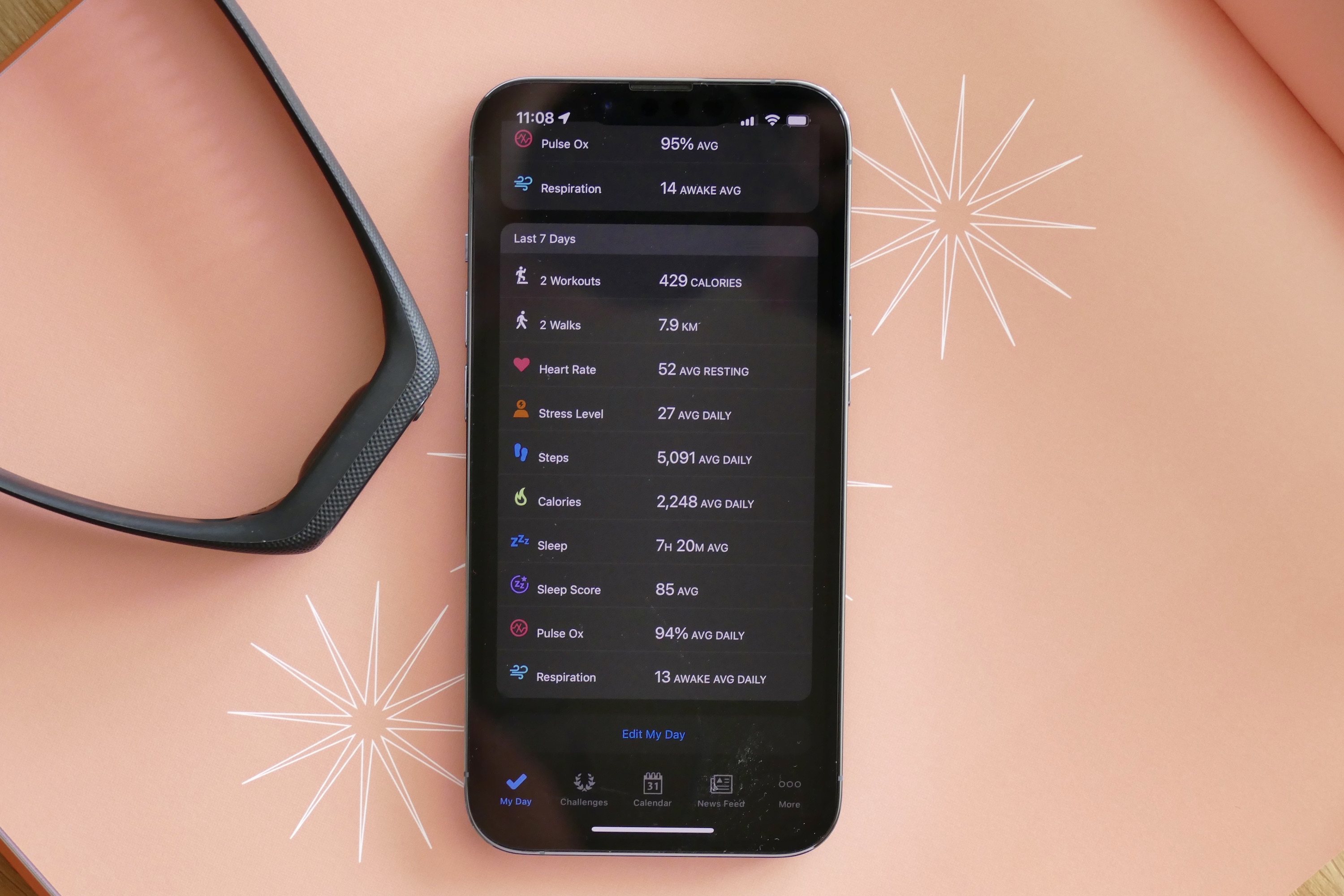
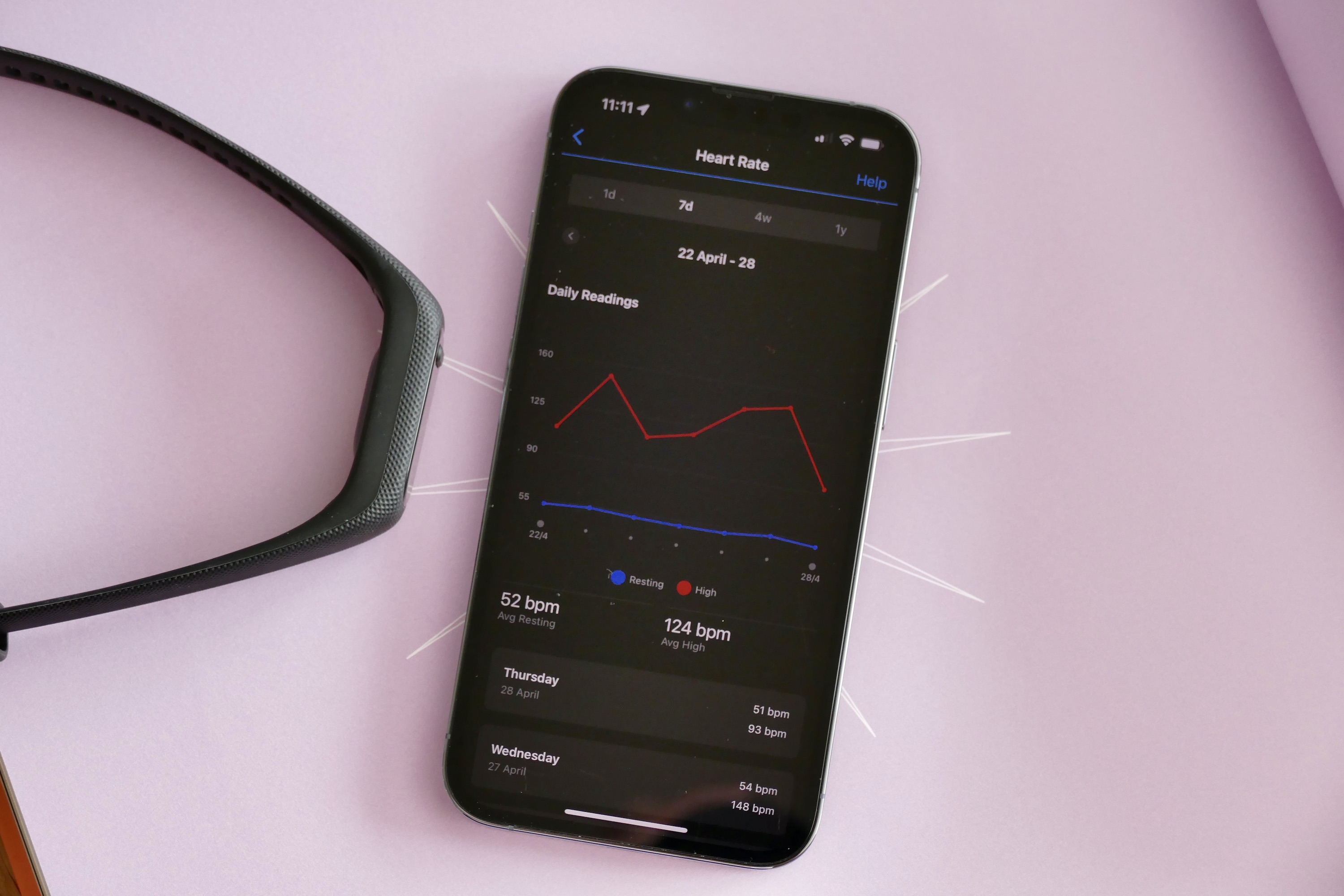
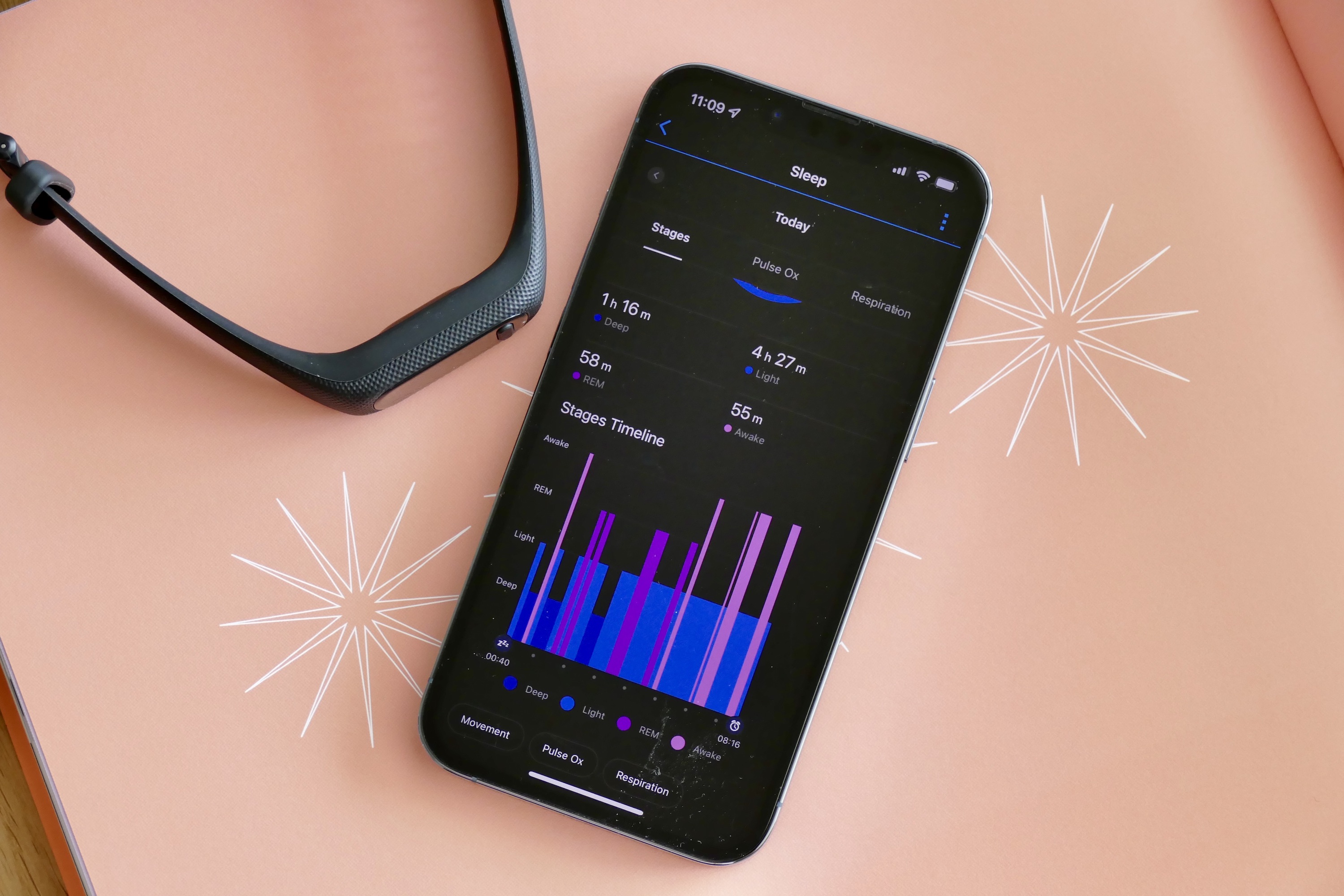
The Vivosmart 5 has a comprehensive sensor array to measure your heart rate every second and watch out for abnormal changes, plus it measures your blood oxygen levels and tracks stress and sleep. All of the data from your daily activities, workouts, and sleep are collated in the Garmin Connect app, available for iOS and Android. I have been using the Vivosmart 5 connected to an iPhone 13 Pro.

Garmin Connect is brilliant. It’s the reason you should be considering the Vivosmart 5. It’s throughly comprehensive and data-packed, providing deep insight into your body’s state and performance. It does all this for free — there’s no subscription model to access special features or historical data here — which is a big bonus over the competition from Fitbit. Yes, it’s a little intense in terms of the amount of information available, but I’d rather have too much than not enough.
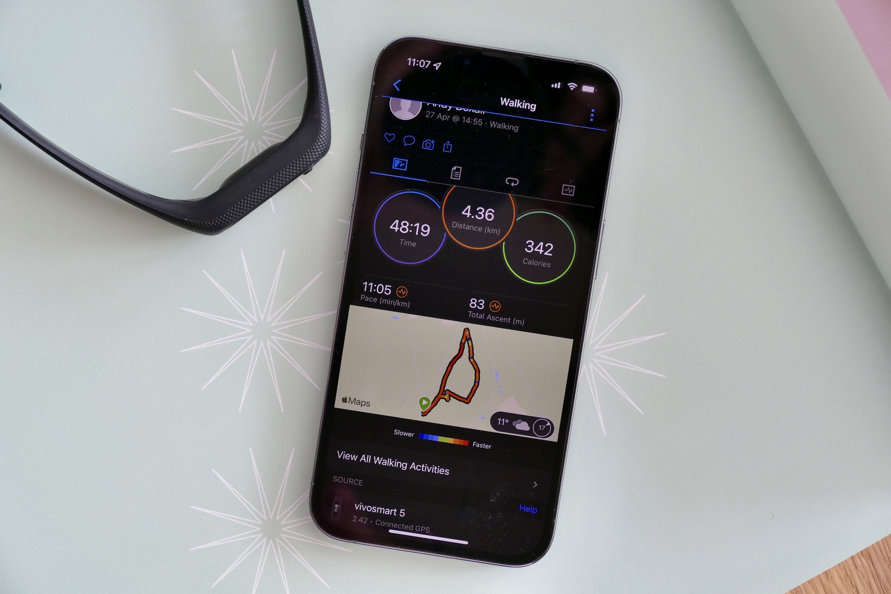
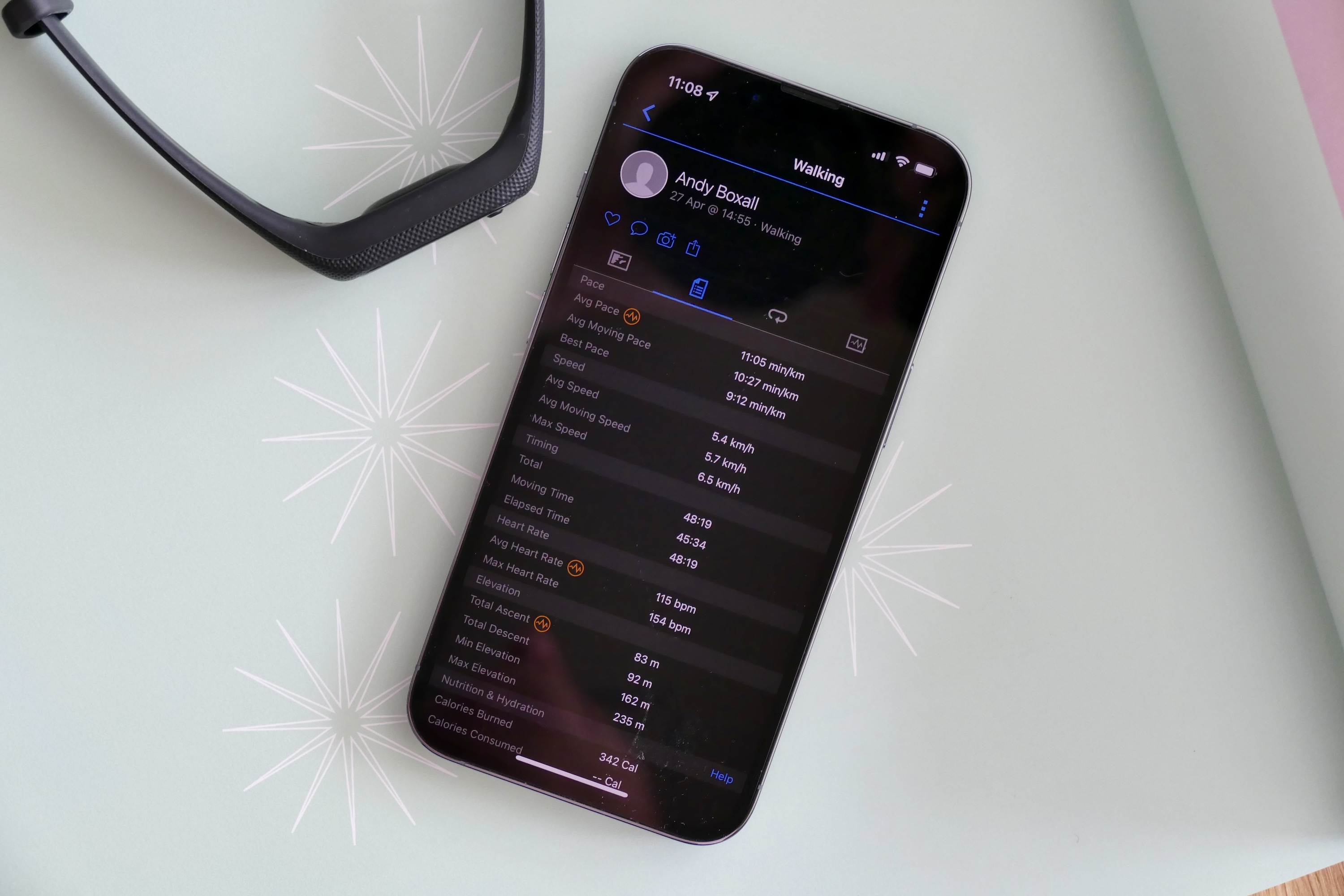
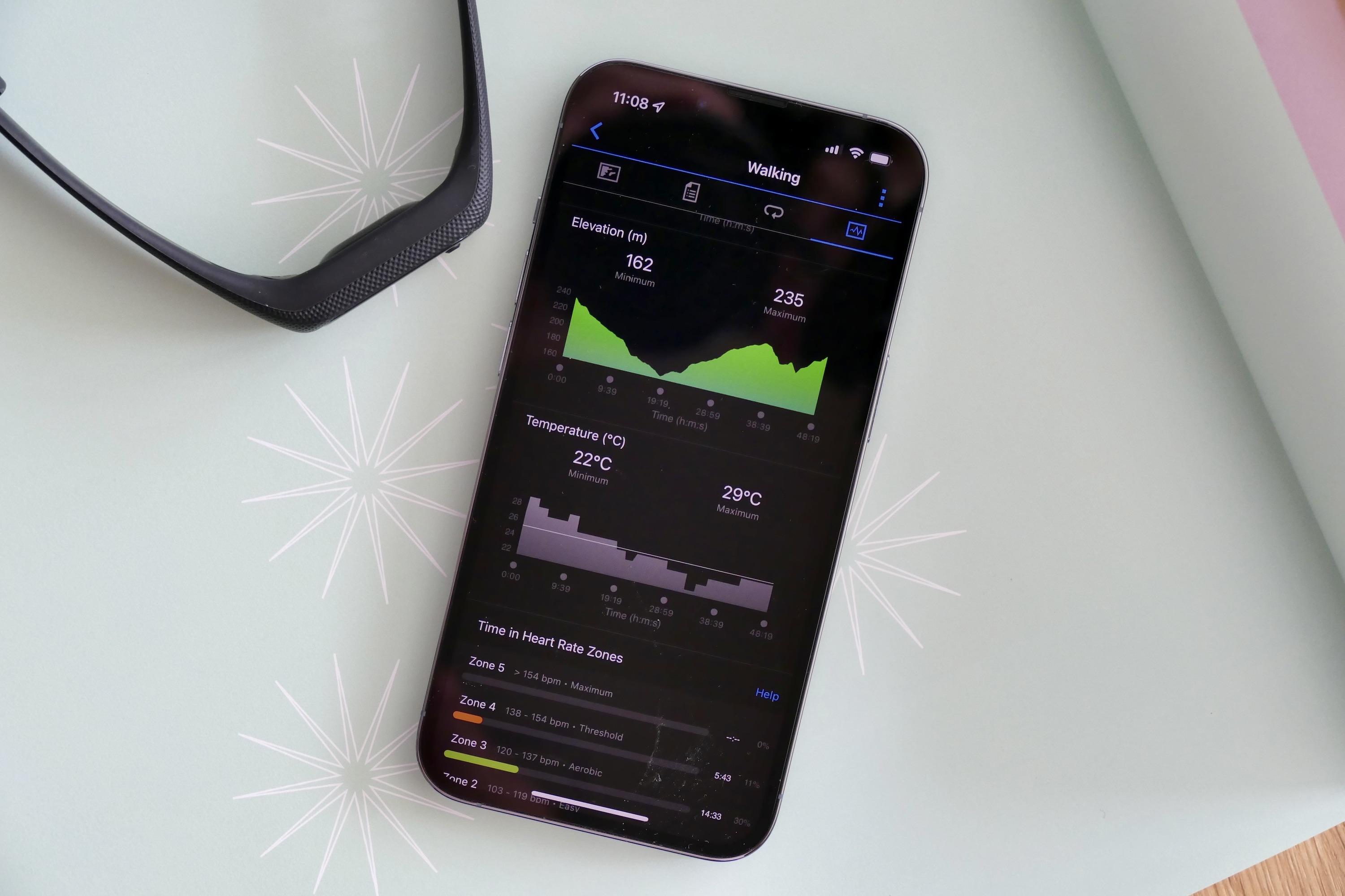
Tracking a 50-minute walk provides pace, speed, timing, and heart rate data, plus calories burned, average temperature, and workout intensity information. The Vivosmart 5 does not have its own GPS and relies on your phone’s GPS for location data. It connected to my iPhone, but it requires opening the app first if you don’t allow it to have access to your location all the time. Once the GPS connected, I could put my phone back in my pocket. The map plotted afterward adds pace information, a breakdown of laps, ambient temperature, and elevation to the overall picture of your workout.
There’s really everything you could want or need. Certainly for me, a casual exerciser, it’s total overkill. I take this to mean the more dedicated person will find all the information they could want. In addition to walking, the Vivosmart 5 has running, cardio, strength, cycling, pool swimming, HIIT, and a variety of other workout-tracking modes.
Goals can be set manually, but by default the platform automatically adds goals for you to meet. They are set quite low, and changing them means digging through various menus to find the option. Connect can be quite complex to navigate and there are various ways to find the same data, making it feel busier than it really is.
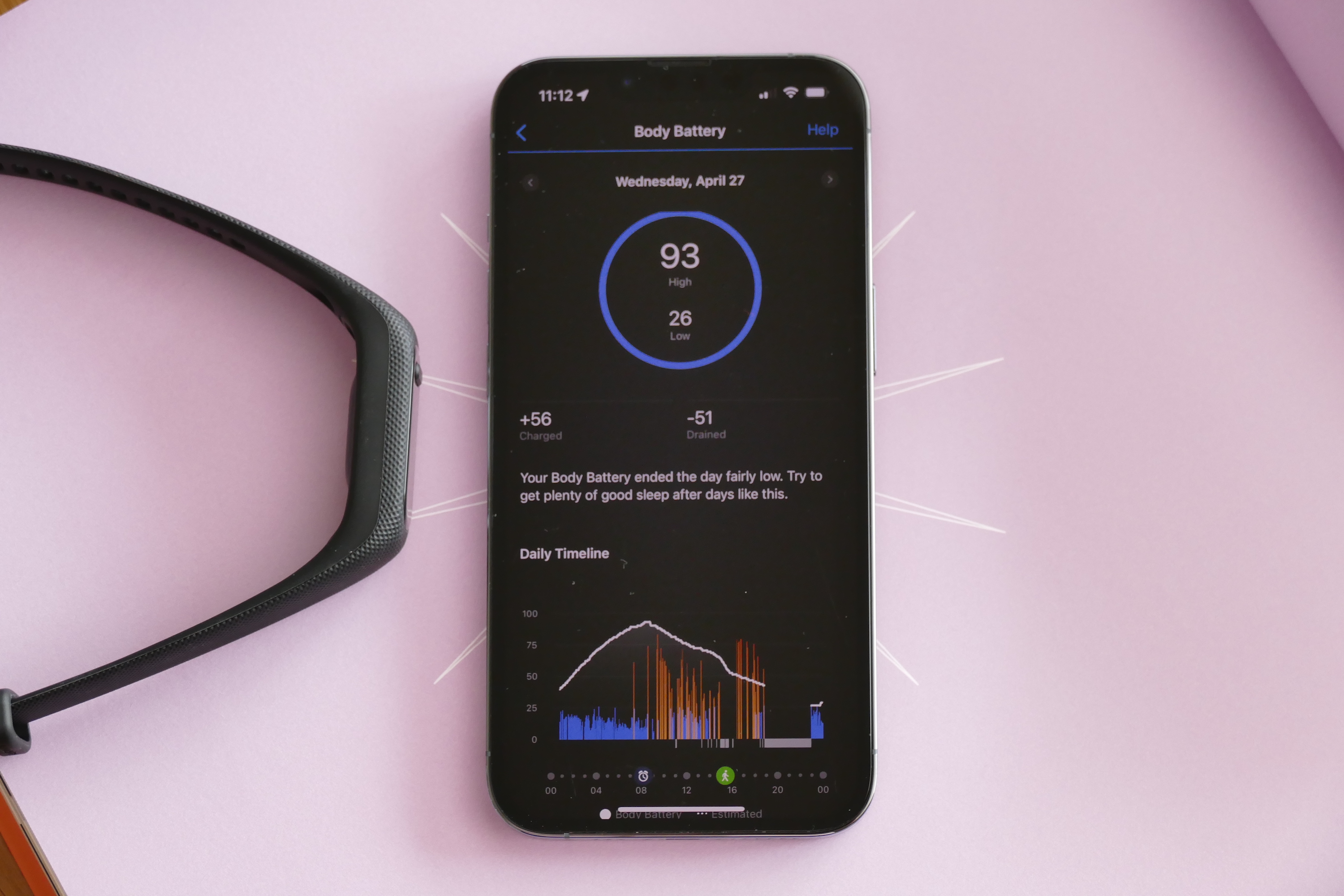
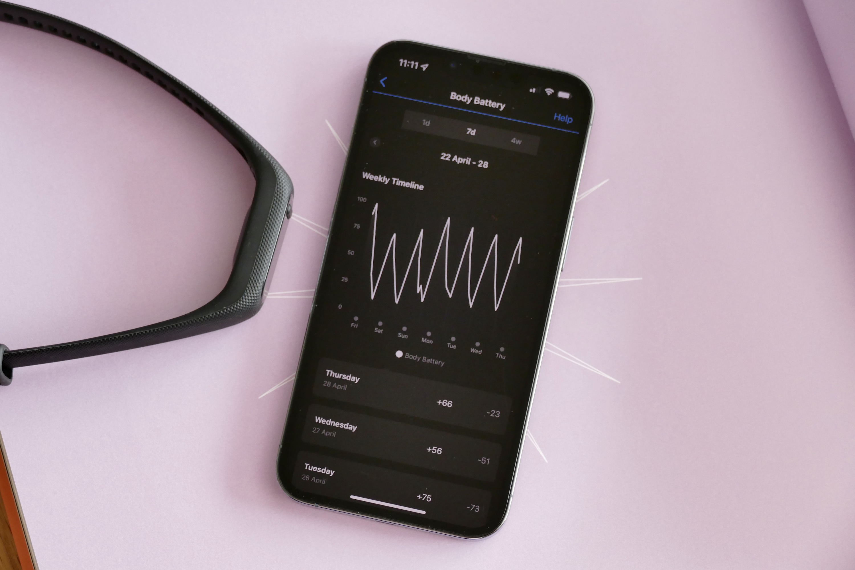
My favorite stat is Garmin’s clever Body Battery. It takes stress, sleep, and heart rate variability into account to help gauge your energy reserves for the day, and to better understand how much effort you’ve put into your workouts. It’s informative and simple to understand, and helps make sense of data that otherwise can get glossed over or ignored.
The only downside is there isn’t much motivational feedback, and while there is a lot of explanatory text about what all the data means, you do have to actively go looking for it.
Activity and sleep-tracking comparisons
Putting the Vivosmart 5 against the Apple Watch Series 7 when tracking a 40-minute walk, I found that both matched on the average heart rate and total calories burned, suggesting the accuracy across both devices is good. Across other workout types, the devices usually matched up too, but it’s important to have the Vivosmart 5 tightly against your wrist for precise heart rate tracking. If it’s even a little loose, it can misread, something that affects blood oxygen readings and heart rate overnight.
It’s this depth of data that makes wearing the Vivosmart 5 worthwhile, even if the design doesn’t initially make you keen to strap it on.
Comparing the Vivosmart 5’s sleep tracking with the Oura Ring, the Garmin tracker recorded a longer period of “sleep” than the Oura Ring, as it did not recognize when I was awake in the morning. However, the Oura Ring continues to think I’m awake during the night when I’m not, something the Garmin avoids.
The Garmin gave my 7-hour, 42-minute sleep a 95/100 sleep score, while the Oura measured 7-hours, 21-minutes for an 83/100 score. The heart rate estimate was very different from the Oura, with the lowest recorded being 9 beats per minute, which seems unlikely, as the Oura Ring didn’t see anything lower than 47brpm. The sleep-tracking discrepancy would almost certainly be cured by wearing the band more tightly, but I find this uncomfortable. Worn loosely, I didn’t notice the Vivosmart 5 at all at night.
Operating system and notifications
The Vivosmart 5 is controlled using a touchscreen and a single button on the front. Your current stats are all hidden under a branched menu, so you have to swipe and tap a few times to see them. Press the button to access the main menu and find workouts, as well as the heart rate measurement feature, a way to change the watch face, and set timers. It’s very responsive, and once you’re used to the layout, it’s fast to find what you’re looking for.

Notifications have arrived reliably, but there’s no way to interact with them, and due to the small screen, the formatting is usually off. It means they’re fine for a glance, but not much more. Plus, they can’t be recalled, so if you miss the alert, you can’t check to see what it was. Notifications are very much a secondary feature and don’t match the ability provided by a full smartwatch.
Battery
Garmin says the Vivosmart 5 will give you up to seven days of battery life. This is only if you decide not to activate blood oxygen monitoring and track your sleep. If you do track them, then expect a rather pitiful three days maximum with a single daily workout lasting 30-to-50 minutes tracked. On average, the Vivosmart loses about 15% battery overnight.

This is a problem because the Body Battery feature, which I really like and consider a big part of the Vivosmart 5’s appeal, takes your sleep into account. Also, blood oxygen levels are helpful for many different aspects of health tracking. Not using either or both of them feels like a bit of a waste. Put simply, Garmin’s seven-day battery estimate just doesn’t apply to anyone actually planning to use the Vivosmart 5 in the way it’s intended.
It’s charged using an included proprietary cable and takes a couple of hours to go from under 10% to full.
Price and availability
The Garmin Vivosmart 5 is available to buy now through Garmin’s online store for $150, or 130 British pounds, regardless of whether you get the small/medium or large version. You can choose a black, white, or Cool Mint color, and purchase a replacement band for $30 or 25 pounds.
Our take
The Garmin Vivosmart 5 is all about the Garmin Connect platform. The fitness tracker itself is very plain to look at, but there’s beauty in the data it collects and presents in the app. The tracker has a simple-to-use touchscreen and button-controlled interface, and while the app is data-dense, it’s unlikely you’ll be left wanting more from it.
It’s this depth of data that makes wearing the Vivosmart 5 worthwhile, even if the design doesn’t initially make you keen to strap it on. Because it’s so comprehensive, there’s plenty of scope for the future should your fitness level improve and you find yourself wanting to do more or try new sports. This is also true for the hardware itself, which has all the right sensors to keep track of your health over time.
It’s easy to use and inconspicuous on your wrist, and I’ve found the insights it provides interesting and helpful. It’s just a shame that the design is terribly generic, and that the battery life is too short when you take advantage of its full ability.
Is there a better alternative?
Yes, if design matters to you. The Vivosmart 5’s boring look puts me off, and I’d rather wear the Vivomove Sport smartwatch. It uses the Garmin Connect platform so you have access to all the same excellent data, plus it has the same sensor array, all inside a far more attractive watch-style case. It’s only a little more expensive at $180, or 150 pounds.
If you’re set on a fitness band the Fitbit Luxe has similar specs for the same price, and the more expensive Fitbit Charge 5 comes with onboard GPS, but you will have to pay the monthly subscription for access to all your data. If you want to spend less money on a fitness band, take a look at the Xiaomi Mi Band 6 or the Honor Band 6.
How long will it last?
The Garmin Vivosmart 5 is made of polycarbonate and silicone, so it should prove hardwearing, plus it’s swim-proof for use in the pool. You shouldn’t have any problem with durability. Provided the Garmin Connect software is supported long-term, which I imagine it will be, the Vivosmart 5 should last for many years.
Should you buy it?
Yes. The Garmin Vivosmart 5 may not have much style, but the excellent Garmin Connect software makes up for it, and you’re not charged extra to see all your data.


