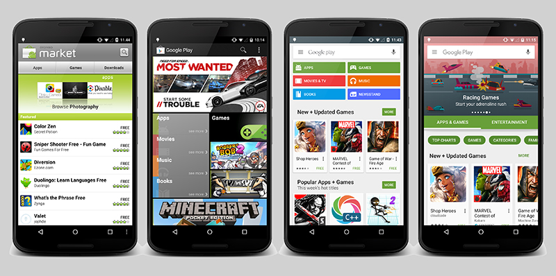

It looks like the bulk of the update happens on the server side — so you don’t necessary have to update your Play Store app to be able to see it — and if it’s not reached your part of the world yet, then it soon will. One of the most notable changes is the use of new “highlights” banner graphics at the top of the interface, showing off new releases, particular categories of apps, and so on.
TechCrunch speculates that Google might be waiting until most users have access to the new Play Store before making an official announcement about it — presumably the engineer in question has been given permission to share these new grabs ahead of time. The update includes the new Google logo and switches to a horizontal scrolling approach; there are also new animations to improve the visual fluidity of the app.

The Google Play Store has certainly come a long way since the early days of the Android Market, with Google gradually turning it into a more iTunes Store-style portal, with movies, music and ebooks on sale alongside mobile apps (Grouchnikov has been on the team for six years, apparently). Now all Google needs to do is work out how to make money from it — the most recent statistics suggest Apple’s App Store generates 80 percent more in revenue for its developers.
If you’re an Android user, keep your eyes out for the update appearing on your smartphone or tablet in the coming days. If Google says anything official about the new look, we’ll add it here.


