Samsung has a reputation for being one of the slower companies to update to the latest versions of Android, but it might be intending to change that with Android 10. If you’re in the U.S., and you own either the Galaxy S10, S10 Plus, or the S10e, you have a chance to access the beta for Samsung’s new Android 10 skin — One UI 2.0.
To sign up for beta access, you’ll need to head over to the Samsung Members app on your S10, S10 Plus, or S10e, and sign in or sign up for an account. Of course, keep in mind that slots are limited, so you’ll need to get on it quick. Also, as it’s a beta, you can expect to come across plenty of bugs — so only sign up if you don’t mind dealing with such things.
What can you expect from Samsung’s newest Android skin? Here are some of Samsung’s headline features in the current beta. (Remember, it’s early days yet, so you can expect more to be added as time goes by.)
Streamlined notifications
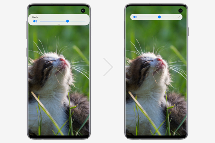
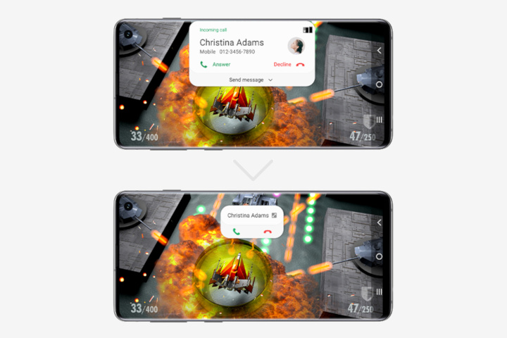
Phone screens are getting larger and larger — but that doesn’t mean notifications have to increase in size too. The new One UI is helping to make notifications and pop-ups less intrusive by making them smaller in size across the board.
You can see two examples of this in the gallery above. The first set of images shows what beta participants can expect from a revamped volume slider. While not an earth-shattering change by any means, by freeing up the real estate above the slider itself, Samsung has reduced the amount of space required. It’s currently unknown whether the picture of the cat also pops up, but we can certainly hope so.
The newly redesigned call notification is a far more dramatic change. Samsung has removed all superfluous elements from the pop-up, including the profile picture, number, and the ability to send a message from the notification itself. Almost all of the text has also been excised, leaving an extremely basic notification — but one that’s still obvious. There’s also an icon to tap that will presumably size it back up into the more informative version — just in case you actually wanted to see all that info.
Dark mode and Smart Lock
Somewhat fittingly for October, Dark Mode is finally coming to Samsung’s phones. The new One UI will add a systemwide Dark mode, so you can use your phone at night without blinding yourself. As less of the AMOLED display will need to light up, it will also come with small battery benefits too.
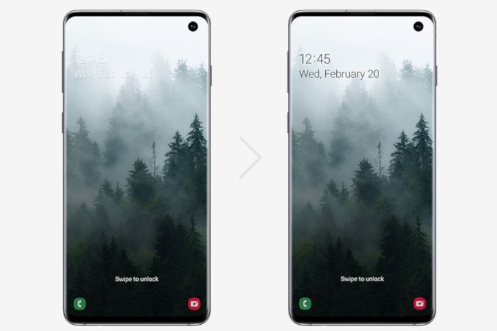
The other addition, Smart Lock, is more subtle — but no less welcome. Smart Lock will ensure you’re always able to read the text on your lock screen by changing the text color to match your background. Light backgrounds will get a darker text, while darker backgrounds will — you guessed it — get white text. We’re looking forward to seeing how intelligent the system is — will it be able to adapt text color to take on black-and-white stripes, for instance?
Digital Wellbeing & Focus Mode

Google recently laid down the law: New devices and those updating to Android 10 must have access to Digital Wellbeing tools. That’s probably why we’re seeing Digital Wellbeing in the new One UI beta. One UI will now track your usage, breaking down which apps you’re using the most, and how much overall screen time you’re getting. Need to break away? One UI’s new Focus Mode is here to help you go cold turkey. Just activate Focus Mode and certain apps will be paused temporarily — helping to keep you in the zone, and stopping you from getting distracted.
That’s all we know about Samsung’s new One UI for Android 10, but with Samsung’s Developers Conference coming at the end of the month, you can be sure we’ll be hearing more very soon.


