I recently came across a research paper published in the Frontiers in Behavioral Neuroscience journal. It mentioned the benefits of writing on paper compared to digital screens, like tablets, and how it can help you better remember critical information.
In simpler terms, writing on paper is associated with higher brain order functions as it creates a more intimate memory that can also be easily recalled. “The unique, complex, spatial and tactile information associated with writing by hand on physical paper is likely what leads to improved memory,” the researchers explained.
Why am I telling you all of this? Because that’s precisely the benefit you get with the Onyx Boox Go 10.3.
What exactly is the Onyx Boox Go 10.3?

To start, I hate the name, but bear with me. The Remarkable has been out there for a while. The Kindle Scribe has its own set of fans. But the Boox Go 10.3, from a relatively unknown brand called Onyx, is a cut above the rest.
It is hands down one of the most excellent pieces of hardware I have ever seen. Just take a look at how absolutely thin it is — and it’s amazingly light. For the logophiles out there, it is just 4.6 millimeters across and weighs 375 grams.

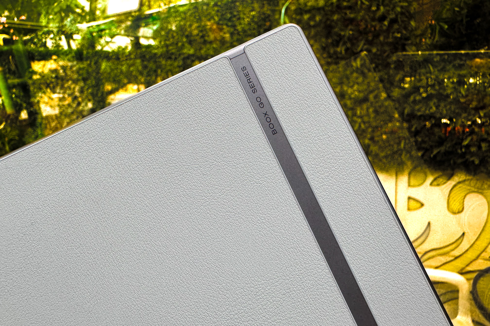
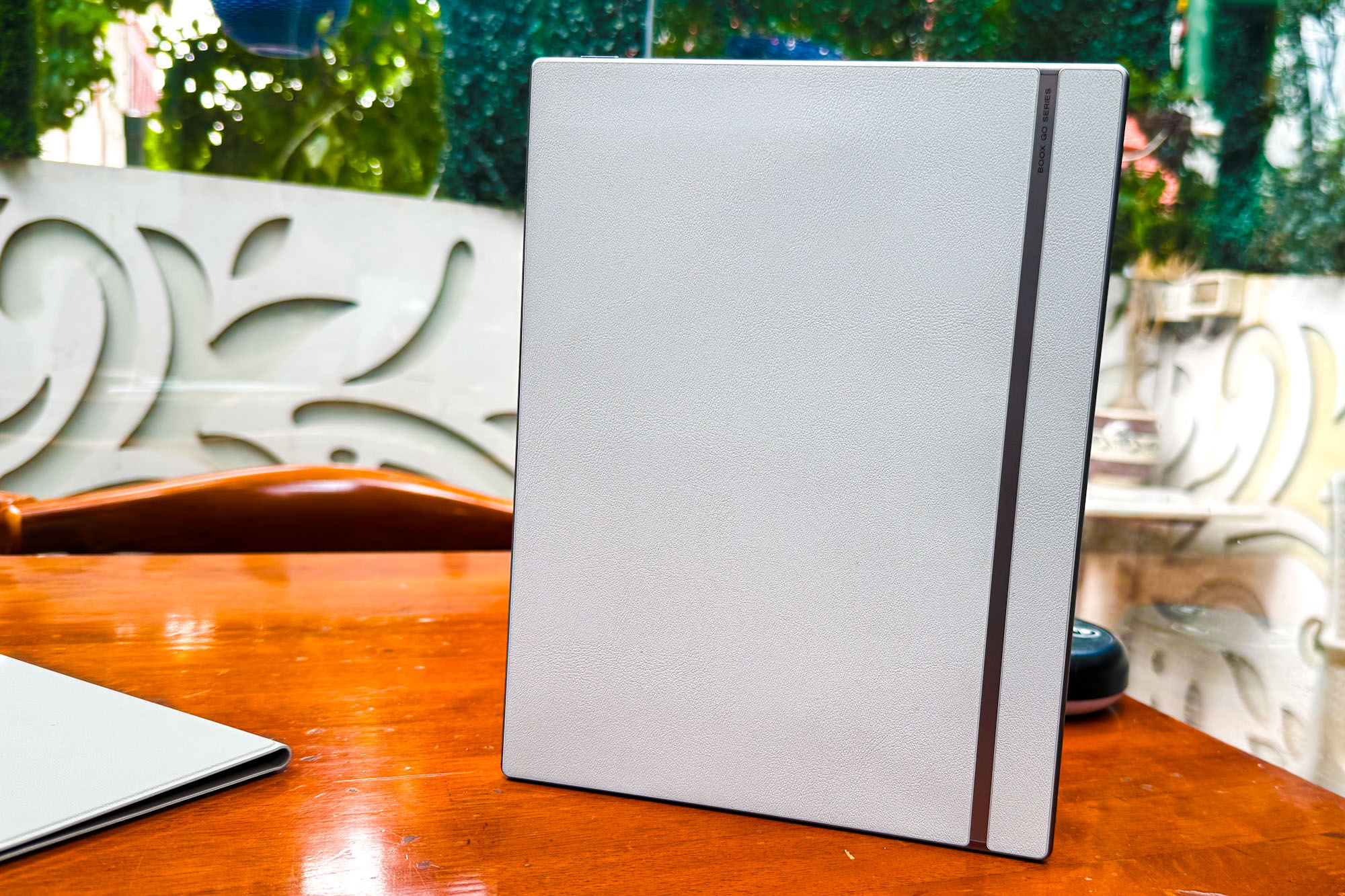
Onyx went a step ahead and hammed down the “feels like paper” idea. Over at the back, you get a lovely faux leather finish with a sleek metallic luster strap breaking the monotony, aping the look of some premium notebook worthy of gift shop stands.
I’ve tried about a dozen devices with vegan leather or faux leather finishes. But the work done on the Onyx tab feels the least flimsy and looks like it can handle rough usage for the next few years. The frame is metallic and has a nice curve to it.

Then there’s the magnetic stylus, an all-white specimen with vertical grooves for extra grip, somewhat like those pricey Sakura or Artline pens for architects. It doesn’t need charging or pairing shenanigans and just works straight out of the box.
But the real gem of this whole kit is the leather sleeve. This one also has a leather-like texture and a groove inside that lets the tablet prop up like a reference screen, acting as a kickstand for consuming content.
It also comes with a matching flap that features really strong magnets and keeps the pen locked in place. That’s a thoughtful touch, as you don’t have to worry about misplacing or losing the stylus.
A unique and lovely display

Over at the front, we get some sizable bezels that allow enough space for a secure grip. It’s a lovely white-gray look that shines under natural light. I can’t stress this enough, but this is one of my favorite designs of all time.
It is exquisitely built, sturdy where needed, and with the right pinch of luxurious leather thrown into the mix. It puts iPads, Kindles, and Remarkables to shame with sheer finesses. Fantastic job, Onyx!

The display is a reverse vampire situation. Under light, the Onyx Boox Go 10.3 is a fantastic device. In the dark, you may as well just put it back in the bag. That’s because it’s a reflective screen, not backlit or front-lit. Underneath the shell is a 3,700mAh battery.
Now, let’s focus on the panel itself. It needs external light, which is then reflected off the Carta 1200 display to give the semblance of a monochrome display in your hands. “Made for sunlight,” says the company. Thankfully, the pixel density is a respectable 300ppi.
For comparison, the 10th-gen iPad has a pixel density of 264ppi. Shocking, right? On the Onyx slate, the screen isn’t glossy, which means there is minimal glare issue to be seen here. Moreover, the surface texture makes it much easier to jot down notes or scribble doodles than the smooth glass screens on Apple and Android tablets.

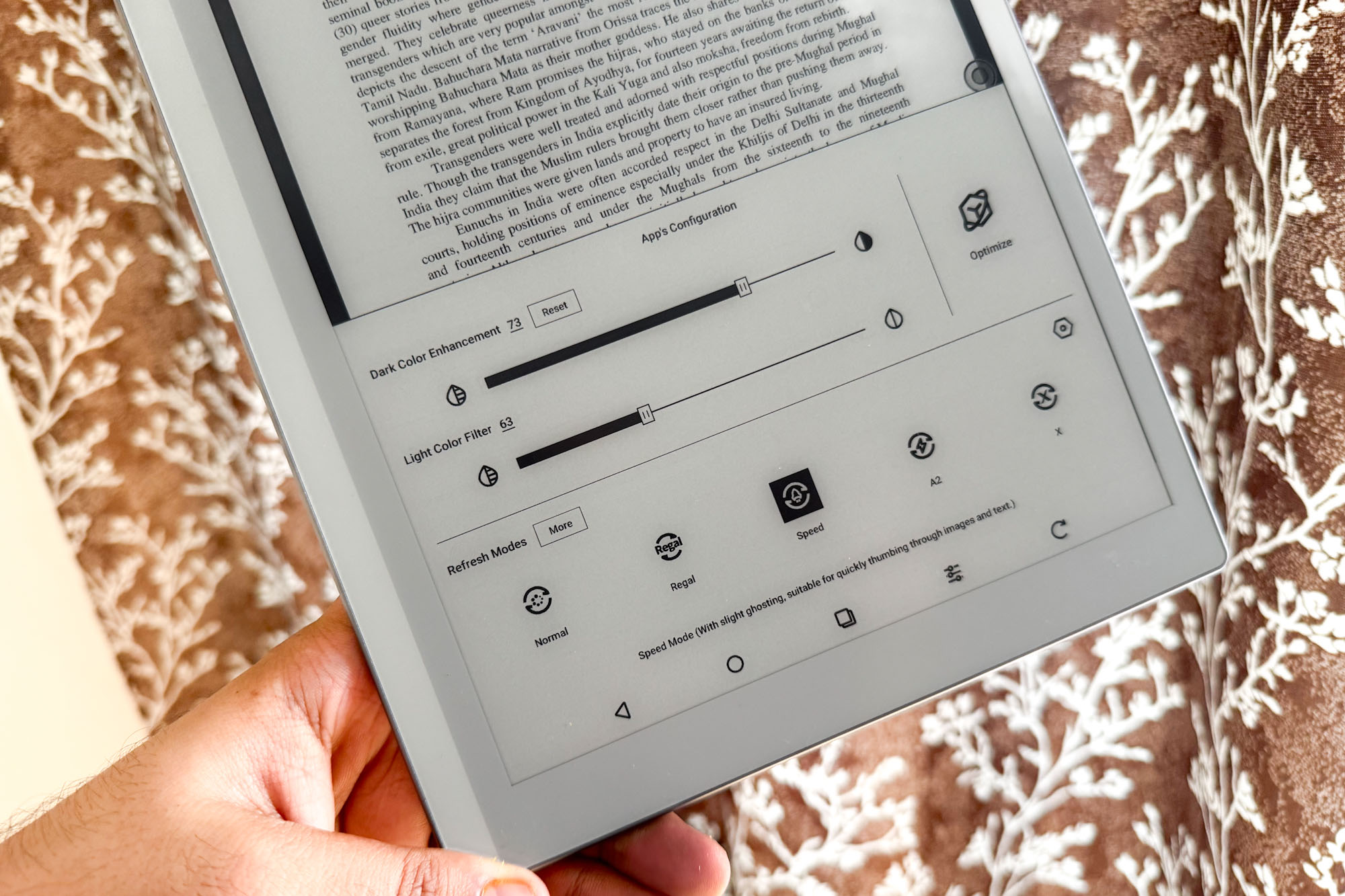
Overall, it’s a lovely screen for reading and taking notes. But what truly makes the Boox tablet special is the deep level of visual customization available. For a tablet with a “basic” monochrome screen, there’s only so far you can go with the adjustments.
I want to mention here that the stylus offers a near-lag-free experience, whether you’re sketching, taking notes, or just scribbling on documents. It traces hand movements remarkably well and with reliable palm rejection. But ghosting is still a problem on e-ink screens like this one, and the slow refresh rate doesn’t help. Thankfully, on the Boox Go 10.3, you can adjust the screen refresh parameters to a healthy extent.
For example, you can adjust the drag-based screen refresh duration, change the refresh frequency based on click count, play with dark and light color intensity, enable image smoothing for content like comic books, and even specify the depth on a per-app and per-item basis.
So much to customize

In addition to DPI adjustments, there are animation filters and font de-aliasing quick toggles. For most scenarios, however, the five system-level presets for refresh mode adjustment automatically change the way content looks and how smoothly you can scroll between pages.
For books, there isn’t much of a hassle to get the best reading experience. But during web browsing, it hinges on the page layout, color scheme, and how multimedia-heavy it is. It is for such scenarios where you have to fiddle with some toggles and sliders.

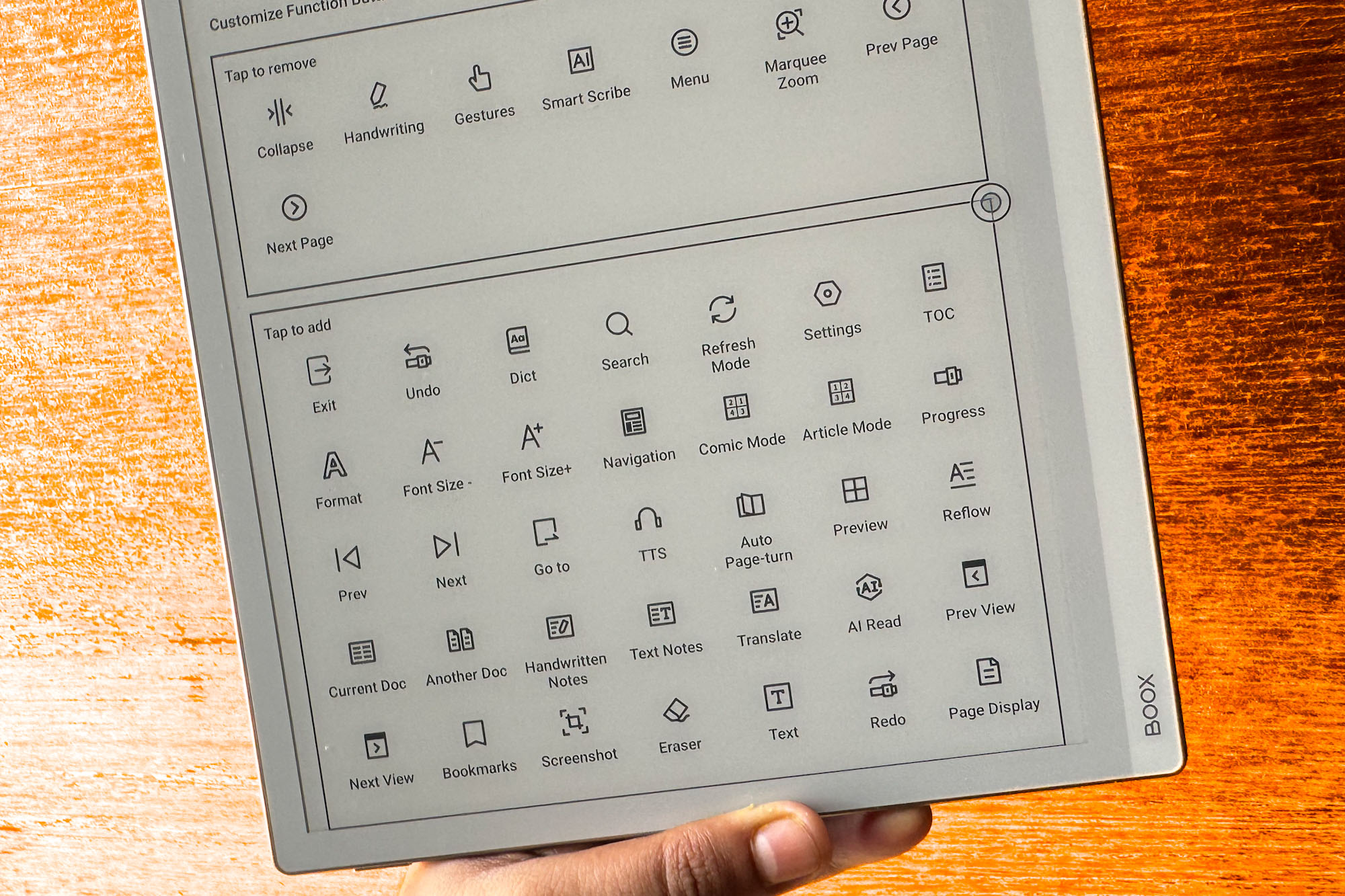
Thankfully, all these controls are just a swipe away. The real note-taking gems and viewing controls are hidden in the Boox NeoReader app, one of the most feature-loaded reading applications I’ve come across.
The latest Boox firmware update finally added a color invert, aka dark mode, and it looks really lovely. A clean, built-in translation mode opens both text versions in split-screen mode. You can even choose your translation engine: Boox’s in-house version, Microsoft’s Bing, or Google Translate.

There’s also an in-built OCR system for scanning content on the screen, though you only get five attempts each day. The built-in AI Smart Scribble features take some inspiration from Apple, offering tools like shape correction, scribbling marks, scribble erase, and circle marking.
To my surprise, the tablet also comes with a smart lasso feature reminiscent of popular editing software like Adobe Photoshop. It is complete with your usual set of copy-paste and progress shortcuts. It works reliably and lets you choose between fixed shape and free selection modes.

Talking about convenience, three-finger swipes work smoothly for screenshots. Another excellent feature addition is what Boox calls FreeMark. As the name suggests, you can scribble notes anywhere on the tablet. With a quick tap, these scribbled pages can be turned into screenshots that are automatically added to the system gallery. The implementation is flawless and takes the whole purpose of note-taking to an altogether different functional level.
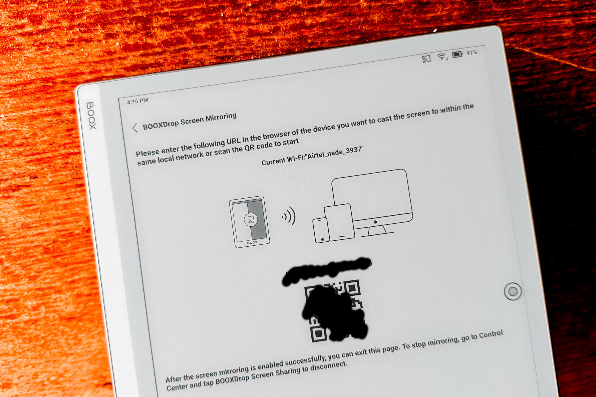
Boox has developed a screen mirroring tool that lets you flash the tablet’s screen to any other computing device. All you need to do is ensure that both devices are tethered to the same network.
Yes, it’s also an Android tablet

The best part, however, is that the Boox Go 10.3 is based on Android. It runs
The whole point of building software on top of Android is the near-unlimited flexibility you get, from expanded sharing controls and app versatility to perks like Google auto-fill for quick sign-in and access to everything in the cloud that your Android phone can access.

That also means you get access to core Google apps and, with it, communication apps, as well as personal or workplace ones. Who doesn’t love a Slack notification when they are deep into the final act of a gothic romance novel on a monochrome tablet?
It can also play YouTube videos. Yes, you can make sense of what’s happening on the screen in the same way as watching a black-and-white broadcast on a boxy TV in the 1970s. The speakers, however, are surprisingly clear and loud.

There’s an octa-core processor inside the tablet, paired with 4GB of RAM and 64GB onboard storage. For all customers — new and old — Boox offers 10GB of cloud space. That’s a lot of space for saving books, notes, and anything in between fitting for a “reader” tablet.

You can multitask, run apps in split-view mode, or scroll the web. It’s just that the e-ink screen keeps things from looking buttery smooth because it just can’t refresh the on-screen content at the same pace your fingers are gliding on it. There’s a slight delay in almost everything, but not enough that you do it a second time over.
The point here is that this is a note-taking tablet. And a fantastic one at that. It’s just a monumental bonus that you get access to full-fledged Android. Make the best of that flexibility with a slightly modest approach.
The Boox Go is a special one

The Boox tablet is remarkably better than the Remarkable (ha!), Amazon’s Kindle Scribe, or any other tablet dedicated to reading and note-taking. This one retains the joy of scribbling with an irresistibly sweet fusion of Android smarts.
At $380, that’s a great deal, even from a comparative lens. But here’s the nicer part. For that price, you get the lag-free stylus with a bunch of extra tips and the grand cover alongside the stylus. Combine that with the fact that the Onyx Boox Go 10.3 is one of the most unique tablets out there, and what’s not to like?

