“The Realme 10 Pro+ has two-day battery life, great everyday performance, and improved software. But beneath the sparkly back, it lacks that something special to make it a winner.”
- Two-day battery
- Great general performance
- Stereo speakers
- Lightweight and eye-catching design
- No water resistance
- No wireless charging
- Wide-angle camera disappoints
What phone should you look at if you want reliability, long battery life, an acceptable camera, and a design that reminds you of the very best flagships from a few years ago?
You turn to Realme, which continues to make good phones at reasonable prices, with the new Realme 10 Pro+ being no exception. It has been my main phone for more than a week, and while I like it, I don’t love it — and that’s a problem. Here’s a closer look at why that is.
Realme 10 Pro+ design

The Realme 10 Pro+ you see in our photos is in the Hyperspace finish, which according to the company, has a “prism acceleration pattern” and “nebula particles.” This, in language we can understand, means the rear panel has a glitter ball effect and is also quite sparkly. It’s not the most masculine of finishes, but it really catches your eye and, in the right light, looks colorful and fun. It reminds me of the amazing work Huawei did to make the P30 Pro stand out like it did.
If the Hyperspace finish isn’t for you, then the Realme 10 Pro+ comes in Dark Matter (black) and Nebula Blue, a color-shifting blue that also recalls Huawei’s efforts. These comparisons are compliments, but unlike Huawei’s top phones, Realme has used plastic for the rear panel and not glass. This does help keep the phone lightweight at 173 grams, and the 7.78mm thickness makes the Realme 10 Pro+ slim and manageable. The sides are sharply tapered, but using the flexible TPU case included in the box prevents it from becoming uncomfortable to hold.

Realme doesn’t mention Corning Gorilla Glass, but does say the glass on the front is double-reinforced for strength and that the phone can survive drops from around one meter without cracking. Unfortunately, there’s no mention of water resistance at all, so you’ll have to be careful with the Realme 10 Pro+ if you want it to last.
Narrow bezels give the front of the phone a modern look, and although the dual camera modules on the back look a little small to my eye, they don’t dominate the design, leaving the sparkling Hyperspace finish to do all the talking. While the durability may not quite meet our expectations, the Realme 10 Pro+ looks excellent.
Realme 10 Pro+ camera

A 108-megapixel main camera leads the charge, followed by an 8MP wide-angle camera and a basic macro camera. There’s also a 16MP selfie camera set at the top center of the screen. This is exactly the same camera setup on paper as the Realme 9, released in April of this year, but here it comes with some additional software tweaks to justify calling it new. Realme says the camera has 9-in-1 pixel binning, improved dynamic range, better A.I., more speed, and improved algorithms for portrait shots, group shots, and night images.
It’s all about the main camera here, as the wide-angle camera is a disappointment and the macro camera is a waste of time. But even the main camera has its problems. In great conditions, it performs quite well — with pleasing colors and contrast, lots of detail, and enough pop that you would be happy to share the photo without editing. But other times, it exposes shots badly and amps up colors to the point where they no longer look natural.
The wide-angle camera is worse, and most of the photos I’ve taken with it have been muddy, blurry, noisy, and poorly focused. The awful 8MP camera joins the 2MP macro camera as filler on the back of a phone. Night mode shots are fine, but there’s a lot of smoothing going on to make them look acceptable, and the 3x zoom shortcut in the camera app leads to a digitally zoomed image of questionable quality.
Yes, the Realme 9 Pro+ has three cameras, but you’ll only really want to use one of them. And even then, the results will vary.
Using the Realme 10 Pro+ every day

The big 6.7-inch, 2142 x 1080 pixel AMOLED screen has a 120Hz refresh rate, is curved down the sides, has narrow bezels, and uses clever technology that reduces flicker even when the display is dimmed down. With a maximum of 800 nits, it’s not especially bright, and although it has been fine during the gloomy early winter days here in the U.K., I’m not sure how it will perform during the summer. Viewing angles are good, but the display’s color accuracy does diminish when you reach extreme angles.
MediaTek’s Dimensity 1080 is a strong performer. I play Asphalt 9: Legends and haven’t noticed any serious slowdown or frame rate problems, and it was as fun as always. The chip also keeps the software running smoothly, and I’ve had no problem opening and swapping between apps as the 12GB of RAM is great for multitasking.

For everyday use, and for general gaming, the Realme 10 Pro+ is a fine companion. It’s efficient, too, with 30 minutes of gaming depleting around 8% of the battery, and 30 minutes of YouTube taking even less than that (even with both at full brightness). Dual stereo speakers make games and video enjoyable, and although there’s not much bass, you don’t have to adjust your grip because you’ve mistakenly covered up a single speaker.
Using the phone normally, with between two and three hours of screen time per day, I’ve got at least two full days of use out of the 5,000mAh battery before it needs a recharge. Plug it in with the supplied 67-watt SuperVOOC charger and cable, and the battery will go from zero to 100% in around 50 minutes in my tests. While clearly fast, this isn’t as fast as some other Realme phones, or the best from OnePlus and Oppo. There’s no wireless charging either, which is a disappointment.
Realme 10 Pro+ software
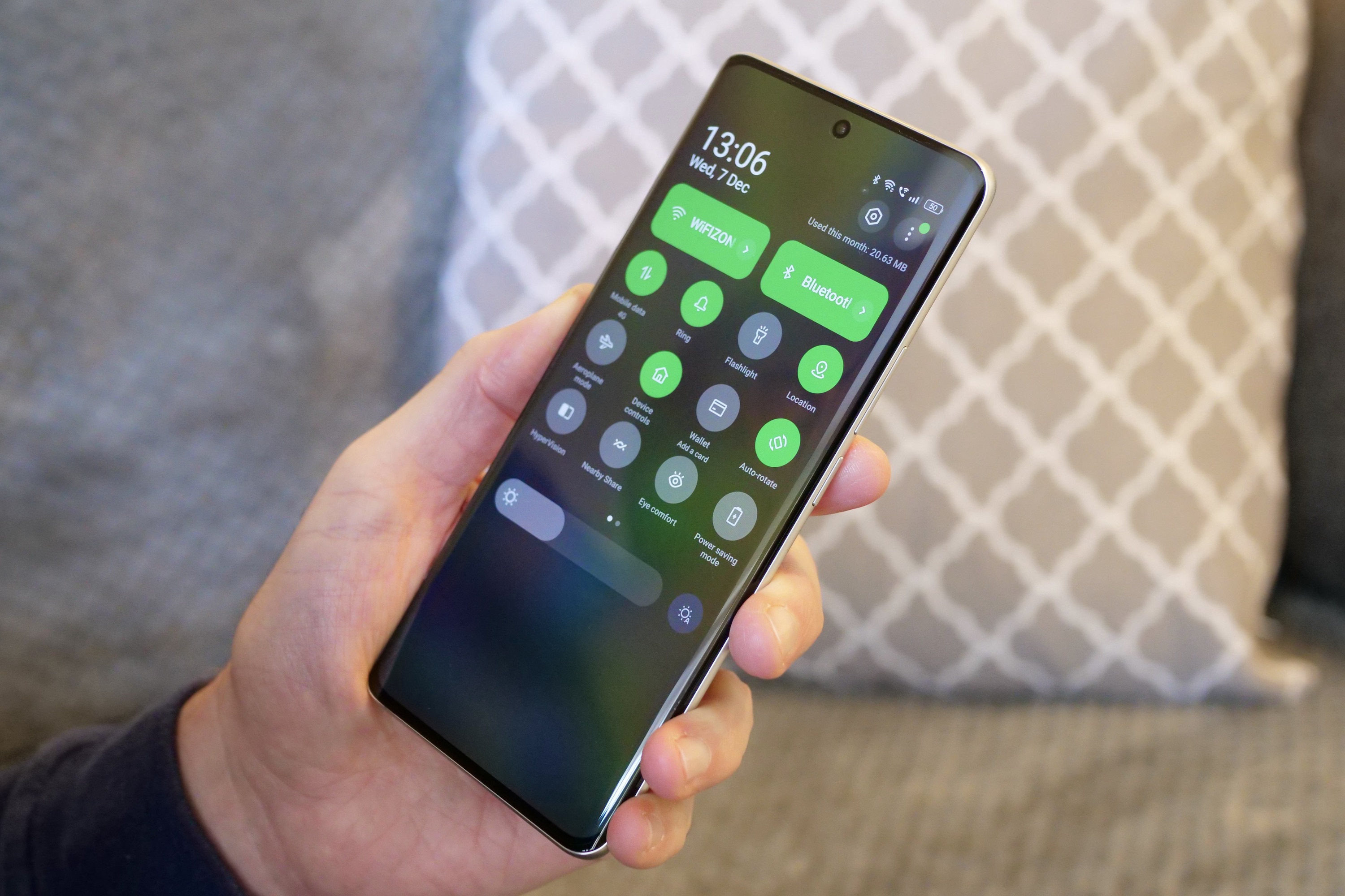
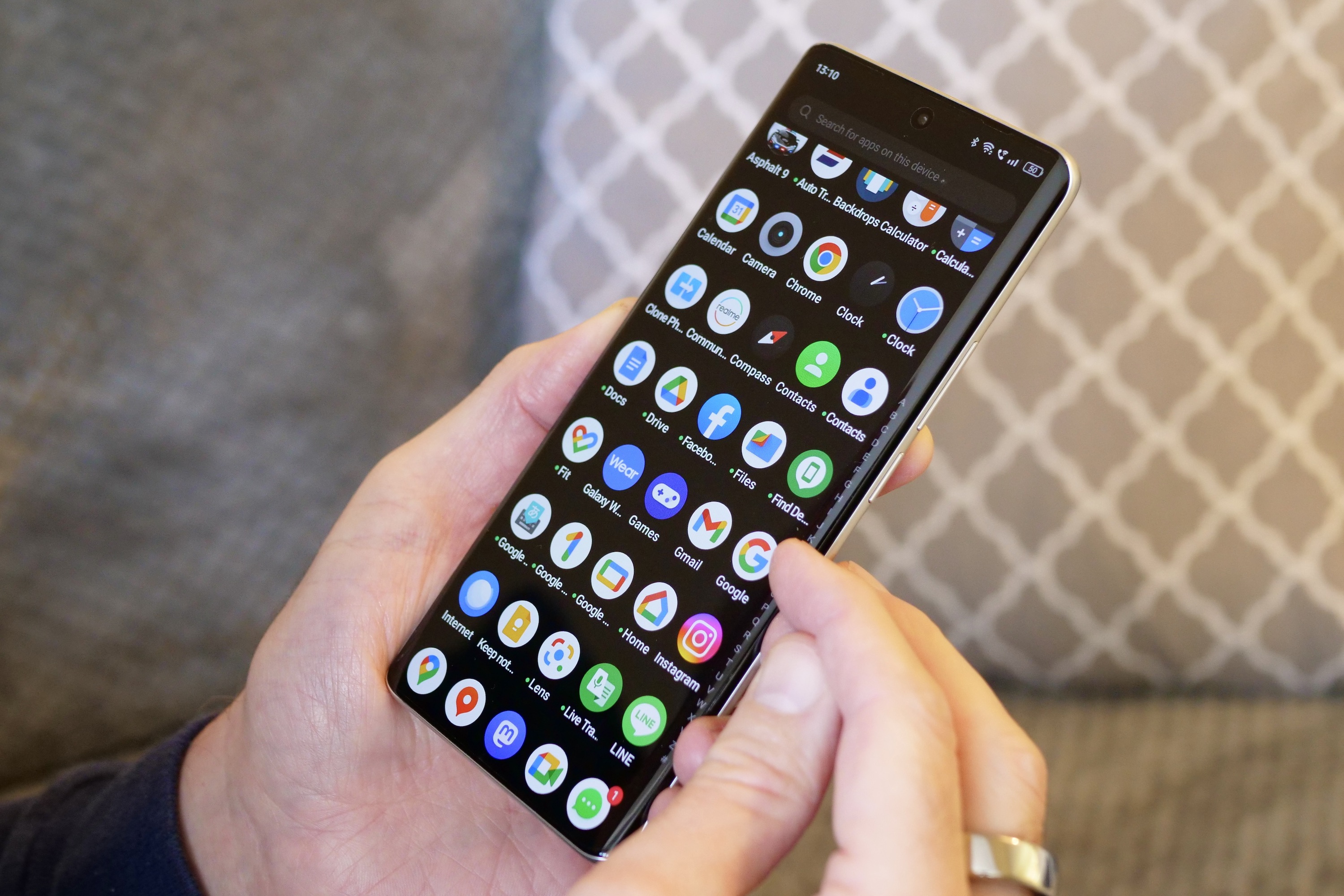
You get Android 13 with Realme UI 4.0 installed on the 10 Pro+, and it’s the first phone from the brand with the latest version of its software installed out of the box. I’ve not really been a fan of RealmeUI and Oppo’s ColorOS (they are basically the same) due to their endless nannying, irritating apps, and inconsistent design. But some real improvements have been made here.
For a start, it has not bothered me with notifications for this and that during the first few days of use. It has simply got on with things itself, and let me do the same. The new control center looks great, and the icons appear more consistent and are easier to recognize at a glance. These sound like small changes, but together they make the phone faster, simpler, and less annoying to use.
Problems still exist, though. For example, why the always-on screen notifications refuse to show the latest email from Outlook, preferring to show an older message instead, I’ll never understand. It’s fine with WhatsApp, so I can only assume it’s a compatibility problem with Outlook. Overall though, Realme UI 4.0 is an improvement over older versions. However, it’s still not as pleasurable, logical, or as attractive as Samsung’s OneUI or Google’s version of Android on a Pixel.
Realme 10 Pro+ price and availability
The Realme 10 Pro+ won’t be available in the U.S., but Realme has provided its “global” price in dollars. The cheapest 8GB/128GB version is $379, the 8GB/256GB version is $399, and the top 12GB/256GB version is $429. There is no final release date for the phone yet, and no details on whether it will be released in the U.K.
Its biggest competitor is the Google Pixel 6a, which costs around the same, but offers a far better camera, great everyday performance, and a really pretty design. The Samsung Galaxy A53 5G costs a little more, but has water resistance. The Nothing Phone 1 should be another consideration, with its cool design, no-nonsense camera, and excellent software. I’d choose any of these three over the Realme 10 Pro+.
The reason to buy the Realme 10 Pro+ is …

I want to give you a reason to buy the Realme 10 Pro+, but I’m not sure I can. It’s a solidly built, (mostly) attractive, and capably performing smartphone with a battery that lasts for a couple of days. That makes it a good smartphone, and on the surface, a good purchase too. I really don’t think you’ll be disappointed if you buy it either; I’ve certainly not been desperate to stop using the phone, or found problems that make me want to throw it out the window.
The issue is it doesn’t do anything new and alluring. Realme pushes the screen’s special 2160Hz PWM Dimming mode as one of its standout features, but it’s not really something I’ve noticed working during my use. I came from the Pixel 7 Pro and Galaxy Z Fold 4, neither of which have the same dimming technology, but I couldn’t have told you the Realme phone had it. Its presence is likely beneficial, but the lack of water resistance and wireless charging, as well as the inconsistent camera, are far more impactful to everyday use.
I like the Realme 10 Pro+, but the competition around it is considerably more appealing, and I don’t think Realme has struck quite the right balance between genuinely helpful features and cost. If the 8MP wide-angle camera is the best it can do, I’d rather see that and the macro camera disappear, potentially making room for water resistance and wireless charging on the budget sheet. It’s decisions like this that would make the Realme 10 Pro+ stand out, as at the moment, when you take away the sparkly rear panel, it’s all a bit ordinary.


