“The Gear S3's release is imminent, but the S2 remains a beautiful piece of industrial design, and a decent smartwatch.”
- Beautiful round design
- Elegant, fluid user interface
- Rotating bezel is a true innovation
- 2-3 day battery life
- Barely any usable apps
- Reactivation Lock is buggy
- Fitness functions are very limited
Smartwatches have gotten better and better looking since the the Gear S2 watch first blew us away at the 2015 IFA trade show. Maybe it was the Berlin goggles, but Samsung’s was the best-looking, easiest-to-use watch we had ever seen, from an interface standpoint. And over time, the watch’s beauty held out. In many ways, the Gear S2 was the best Samsung product in years. Unfortunately, since strapping the final version of the watch on our wrists — and over the months since then –the experience hasn’t been all daisies and daffodils.
Samsung has updated the software to address some of the bugs we detected last fall and has released a handful of key apps — including Samsung Pay support for Uber. These improvements to one of the most compelling smartwatches yet are great; the company seems to finally understand why folks might want a watch at all. But concerns about usability remain, and ultimately, there’s no killer app that makes this a must-have device.
Updated on 10-03-2016 by Jeremy Kaplan: Updated to reflect bug fixes and new apps, and added experiential testing with the S Health app.
Beautiful and comfortable
The user interface of a watch is important, but an attractive and comfortable design is more important. Watches are fashion statements, and no one wants to wear something crappy or huge just for some notifications. A lot of post-Apple Watch wearables are looking more acceptable on the wrist, but the Gear S2 is one of the best-looking, best-sized smartwatch yet. That said, the competition in recent months has gotten quite stiff. The Huawei Watch is better looking, for example, though the interface is less intuitive and elegant. And the Gear S3, which should be released shortly, promises competition and adds some crucial missing features, though Samsung says it is will not replace the S2.
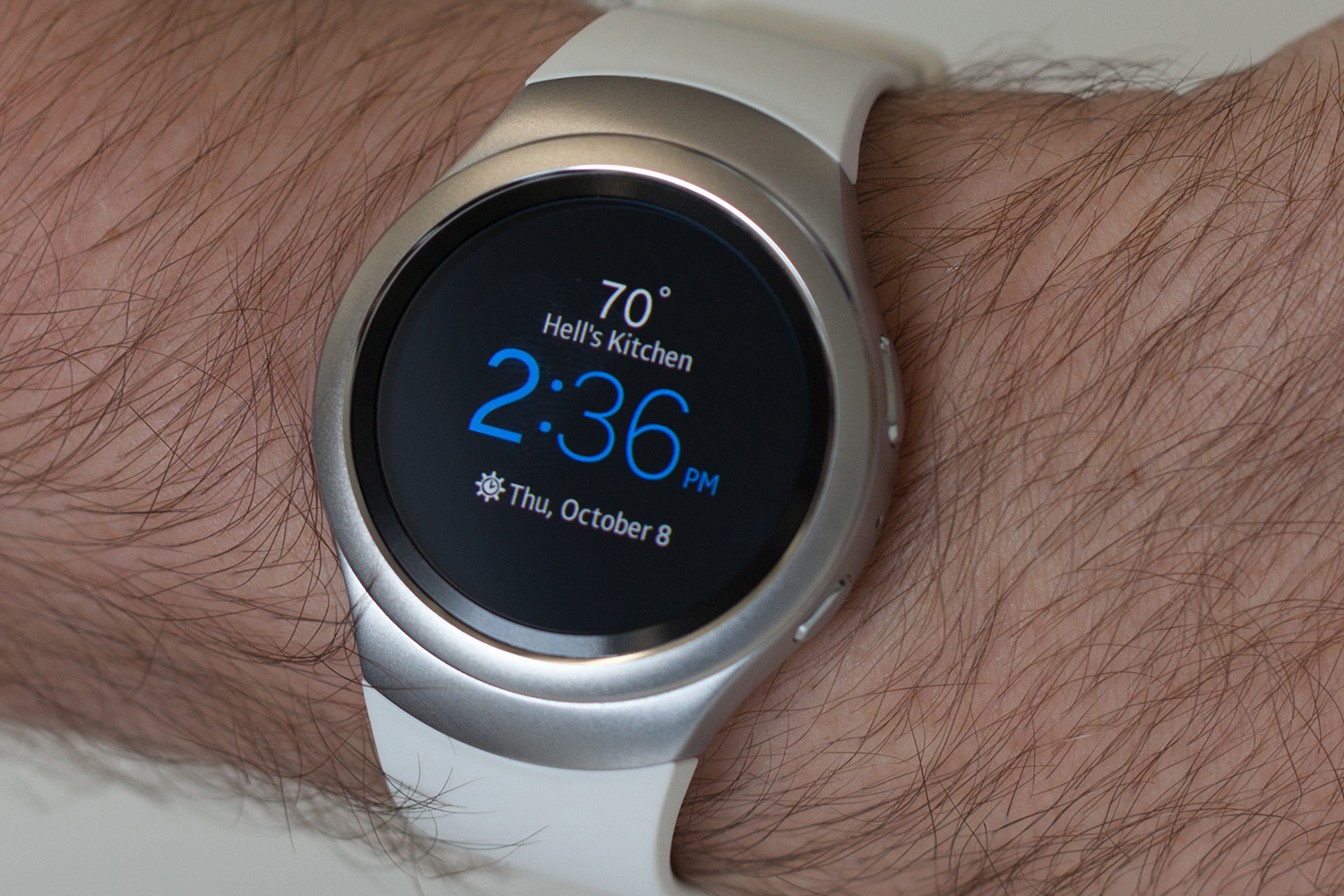
But back to the S2 itself! Perfectly round and sized at a comfortable 1.2 inches (42mm total case size), it’s an optimal size to fit on a large variety of wrist shapes and sizes. It’s in between the two Apple Watch sizes, and comes in two designs: a sporty version and a Classic version. The Classic also has a ribbed watch face and traditional lugs, making it compatible with any 20mm watch band. There are versions of the Sport with added 3G/4G connectivity as well.
The Gear S2’s secret weapon is the bezel surrounding its screen.
I tested the stainless steel Sport version with Bluetooth, which has a brushed metal finish and winged-style straps that make it look a little more elegant on smaller wrists. The strap that comes with it is a rubbery silicone, which feels a lot like the Apple Watch Sport bands. The bands on the Sport are easily removed via a button on the bottom of each, and replaceable with other Samsung-made straps. There are already a number of choices at launch, though if the Gear S2 doesn’t take off, early adopters will have a hard time finding straps in a couple years. Samsung is known for iterating fast and abandoning losing ideas pretty quickly. It calls this cut-and-run philosophy “relentless innovation.”
The button layout on the Gear S2 is straightforward and better than any other smartwatch. It has two navigation buttons on its right side. The bottom one acts as a power button and Home button, which brings you back to the home screen, and the top acts as a Back button, bringing you back into the previous menu, like an Android phone. Both buttons are comfortable to press and easy to find, even in the dark.
The Gear S2’s secret weapon, however, is the bezel surrounding its screen, which turns and twists like a radial dial of sorts, allowing you to easily select and scroll through onscreen menus. Operating like a tiny little steering wheel, it has a pleasant click to it as you turn, giving light tactile feedback so you know how fast you’re wheeling around.
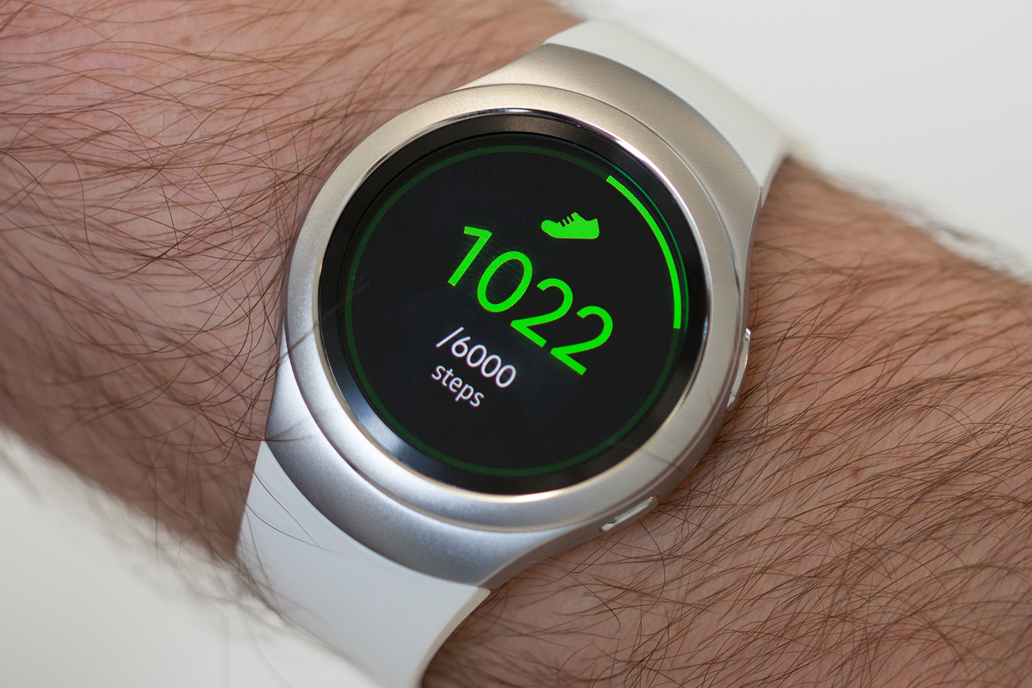
Finally, there is a heart-rate monitor on the bottom of the watch (which is pretty common these days). It also tracks steps at all times.
Operating system
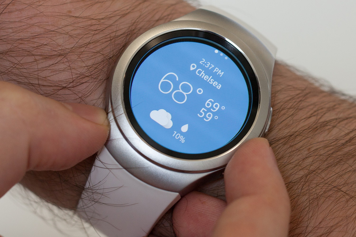
Samsung’s Tizen interface is brilliant — the best around — blending Apple’s best innovations with smart, thought-out designs. All of the menus are built with a round screen in mind, and using the rotating bezel to scroll through menus, or swipe around as you would on a phone, is incredibly intuitive.
Seriously, there are almost no apps for this watch.
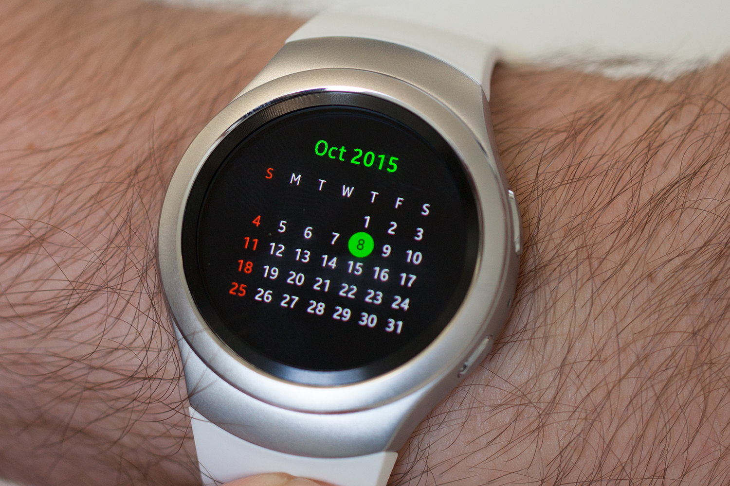
Samsung’s best innovation is simplicity. It’s a button click (or swipe) to get to the radial apps menu, a swipe down to access the battery life and connectivity menu, a swipe right to check notifications, and a simple swipe left to see your widgets. And, of course, you can do all of this with the rotating bezel as well, which clears up valuable screen space that your fingers take up when swiping. Every menu and app is designed to perfectly fit this easy, round design philosophy, with the exception of the square calendar app.
Samsung definitely stole a note from Apple with its watch customization menu. It looks and operates identically to the Apple Watch, but we can’t complain a ton, because it works. An added bonus: Samsung watch faces can be interactive. Several baked-in faces animate to show if you’re meeting your fitness goals, and companies like CNN have created special watch faces with their headlines scrolling past.
You would never know, but this entire watch runs on Samsung’s own Tizen operating system, which is in its new smart TVs but absent from its Android-powered phones. It wasn’t fun to use on the original Galaxy Gear, but six watches later, the Gear S2 shows that maybe Samsung can do its own thing. Except for one major problem: There are no apps. Really.
When we first reviewed this watch in late 2015, we complained about the dearth of useful apps. And now, fully a year later, there are still almost no apps for this watch.
For example, let’s take a spin through the travel apps available for Apple Watch. There are apps for every major airline (United, Delta, JetBlue, Alaska, Lufthansa), apps to buy tickets and read reviews (Priceline, TripAdvisor, Expedia), taxi apps (Uber, Lyft) apps for lodging (Starwood, AirBnB), and apps to tell you what to do when you arrive (Yelp, Foursquare). Not a single one of those is available for the Gear.
Correction: two are. Sort of.
Samsung has its own app store, and claims that there are thousands of apps, but aside from the Flappy Bird clone, Yelp, Nokia Here Navigator, ESPN, Bloomberg, and CNN, there’s nothing you’ll want to use. Samsung’s apps are fantastic, especially its fitness app, but there just isn’t anything else.
Samsung touted the release of a few high profile apps, notably the Uber app (the other item from that list of Apple apps is Yelp). Adding Uber was great for Samsung phone owners, not so much for everyone else. You see, the company offers two separate and distinct app stores. Read that again, because it’s total madness. If you own a Galaxy phone, you have access to the Uber app. If you use a phone by a different maker, you won’t see it. This is unacceptable, a clear effort to replicate Apple’s walled garden, which we also find maddeningly restrictive.
Likewise, Samsung rolled out Samsung Pay over the last few months; you can download a “beta” of the app — how is it a beta if it’s released to the public? — and pay for products with a wave of your wrist. The app works great, in my testing, but again, it’s only available through the Samsung Gear app store, not the
If Samsung wants to keep running a store independent of the
Massive connectivity bugs and lag, fixed at last
As much as we love wearing and using the Gear S2, it was for a while one of the most frustrating products we had ever reviewed. In testing the device paired with a Nexus 5X and Samsung Galaxy S6 Edge Plus in November of 2015, we encountered tremendous issues connecting to our phones — issues that have subsequently been fixed. Here’s the scoop.
The setup process for the Gear S2 is fairly straightforward when it works. You download the
If the Gear S2 runs out of battery, it will never reconnect to your phone again.
We uncovered a massive bug with the Gear S2 last fall, however: If you wear it until it runs out of battery, it will never reconnect to your phone again. The only solution is a factory reset, where you lose all your data and apps. I’ve had to do this three times now. Other users and reviewers have reported similar issues. This bug makes the watch nearly unusable. I don’t know if every Gear S2 has this problem, but several other reviewers — AndroidPit, GreenBot, AndroidHeadlines — have struggled with the exact same problem. The problem, fortunately, has been rectified, but for a time, it was pretty hairy.
Switching the phone you use it with is another ordeal. It will require a factory reset, but if you had a different Samsung/
The Reactivation Lock is a nightmare if you are the person trying to switch phones or users. DT Mobile Editor Malarie Gokey and I swapped the Gear S2 between us (a family might try to do this as well), but even though she factory reset it, it would not connect to my Galaxy S6 Edge Plus because she had turned on the Reactivation Lock. There were no good on-screen prompts for how to proceed — a hard reset and debug menu didn’t help, either. In the end, I had to log in as Malarie on my phone to make it work. It was a colossal pain in the ass. Don’t ever factory reset a Gear S2 before you disable the Reactivation Lock.
Notifications seemed to never arrive on the Gear, or came slowly, when we first reviewed it. This issue too seems to have been resolved. Finally, we never encountered much lag in the OS, but if you scroll quickly, it will fail to keep up. More annoyingly, if you have an app that sends multiple notifications, such as a chat app, Samsung’s swipe-up-to-delete gesture will fail to work. Instead, it will just scroll through the notifications. Eventually, if you press hard enough or get lucky, these notifications will vanish, but they do so in an ugly, laggy way.
Using it as a fitness band
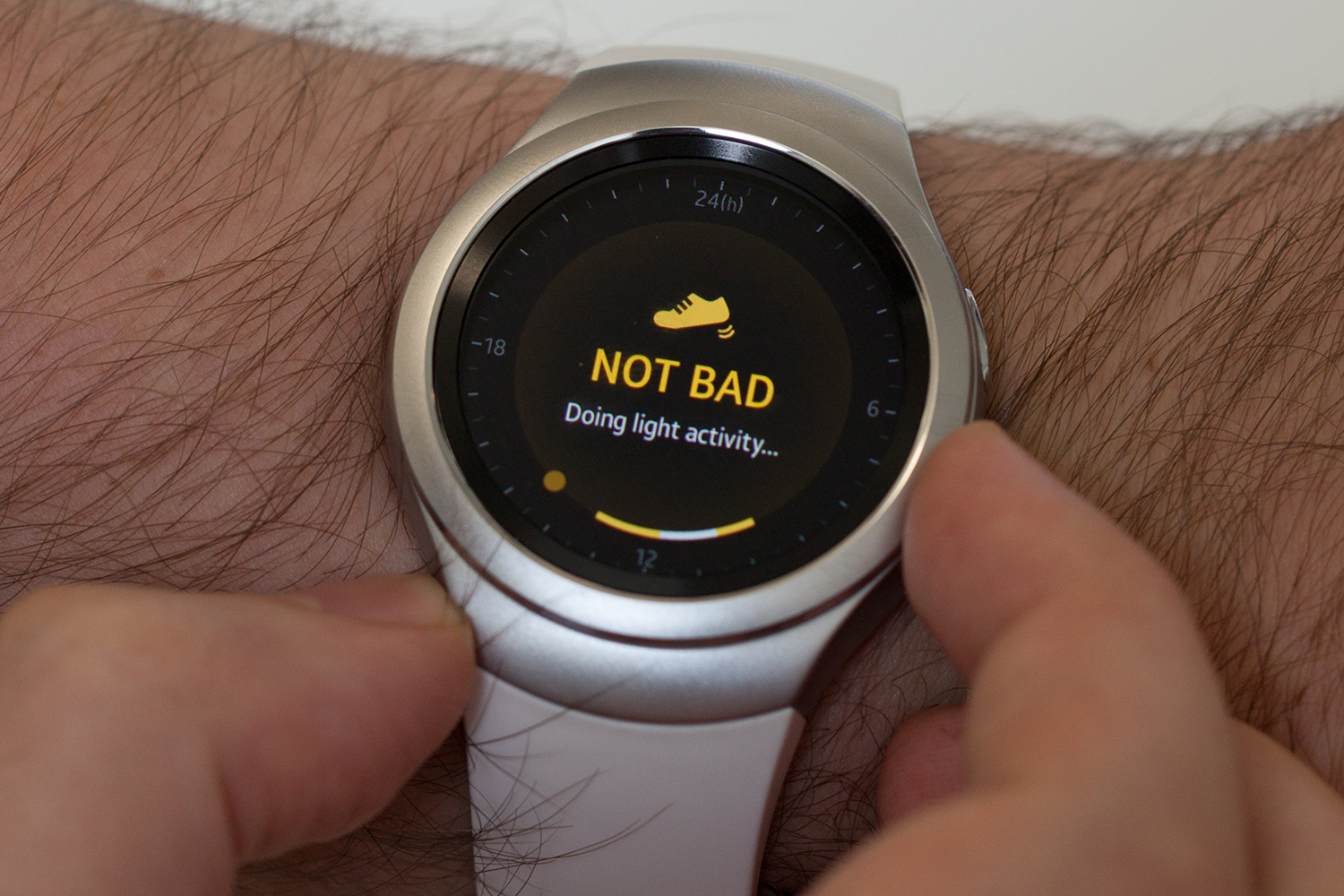
Given the near total absence of smartwatch apps here, I tend to use the Gear S2 as a fitness tracker more than anything else. So how does it perform in this capacity? It does … okay.
The Gear S2 has S Health, a very full-featured suite of tools to track your activity. We’ve ran hundreds of miles with the watch, and biked just as many. We’ve tried golfing with the Gear S2, cross-trained, hit spinning class, and more. Across those activities, the watch appears to track step counts reasonably well, though no fitness band seems to count the same number of steps nor log the same distance. For example, we recently ran 5.5 miles on a treadmill in the gym; the Gear S2 recorded the distance as 4.96 miles. What happened to that last half mile?
Examining that run after the fact on the app yields an abundance of data: heart rate over time, calories burned (615! Woo hoo!), average speed and pace, and so on. However, as a fitness band, the Gear S2 is limited by the absence of GPS functionality. Unless you carry your phone with you on that run, you’ll have no way to know exact distances or to track your path. We’re glad to see Samsung adding this feature into the S3. Also, while the watch charges quickly enough, it has died in the middle of several runs for us, meaning all data is simply eliminated.
Additionally, the app makes it easy to select the last used activity but doesn’t make it easy to change it. If you recently went for a run, just scroll the dial right to get to the Start Workout widget and quickly start another run. Want to go cycling instead? Scroll right once, push apps, select S Health, scroll right to the green screen, push the arrow at the bottom of the screen, and select a different workout type. Whew! There are only eight types of activity, unfortunately, another limitation of the app. Cross training? What to select?
Solid specs
The Gear S2 has a gorgeous 1.2-inch 360 × 360 pixel Super AMOLED screen that couldn’t look nicer. It’s covered by Gorilla Glass 3, runs Samsung’s Tizen OS, and has a 1GHz dual-core Qualcomm MSM8x26 processor, 4GB of internal storage, 512MB of
The
Bountiful battery life
The Gear S2 kicks ass when it comes to battery life. The 250mAh battery in the S2 doesn’t sound like much, but I’ve gotten about 2.5 – 3 days out of every charge. I did experience a lot of connectivity issues, which may have improved battery life, but even when it was connecting regularly, the battery killed it. Most watches seem to average about 1 to 1.5 days, including the Apple Watch, so it’s nice to see Samsung excel in this regard.
The Gear’s charging cradle is also well thought out. Instead of a hunk of magnetic plastic that awkwardly slaps onto the back of the device, like the Apple Watch, this has a full stand that props the watch up like it’s on a pedestal, with a little indicator light that tells you if it’s charged or charging.
One-year warranty
Samsung’s standard manufacturer warranty is normal for a mobile device. A Gear S2 is covered for 1 year after the day of purchase for defects that occur under normal use, though Samsung determines “normal use,” so it can deny any claim it wishes. Don’t expect a repair or replacement if you get the Gear S2 wet or drop it, but if the battery gets very bad before a year is out, Samsung may replace it. You can find full details on Samsung warranties here.
Conclusion
Even though the Gear S3’s release is imminent, the Gear S2 remains a beautiful piece of industrial design, and a decent smartwatch. Updates to the software have come steadily, patching the serious connectivity bugs we identified in our initial review and adding some neat features, notably support for Samsung Pay. But without the enormous app market seen on the Apple Watch, it’s hard to say the Gear is a better product. Buy one and you’ll invariably find yourself wishing you could do more with it. That’s a shame, because Samsung has made a watch with possibly the best battery life, clearly the best interface to date, and one of the best designs we’ve seen.
Looking for an alternative? There’s the Apple Watch, of course. Keep in mind that it requires an iPhone — and if you’re in the market for a Gear, you probably own a Galaxy or
Alternatively, you could choose to go low tech. We like the simple Withings Activite and Activite Pop, though they’re made for slender wrists.
Highs
- Beautiful round design
- Elegant, fluid user interface
- Rotating bezel is a true innovation
- 2-3 day battery life
Lows
- Barely any usable apps
- Reactivation lock is buggy
- Fitness functions are very limited


