“Comfortable, competent, and motivational, the Whoop 4.0 is a great distraction-free fitness tracker, but it doesn't standout against the competition, so fails to justify its high price.”
- Comfortable to wear 24/7
- Informative health data
- Motivational Strain metric
- No notifications
- Awkward, slow charging system
- Monthly charge makes it expensive
- Automatic workout tracking isn't customizable
The Whoop 4.0 is not a smartwatch, let’s get that out of the way right now. It’s also not a device you buy outright, as you pay a monthly subscription for the app, and the band itself comes for free with it.
This makes the Whoop 4.0 very different from your usual health and fitness tracking wearable, but is it better? I’ve worn the Whoop 4.0 for almost a month to find out if it’s worth paying monthly for a fitness tracker.
About our Whoop 4.0 review
On February 15, 2023, Whoop reduced the price of the Whoop 4.0’s 12-month and 24-month subscription packages, which we have altered in the Price and Availability section below. It’s important to note the cost of paying monthly for the Whoop 4.0 remains the same, but it has become cheaper if you commit to paying for a set period of time. While this is welcome, it has not changed our score or overall opinion of the Whoop 4.0.
Whoop 4.0 review: setup and wearing it

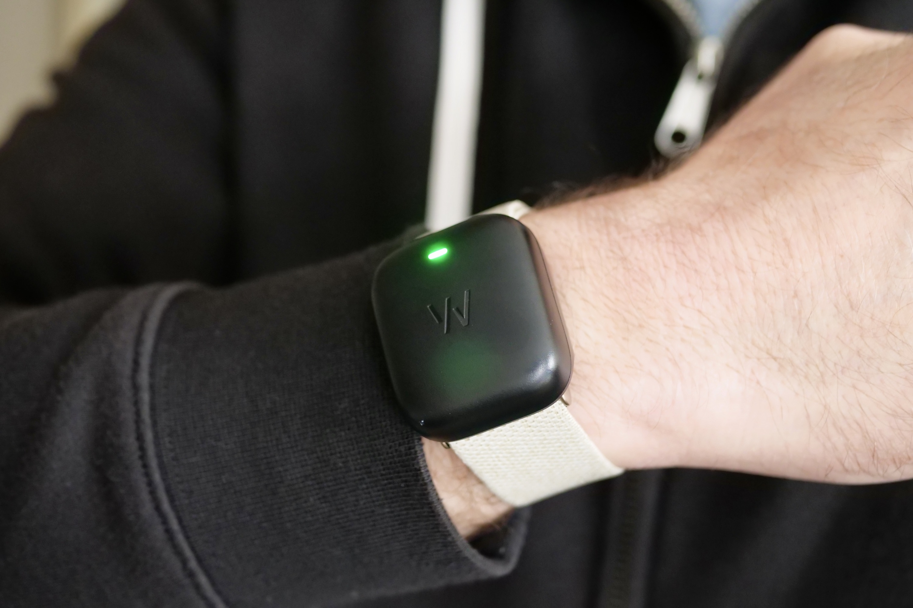
The Whoop 4.0 is a fitness band in the truest sense. It has no screen, and the main unit is attached to your wrist using a fabric strap. It can also be slipped into pockets in specially designed fitness wear if you’re willing to buy them. It’s light at just 27 grams, and the fabric is very soft, stretchy, and comfortable. I’ve worn it solidly for more than four weeks and haven’t had any problems with skin irritation or sweat. While the main unit does appear quite thick, it hasn’t interfered with my clothing at all, despite freezing temperatures requiring me to wear multiple layers.
The Whoop 4.0 has no screen, and the main unit is attached to your wrist using a fabric strap.
You can personalize the Whoop 4.0 with different colored straps, which are easily changed, and they are also quickly adjusted to increase or decrease the tightness around your wrist. However, while I know all this now, it’s not all that clear when you first open up the Whoop. In fact, the entire onboarding process is poorly explained, and it leaves you questioning whether you’ve actually done everything correctly.
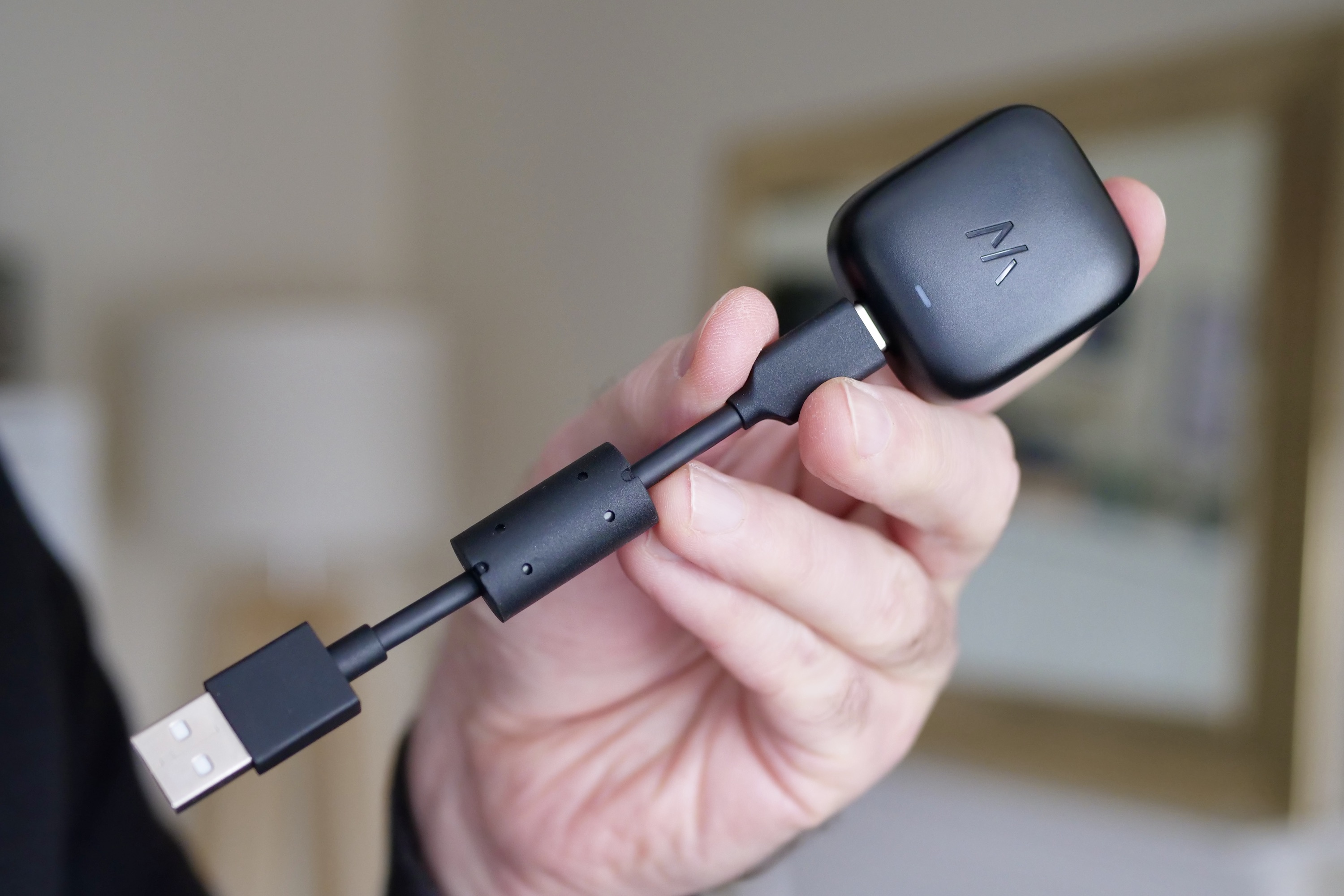
Even the way you charge the device is a bit of a mystery. Unlike almost all other fitness trackers and smartwatches, the Whoop 4.0 doesn’t use a USB Type-C connection or a proprietary charging puck. Instead, to charge it, you use a battery pack. The idea seems to be that you charge the pack, and can then charge the Whoop device on the move. You get a very short MicroUSB cable to charge the pack, at which time you can also charge the Whoop too. There’s no real indication of how to use the pack and to charge the Whoop, and as it’s so different from usual that it’s quite confusing the first time you open the box.

It’s a messy system too. If you do take the charging pack around with you — as seems to be the recommendation —and lose it, you can’t charge the Whoop 4.0 at all and will have to buy another battery pack for $50. I’d have much preferred a simple on-device charging port to use with the dozens of normal cables I have lying around, and the offer of the battery pack as an optional extra. Perhaps I’m too used to charging and setting up regular wearables, and assumed the Whoop would be somewhat similar. But the fact that Whoop is a little different from those products means clear instructions should be a priority.
Once you’re past the initial setup, wearing and using the Whoop 4.0 itself is effortless, mostly because it doesn’t do anything. There’s no screen, no real touch controls, and no little buttons. It’s definitely not a smartwatch, so if you want notifications, alerts, or any kind of screen to see the time, then it’s absolutely not the wearable for you. Instead, Whoop is all about the app.
Whoop 4.0 review: using the Whoop app

Because the Whoop 4.0 band is a wrist-worn sensor pack and nothing else, you rely on the app for almost everything. This means it needs to be very good because you’re going to use it most of the time. The good news is it has a slick, modern, sporty-looking design, and the only bad news is it’s irritatingly slow to process data.
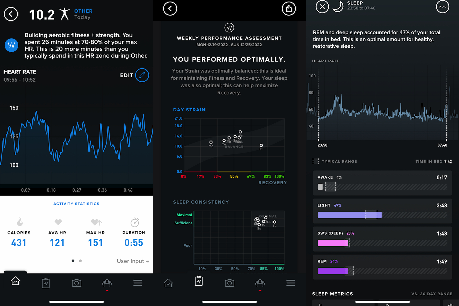
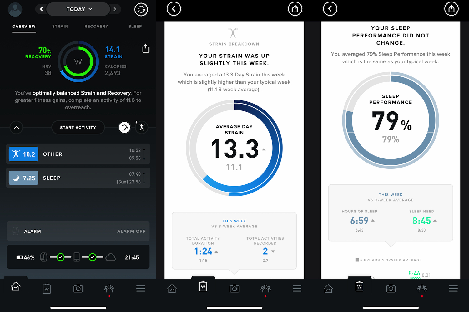
Before we get into all this, let’s talk about how Whoop measures data and tells you about your body’s performance. It uses three basic metrics: Strain, Recovery, and Sleep. There’s no step count here. These three core metrics are presented on the main screen of the app. Strain is calculated by the app, based on your heart rate, sleep, and recovery, and it’s your daily target designed to push your body toward better health and fitness.
Once Whoop has established your baselines, it presents a daily Strain target along with daily calorie burn, heart rate, resting heart rate (RHR), blood oxygen, and heart rate variability (HRV) data. All this is collected into handy, easy-to-read charts, which can also be plotted to include strain and recovery data too. It’s suitably in-depth, but also very easy to understand — even if you’re a newcomer.
It’s motivational due to Strain being a single, simple number. However, it’s not very clear how much work you’ll need to do in order to meet the target. If I need 10 Strain points, is that a 30-minute session on an indoor bike, or a triathlon? I’ve no idea. Yes, experience will tell you, but without universally understood metrics like steps being used, better guidance would help people understand the Strain system more quickly.
While all this does sound confusing, and the learning curve is quite steep at first, the Whoop 4.0 is doing basically the same thing as the Rings system on an Apple Watch. The more you do, the closer you get to your goal. The fact it’s similar isn’t a bad thing, and understanding this helps you to quickly get on board with Whoop’s terminology.
Overall, quirks aside, Whoop delivers an excellent app experience.
You do need to dig through the app to see all the data, with many sections hidden away behind tappable panels or by scrolling, neither of which are always very obvious. That said, I find the app interesting and informative, plus the historical data is extensive. However, it’s irritatingly slow to process incoming new data. Sleep and workouts take a while to actually show up in the app, which I believe is due to the number-crunching being done in the cloud, not in the app. I want to see my sleep data when I wake up, not 30 minutes later when the app sends me an alert.
What else? It integrates with Apple Health, TrainingPeaks, and Strava. There are various Whoop communities to join in the app and a bizarre built-in camera mode where you can take a selfie overlaid with your Whoop performance metrics; great if you’re into that sort of thing. Overall, quirks aside, Whoop delivers an excellent app experience.
Whoop 4.0 review: health tracking

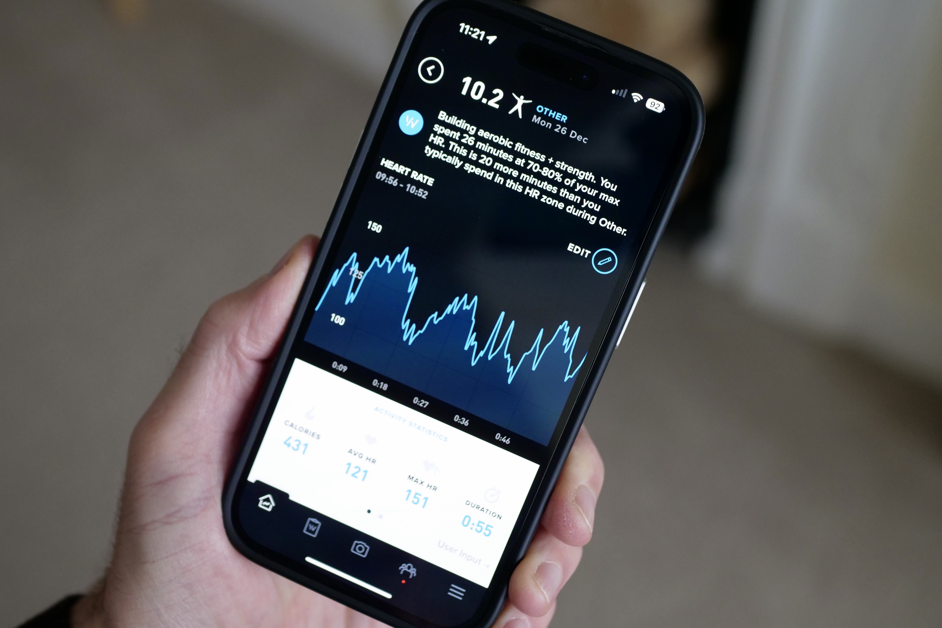
There’s no screen on the Whoop 4.0, so you must rely on the automatic fitness tracking recognition or manually start a workout in the app. This is a little long-winded, particularly if you’re used to a smartwatch or fitness band, where activity tracking is usually a few screen taps away. You do get used to it on the Whoop, though, which is a good thing because the auto-tracking takes its time to activate. The app says it needs 15 minutes of, “sustained, significant cardiovascular exertion” to kick in.
It has auto-tracked when I wash the car, but not when I clean the house, or even when I did a 30-minute HIIT-style workout at home. I assure you my heart rate was more elevated during the HITT workout than when I was washing the car. Ideally, the setting should be customizable, so the timing of its activation is more relevant to more people. I’d rather it activated early than not at all. There are multiple activities to choose from in the app, including out-of-the-ordinary options like Circus Arts and Manual Labor, plus non-physical activities like Medical Operations and High Stress Work. It does not have GPS built-in, so relies on the GPS in your phone when tracking outdoor activities.
I wore the Whoop 4.0 alongside the Apple Watch Series 8 to compare results. A general 30-minute workout recorded on the Apple Watch showed an average heart rate of 103bpm and a 140kcal active burn, while a 20-minute indoor bike session recorded a 113 beats per minute average heart rate and 100kcal burn. During the general workout, the Whoop 4.0 recorded an average heart rate of 95 bpm and a 97kcal burn, and on the bike, it showed a 110 bpm average and a 109kcal burn. The Whoop consistently recorded average and maximum heart rates under those recorded by the Apple Watch.

Neither are medical devices, and I’m not saying one is more accurate than the other, but the discrepancies are notable. For reference, the Apple Watch was on my left wrist and the Whoop 4.0 was on my right. There are some oddities in the way it tracks workouts too. GPS tracking is either on or off, and isn’t workout dependent. This means if you turn it off when you’re indoors, you have to remember to turn it back on for an outdoor activity. The phone’s screen also stays active throughout a workout, so you can see your Strain number increase in real time. It’s motivational, but not great for battery life, and a consequence of not having a screen on the Whoop 4.0 band itself.
The Whoop 4.0 doesn’t demand attention due to not having a screen or delivering notifications, but it is still quite needy. The auto-tracking isn’t as reliable as it should be, so you get into the habit of activating it manually in the app. It doesn’t show data on your activities immediately, so you have to return to the app more than once to see the fruits of your labor.

You can check the battery life by tapping on the wrist module to light up an LED indicator, but it works sporadically. Battery life is accurately shown in the app. None of these have made me want to stop wearing the Whoop 4.0, just don’t mistake it for a wear-and-forget tracker.
There are some other features that require you to put in some effort but may actually provide some benefit depending on your goals. The main one is a daily journal, where you can manually provide insight into how your day progressed and the way you felt, including adding information on stress and anxiety levels, caffeine consumed, vitamins taken, and plenty more. I’ve been adding these most days, but haven’t personally seen where it influences the app or its recommendations.
Whoop 4.0 review: sleep tracking

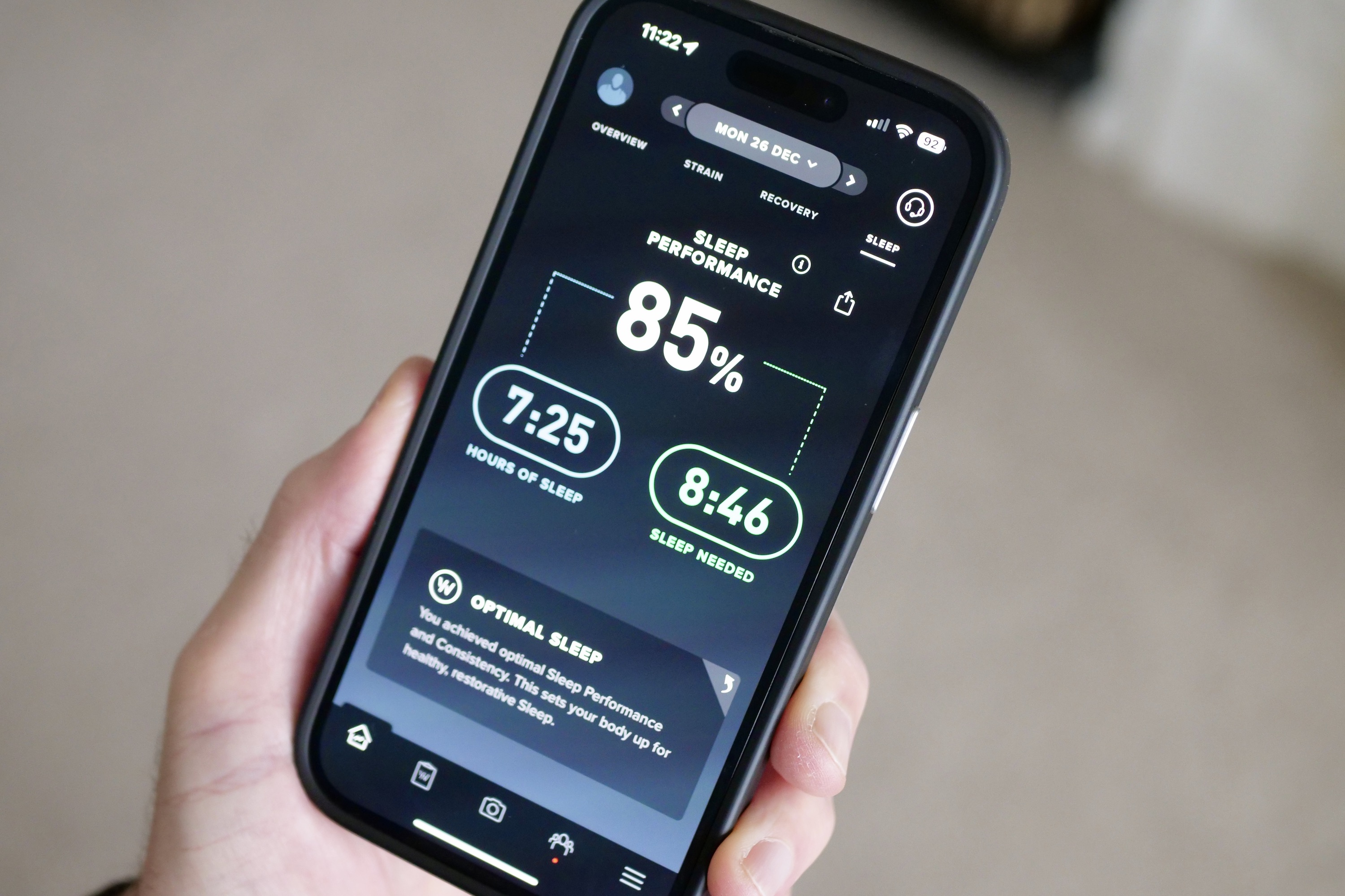
The Whoop 4.0 is perfectly comfortable to wear overnight, and doing so is essential for the app to do its work. In the morning, it shows time spent in REM, deep, and light stages, plus any time awake, along with data on respiratory rate and sleep efficiency. Elsewhere in the app, you can find the amount of time you spent in bed, an “hours vs. need” metric, trends, heart rate variability, skin temperature, and blood oxygen levels. Unfortunately, all this data is spread out in the app, so you have to remember where to find it. It’s not simply under the Sleep menu.
I’ve been comparing it to the third-generation Oura Ring with its new sleep staging algorithm. Both usually agree on light and REM sleep, but differ on deep sleep and awake time. Interestingly, using Oura’s old sleep staging system sees it come closer to Whoop’s estimates. The two usually agree on skin temperature, but Whoop usually records a higher respiratory rate than Oura.
There are differences in the historical data too. In the Oura app, you can go back in time and see all the data collected by the smart ring for each day, while Whoop’s app either deletes or hides away daily data like blood oxygen and resting heart rate from its records. The Oura Ring’s app is generally more logically laid out, equally as informative, and faster to show data too. Both are superior to the Apple Watch when it comes to tracking and informing you about sleep.
Whoop 4.0 review: compared to the Apple Watch

If you’re looking at the Apple Watch Series 8 and the Whoop 4.0, you should know they are both very different devices, and those who get benefit from one will not find the same from the other. The Whoop 4.0 is all about health and wellness, while that is just one part of the Apple Watch’s repertoire. The Apple Watch Series 8 is the best smartwatch you can buy, and the Whoop 4.0 isn’t about to challenge this title. Not because it’s substandard, but because it does totally different things. This applies when putting the Whoop up against any smartwatch.
Some of the more basic Fitbit bands can take on the Whoop 4.0, but for me, the closest competing product is the Oura Ring. The Oura Ring doesn’t have a screen and is expressly designed to monitor your health and wellness. It records the same health metrics as the Whoop 4.0 but misses out on extensive fitness tracking. It’s supremely comfortable to wear and avoids the sporty look of the Whoop too, plus I can happily wear it with a traditional watch or a smartwatch. Wearing devices on both wrists is a little awkward if you’re not used to it. The Oura Ring’s app is faster and more logical too.

The Oura Ring’s Readiness score, presented daily, is less aggressively sports-orientated than the Whoop’s Strain score. For some, this will be preferable. The difference between Strain and Readiness illustrates the big difference between the products. If you’re an athlete or keen fitness fan with clear goals who pushes hard to meet them, the Whoop will suit you better. If you’re someone looking to simply improve your health and fitness, and monitor changes over time, the Oura Ring is the better buy. We’ve gone into more detail about how the Oura Ring compares to the Whoop 4.0 here.
What about a Fitbit? The Fitbit Luxe is the brand’s best-looking fitness tracker, and its sensors measure heart rate, blood oxygen, skin temperature, breathing rate, and a whole lot more. Like the Oura Ring, there’s menstrual tracking, too, something missing from the Whoop. The screen means it’s more convenient to use than the Whoop and Oura, and delivers notifications and shows the time too. Whether you consider this an advantage or not depends on your priorities.
Whoop 4.0 review: battery, charging, and durability
The Whoop 4.0’s battery lasts around four days before it needs a recharge. I’ve already talked about the way you charge the Whoop being a little awkward, and unfortunately, it’s not fast either. It regularly takes at least two hours to fully charge the battery inside the Whoop band using the pack, and about the same time to recharge the pack itself.
You shouldn’t have to worry about breaking the Whoop. It’s encased in the fabric band and its metal clasp, and both the device and charging pack are IP68 water and dust-resistant. In the weeks I’ve worn the Whoop 4.0, it hasn’t suffered any wear and tear, and looks the same as it did the first day I put it on.
The Oura Ring’s battery lasts two days longer than the Whoop 4.0, and while I only get two days from the Apple Watch Series 8, it’s charged and ready to go again in less than 90 minutes.
Whoop 4.0 review: price

The Whoop 4.0 is a subscription-only device. The price has changed since we first reviewed the device, with the 12-month cost falling from $299 to $239, and the 24-month commitment from $480 to $399. The monthly cost remains the same, and these alterations are reflected below.
How Whoop works is you pay for access to the app and its data and get the band for free. It costs $30 per month (a 12-month contract is mandatory), meaning for a year, the Whoop 4.0 costs $360. You also have the option to pay upfront for a year, which costs a little less at $239. For the second year of ownership, you pay these prices again, and if you want a band and case other than the standard black version, be prepared to pay an additional $50 to $100 initially.
Cost of ownership of the Whoop and its competitors is a very important factor here.
An Apple Watch Series 8 starts at $400 with no additional costs to use its features or the Apple Health and Fitness apps, and the Samsung Galaxy Watch 5 starts at $240 without any additional costs. The Oura Ring starts at $300, and after six months costs $6 per month to view your data in the app. This means it’s $336 for the first year and $72 for year two. A Fitbit Luxe costs $130, which includes six months of Fitbit Premium, after which it’s $10 per month. For another year, Premium costs $80.
That’s a lot of numbers, but the cost of ownership of the Whoop and its competitors is a very important factor here. Here’s a chart to make it easier to understand how much it will cost to own and use these products for two years. I’ve used the entry-level prices for the products, so be aware if you want a larger model or a different finish, the basic price of the Whoop, Apple Watch, Galaxy Watch 5, and Oura Ring will increase. I’ve also assumed you’ll pay monthly for the Whoop initially, then pay a year upfront for the second year. Whoop also offers a two-year contract where you pay $399 upfront, but I imagine most will likely choose the monthly subscription first — just to make sure they like the system.
| Device | Purchase price | Year 1 additional cost | Year 2 cost | Total |
| Whoop 4.0 | $0 | $360 (option to pay $239) | $239 | $599 (option to pay $478) |
| Oura Ring | $300 | $36 | $72 | $408 |
| Apple Watch Series 8 | $400 | $0 | $0 | $400 |
| Galaxy Watch 5 | $240 | $0 | $0 | $240 |
| Fitbit Luxe | $130 | $60 | $80 | $270 |
It’s clear from the table how much more expensive the Whoop 4.0 can be compared to other products, even with the recent price reduction. The cheapest ways to own it requires long-term commitment right from the start. The question then becomes, does this additional cost translate into additional benefits or increased value? For me, it has not. Perhaps I’m not athletic enough to gain huge benefits from Whoop’s motivational tools, but I’ve not seen it push me, or more crucially inform me, more than any other wearable health device.
Whoop 4.0 review: verdict

With 27 days logged at the time of writing, I feel I’ve given the Whoop 4.0 a fair chance to really impress. It’s a good health and fitness tracker, and the information provided in the app, along with its motivational tools and advice on when to sleep and recover, is valuable. However, it doesn’t provide more than the competition, and that makes the overall cost of owning and using the Whoop problematic.
I’m not entirely sure where it fits in because of this. Casual fitness fans would be better off with the more versatile Apple Watch or Galaxy Watch 5, while those who don’t want a smartwatch would get the same value (if not more) from a Fitbit. The Oura Ring satisfies those who don’t want a device with a screen on their wrist and has an equally great app experience. Hardcore fitness fanatics should look at a Garmin or Polar wearable.
Slash the price of using the Whoop for two years by half, and it would be a different story, but as it is, the Whoop 4.0 is a competent, comfortable, and informative health tracker that doesn’t dramatically separate itself from the competition — and is too damn expensive to heartily recommend.

